Projects
Once you tap a link the selected page
will appear below this list.
Scroll past the list for the image gallery.
Once you tap a link the selected page
will appear below this list.
Scroll past the list for the image gallery.
Local Host Daily
24 Hour Film/Installation
2023
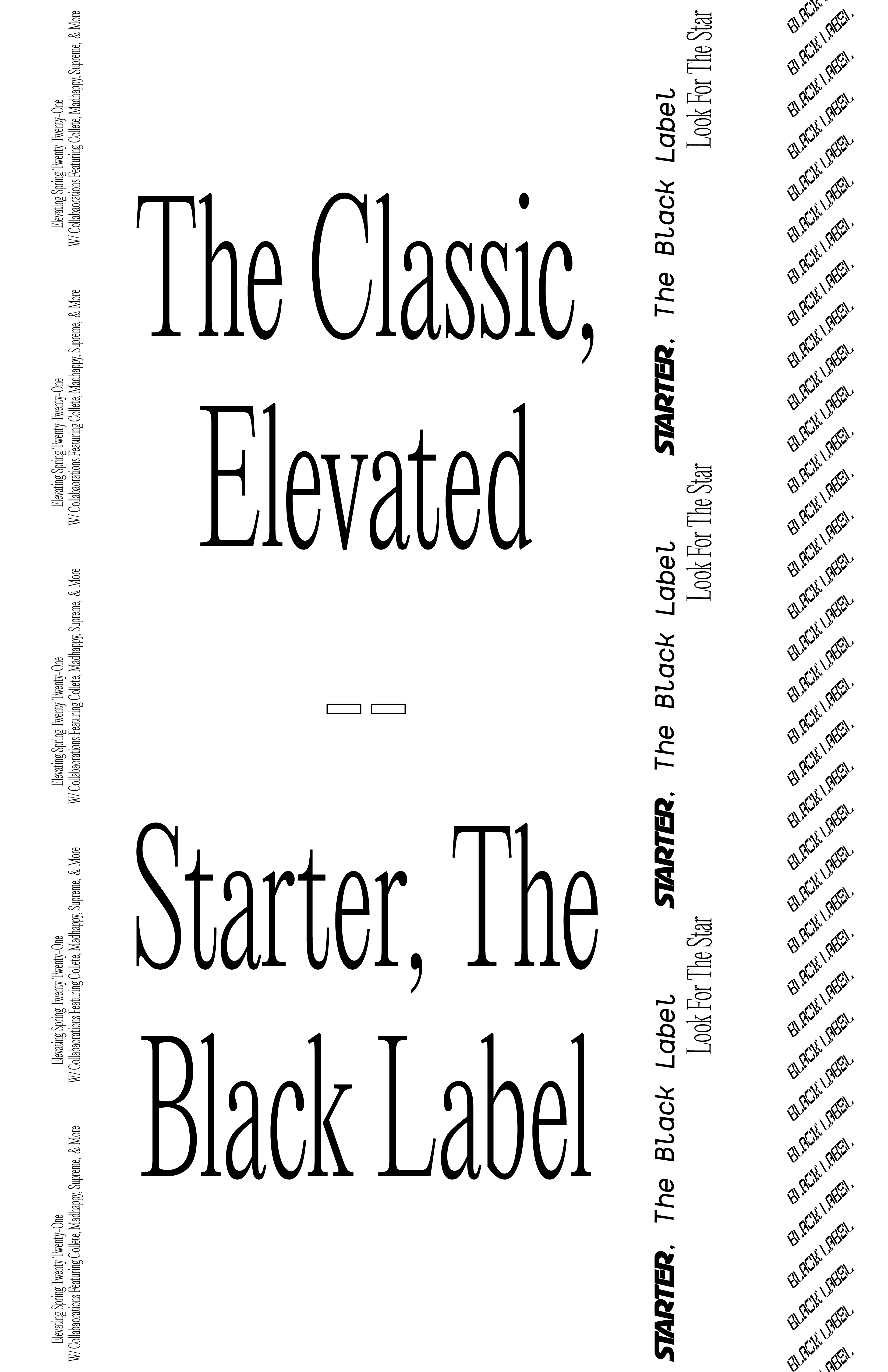
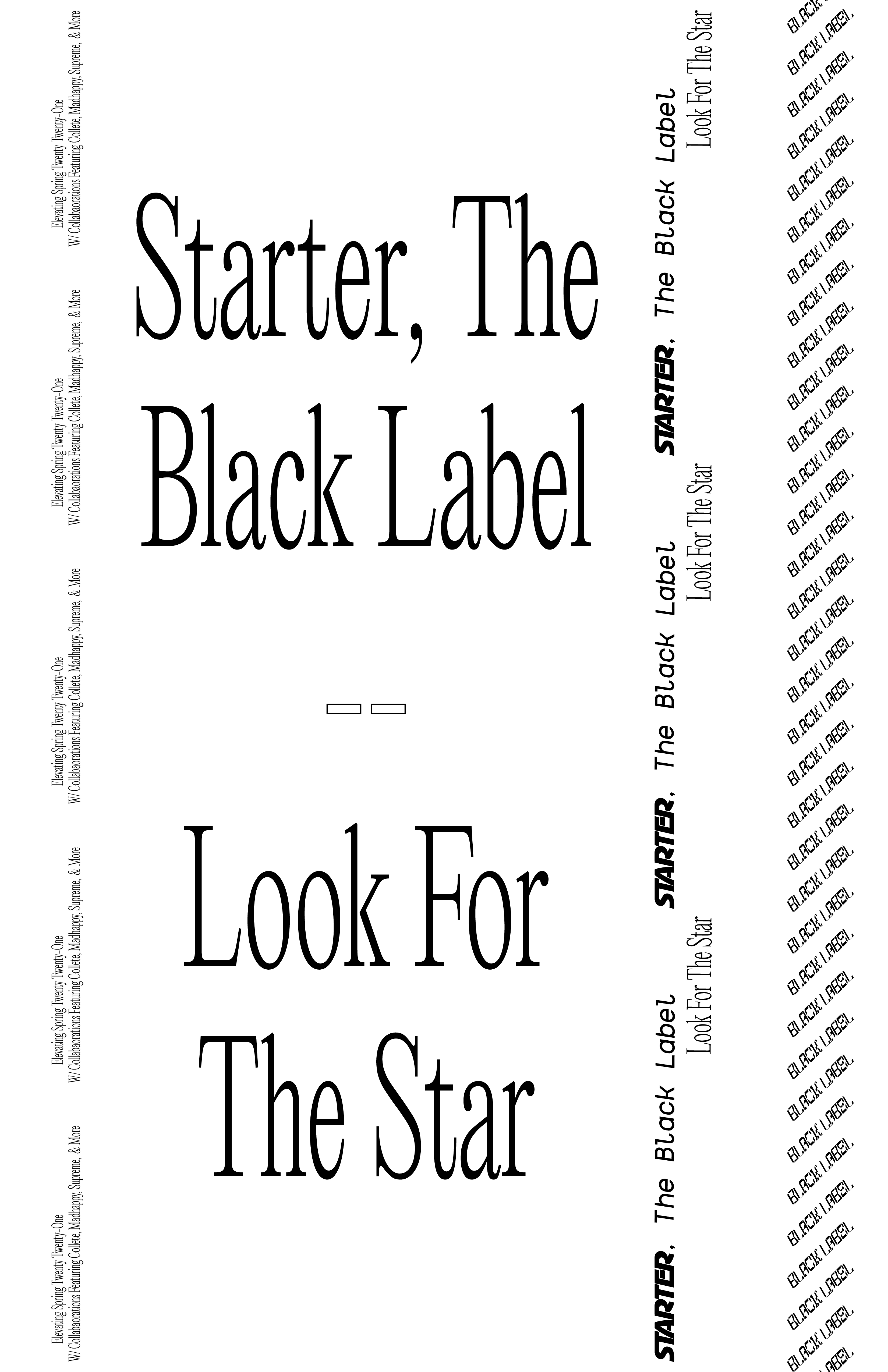
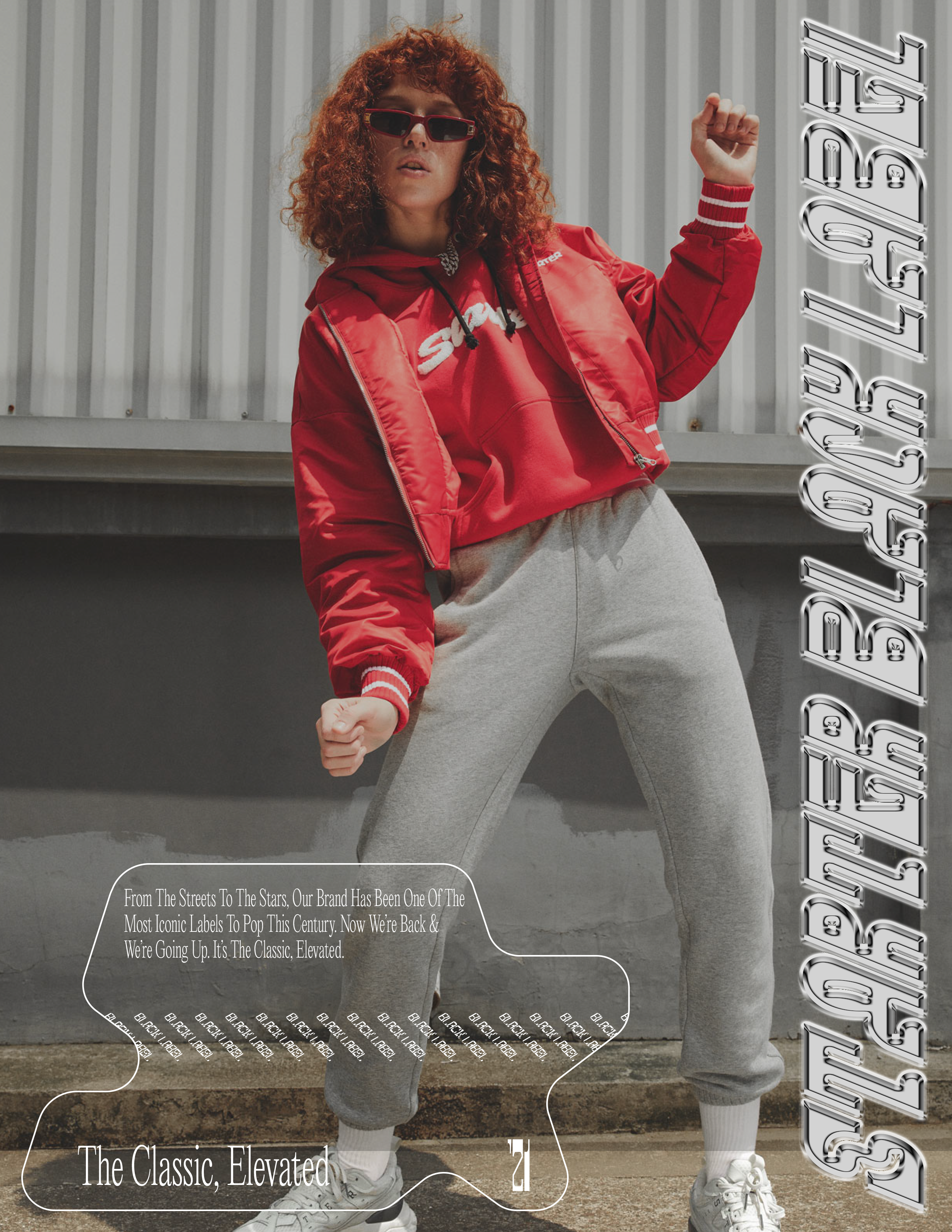
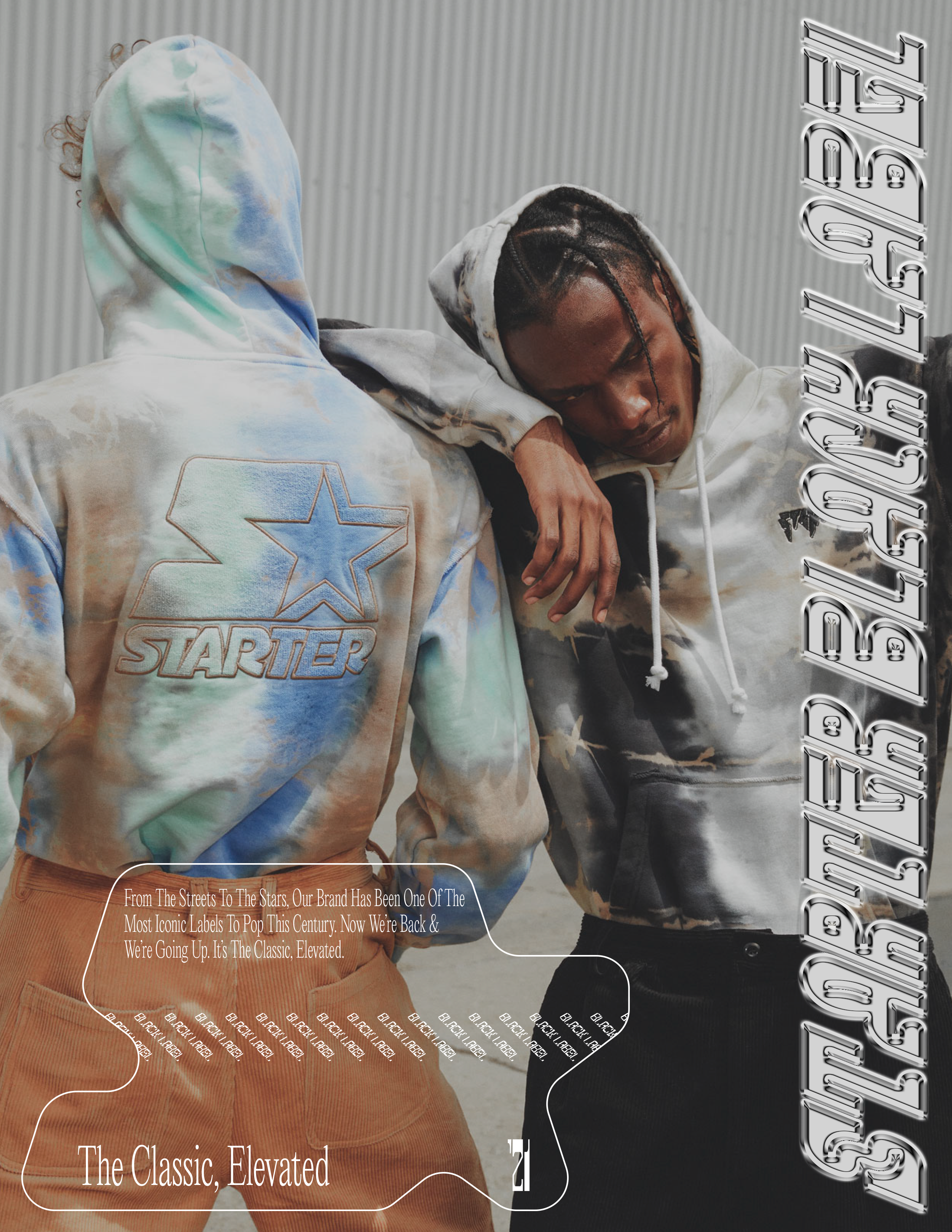
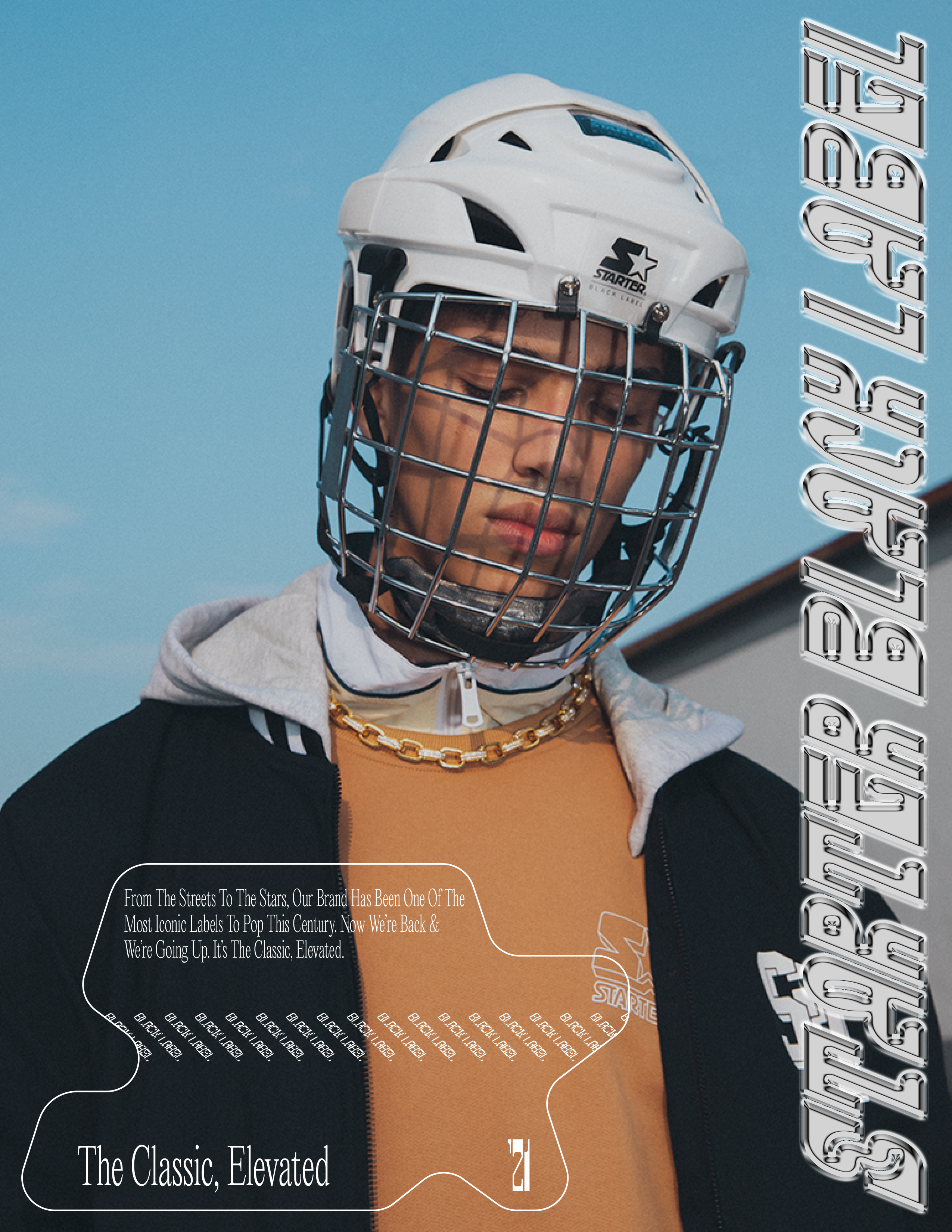
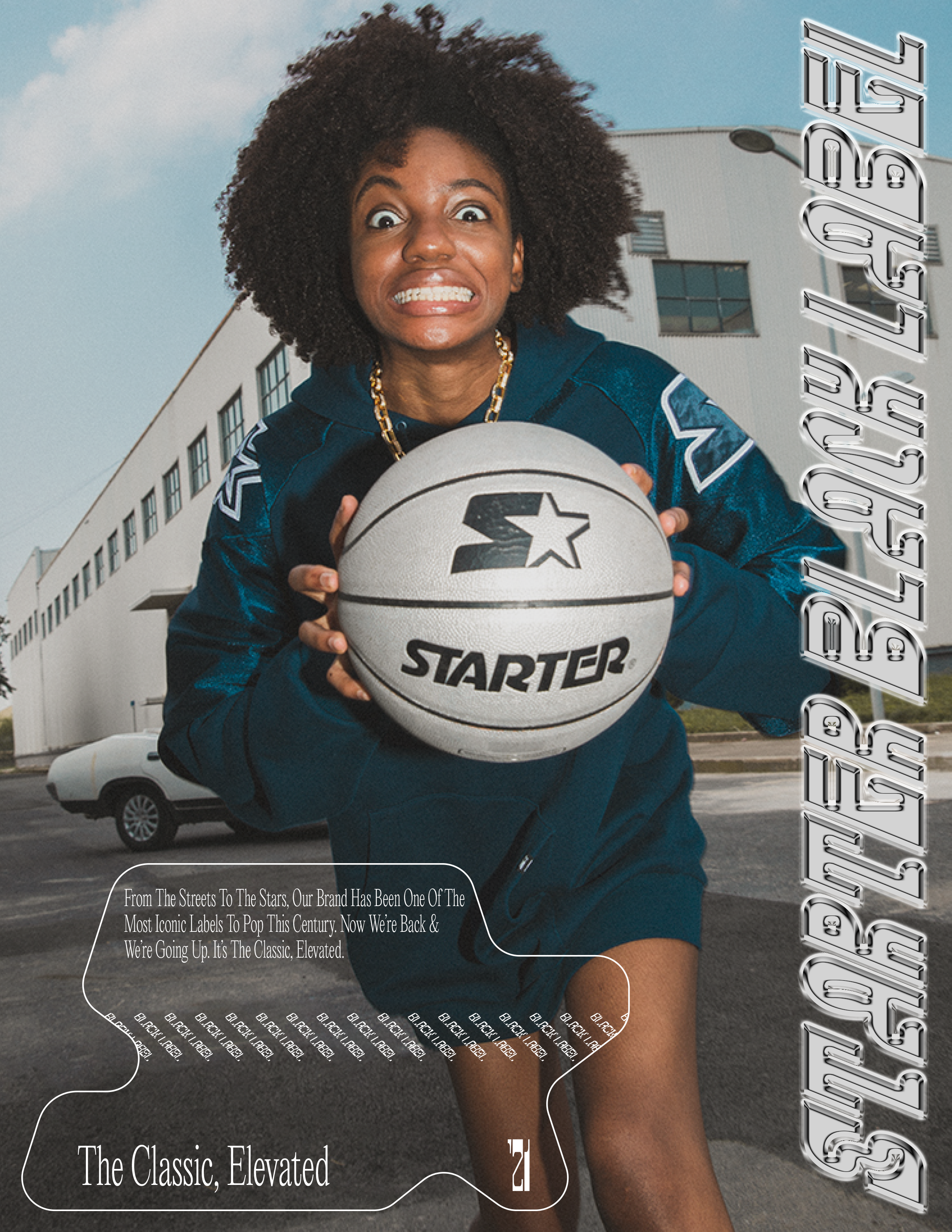
Starter, The Black Label
Mediums - Brand Platform, Print, Digital, Web
[Winter 2020]
Write-Up
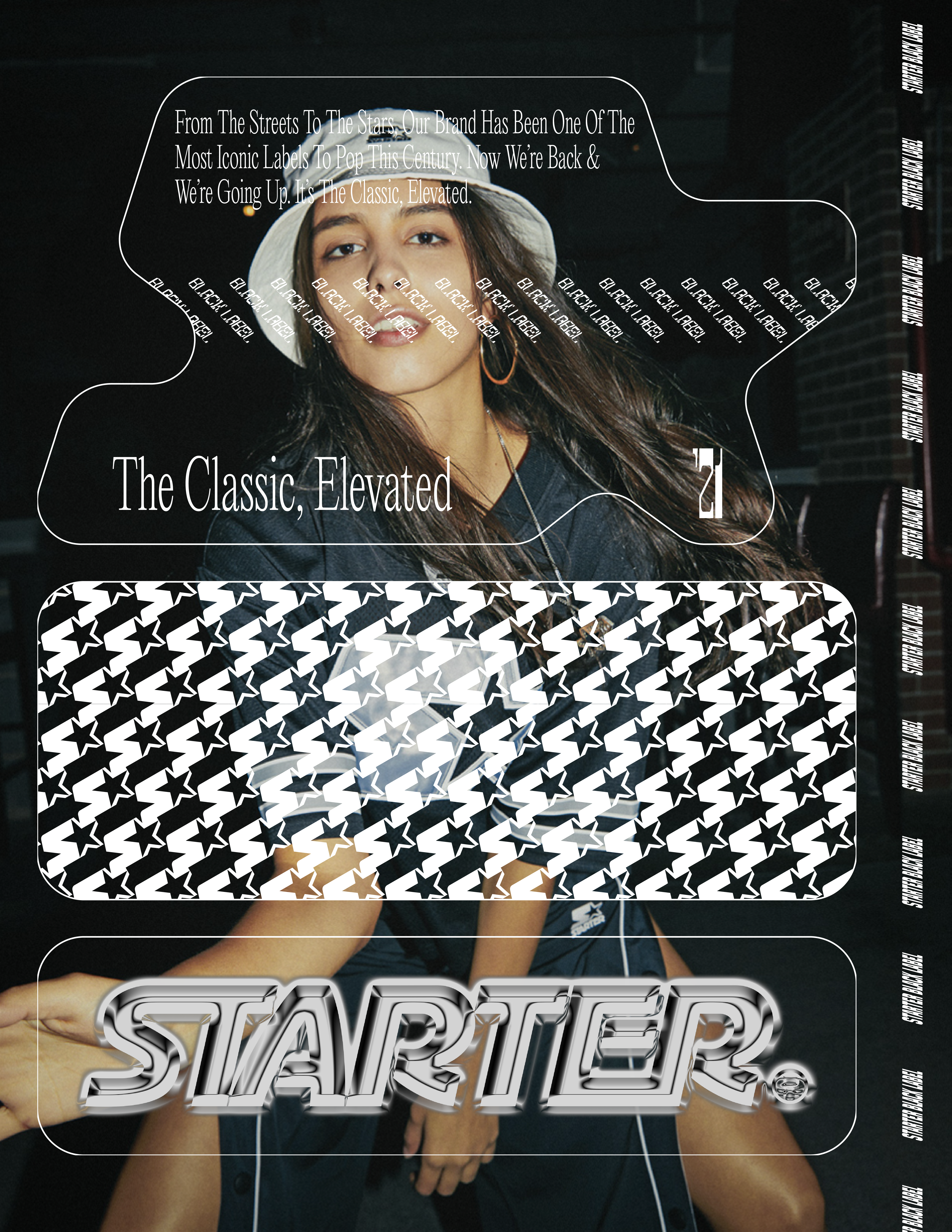
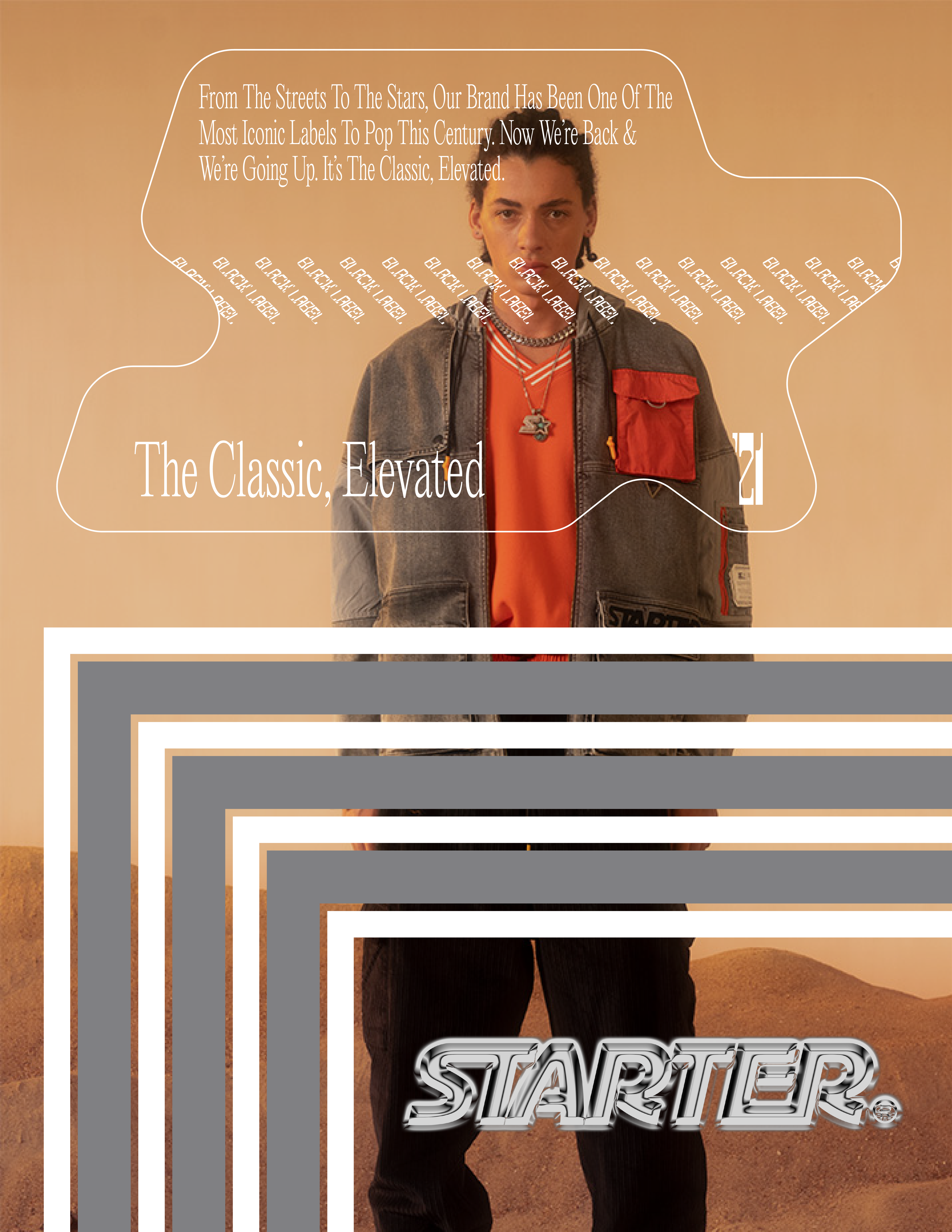
Starter US fell off, any of us familiar with the Nineties know that. Today, you might see someone on the street walking around in a Starter cap but as we all know, it's not really about the hats, it's about the jackets, the energy, the silvery satin, the swagger and the legacy of this brand. In 2021, Starter needs to be reestablished. Starter needs to elevate to where they were thirty years ago and then surpass even that. The goal of this campaign is not to fix anything that’s broken but to take the potential of this brand and turn that into hype while creating a design style that fuels brand recognition, catches culture’s eye and puts Starter, The Black Label in a better position to collaborate with the best premium brands in fashion.
Brand Standards
This is the most important part of the project... Here, we’ve created a guide which provides a look at the design elements, their use, and a loose framework for creating more brand assets. This campaign is highly modular. The elements can all be rearranged and used additively or reductively to create hundreds of different designs, looks, and feels... Kind of like a lego set.


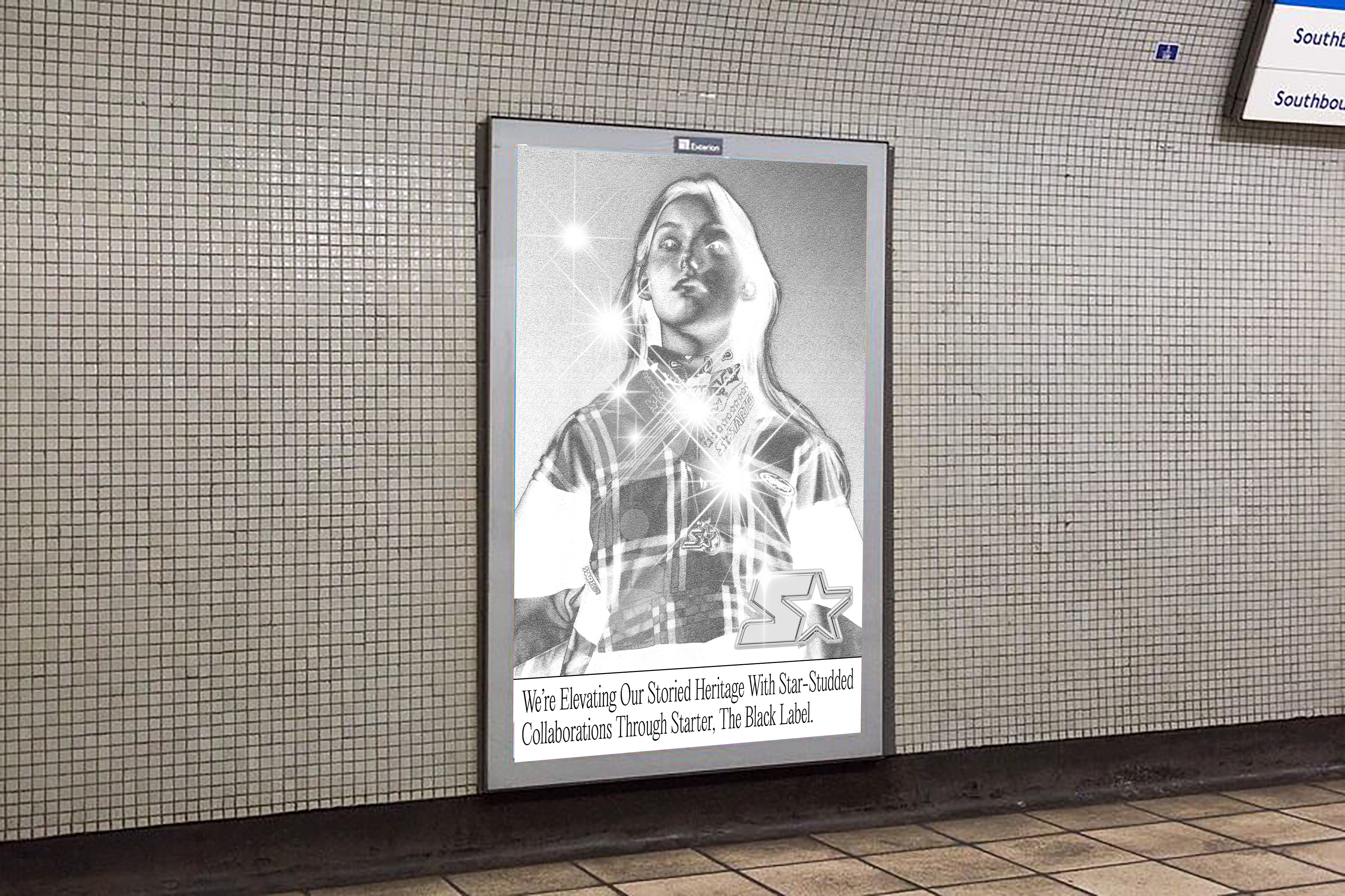
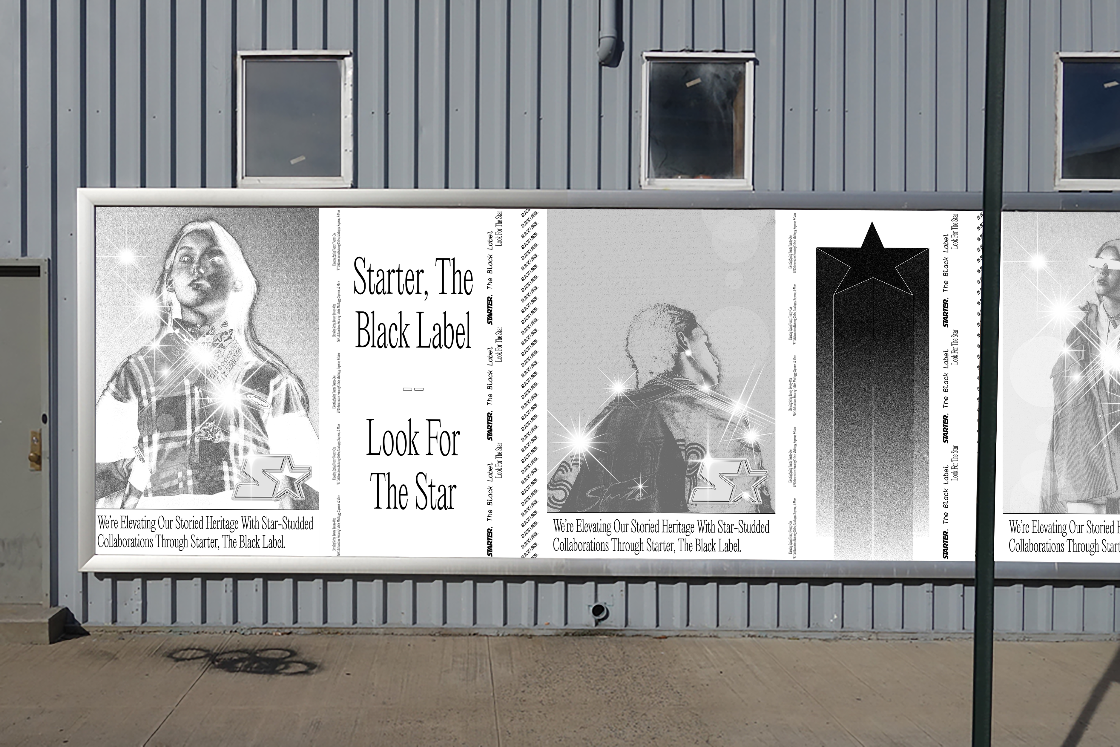
Art - Dir. 1
Photos From Starter China Lookbooks (’17-’20) - Image Treatments By Me
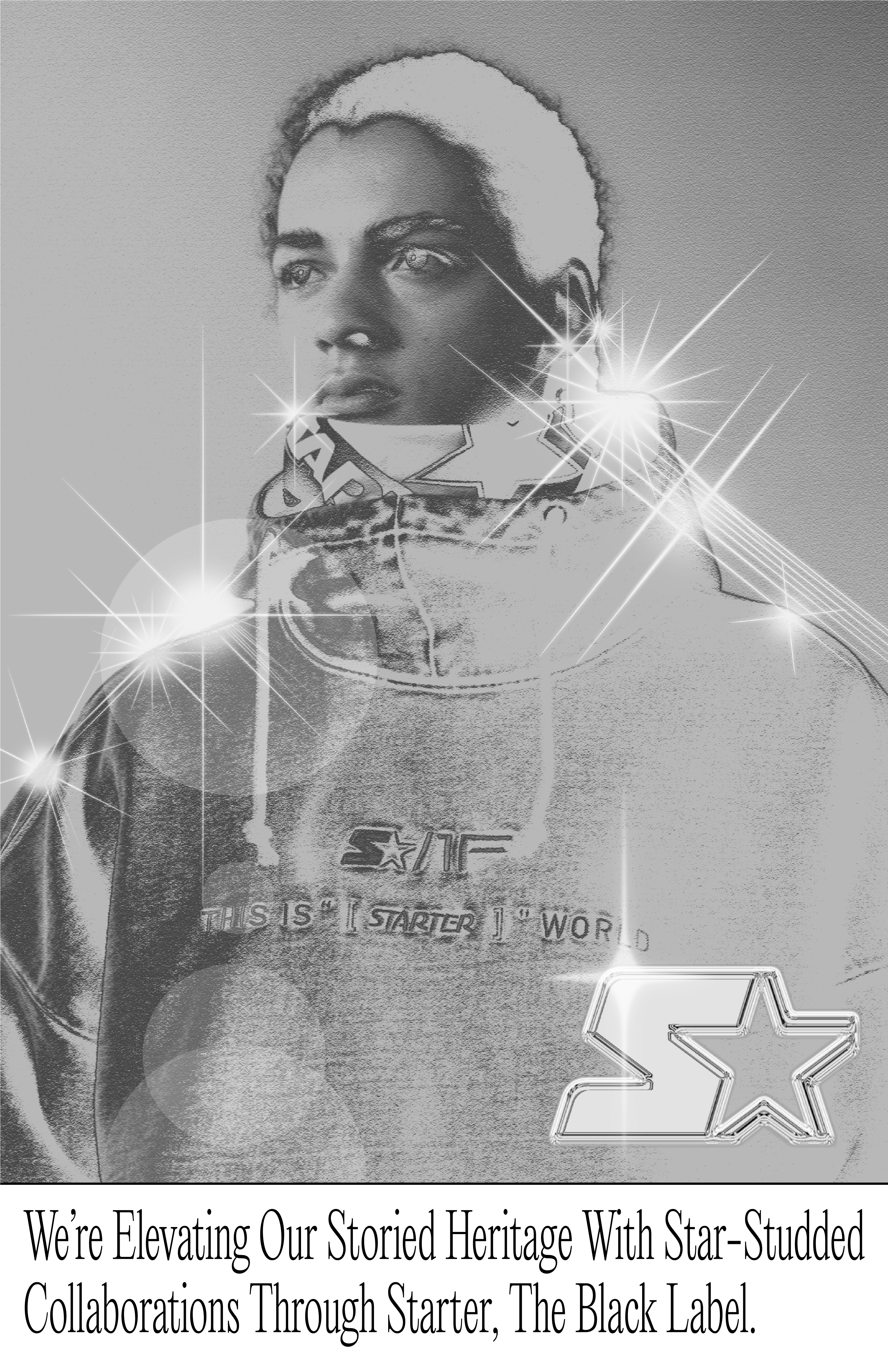
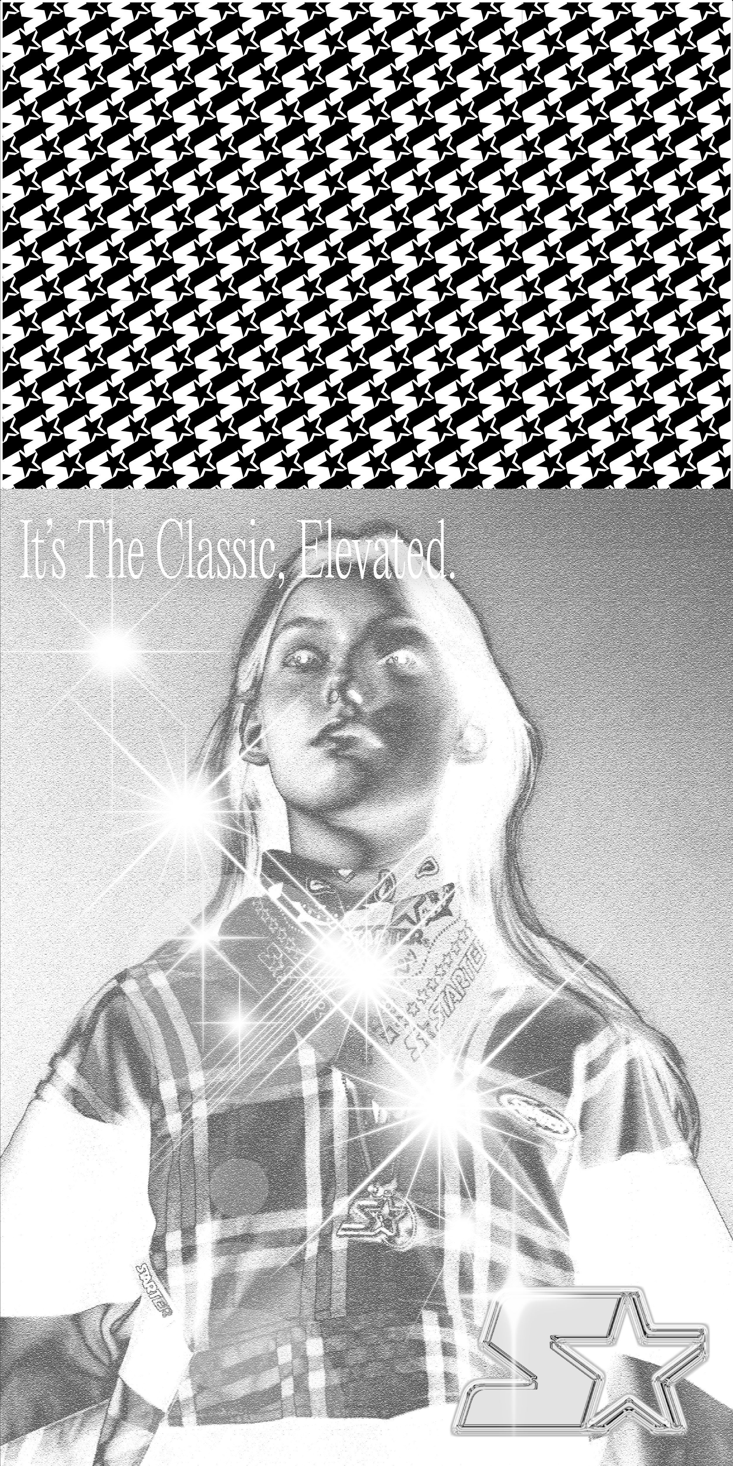
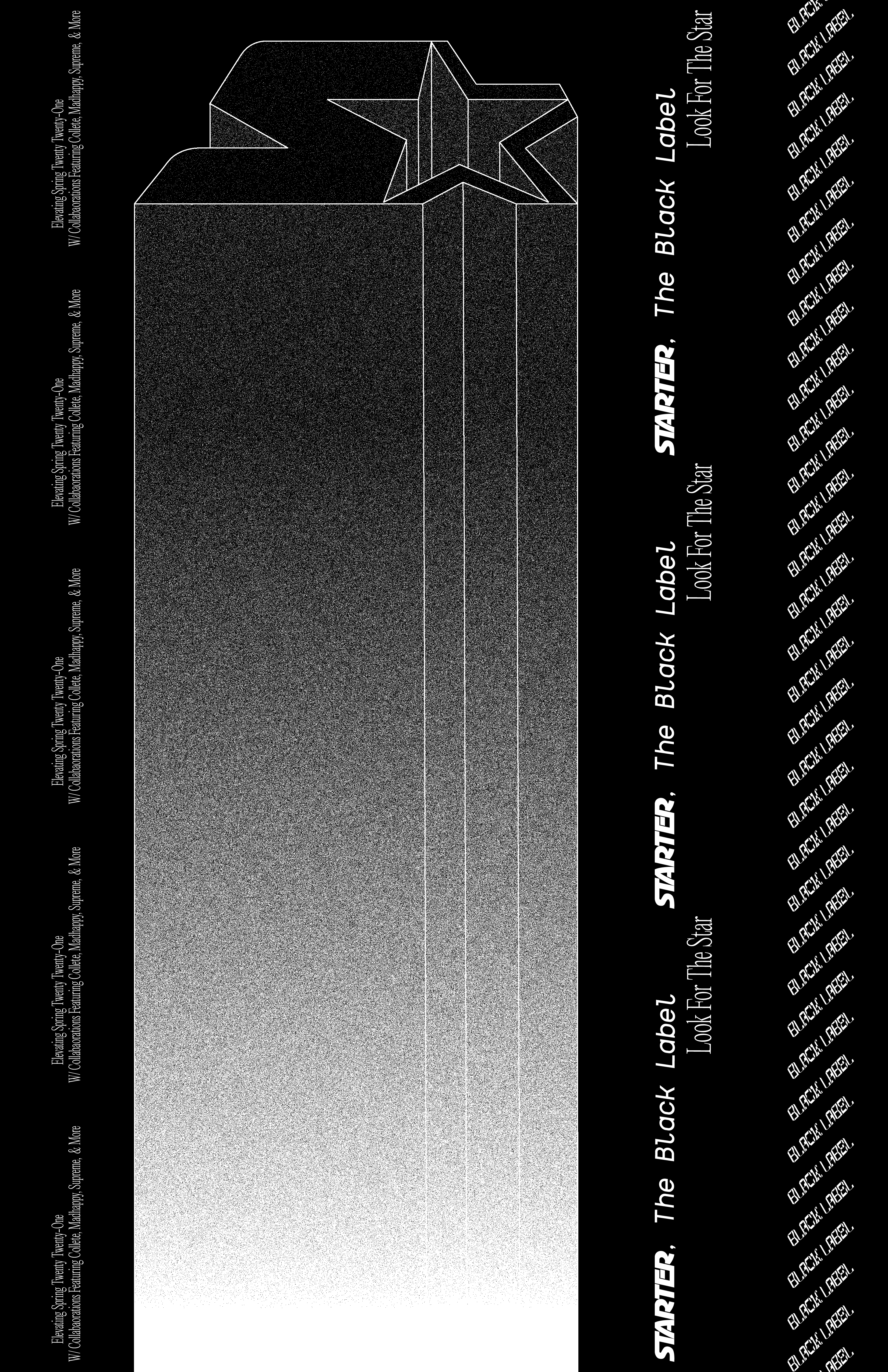
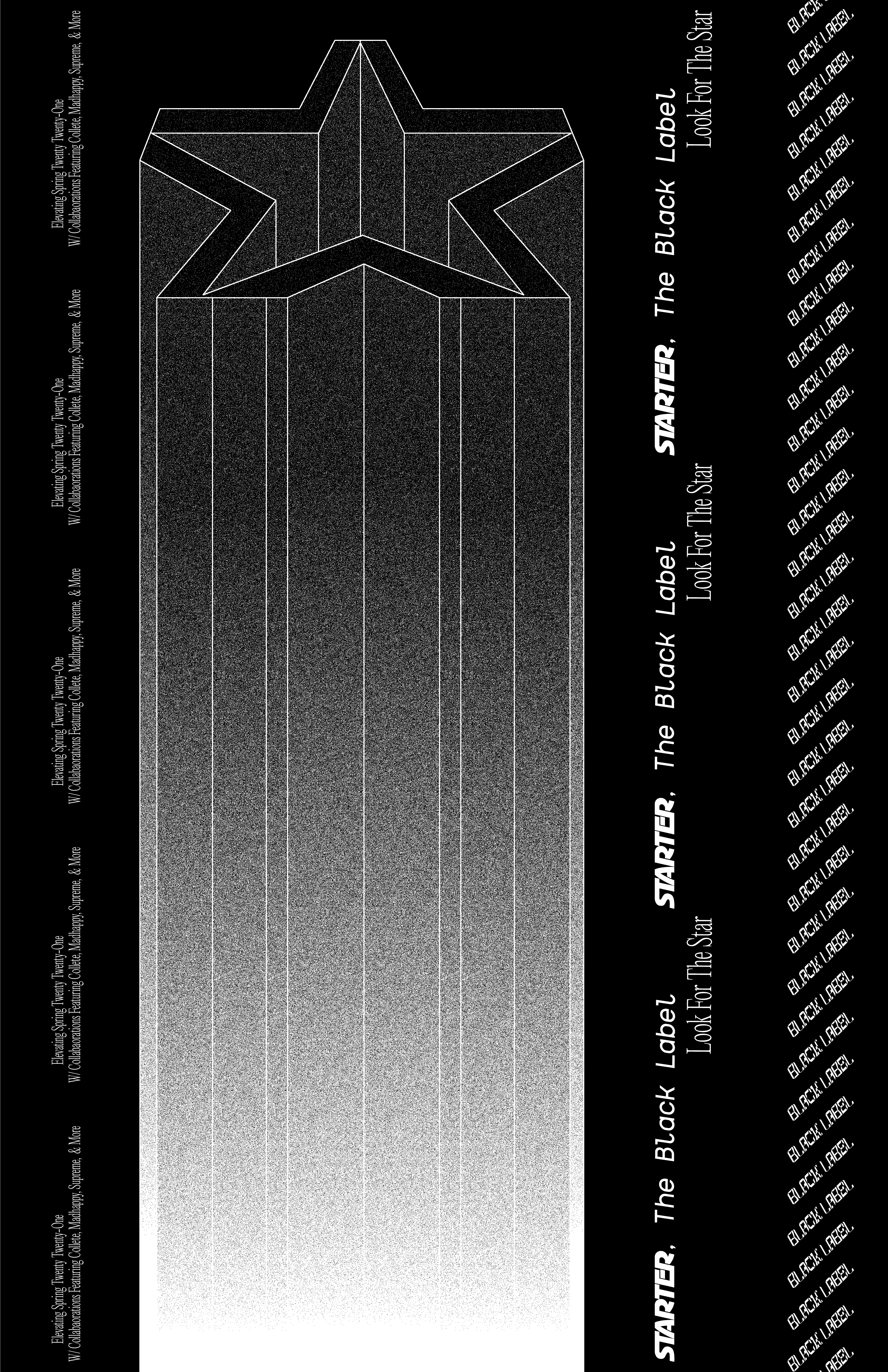
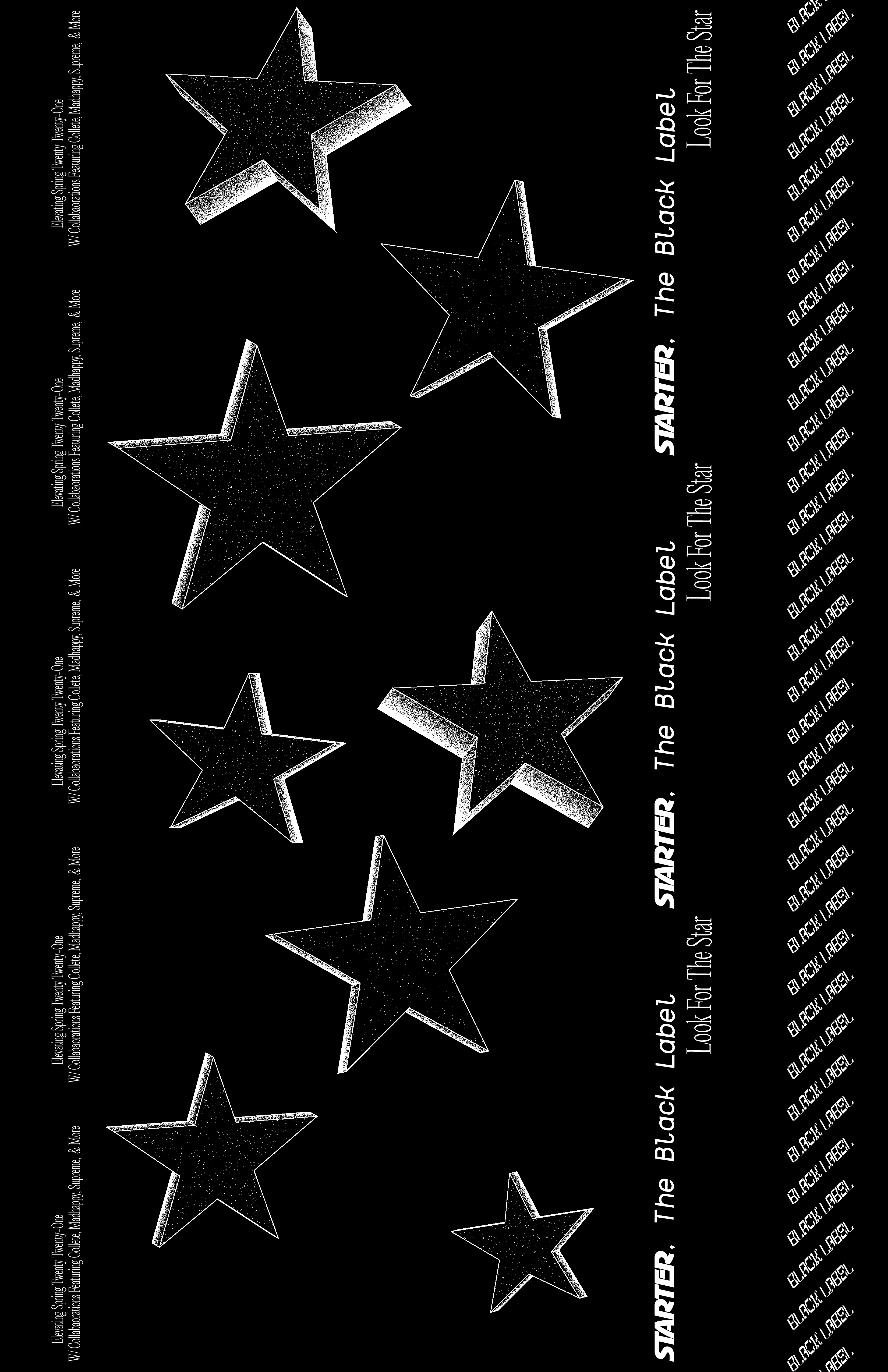
It’s bright and it’s flashy but it’s controlled and it’s simple. To put it short, it’s elevated.
The goal of this direction is to trigger brand awareness and respect for Starter among the streetwear kids and the art students who will push Starter back to where it needs to be. With this camapign, we’re reclaiming the star motif, making it pop, and bringing it into the future while maintaining a tone that differentiates our brand from all of the gimicky streetwear brands who are here for two years and then gone.
The black and white plus the chrome and the elevated 3D type plus the noise gradient lets you know that our roots are in the Nineties and with nostalgia for that time period being at a 30 year high this is perfect direction for restablishing and elevating the brand.


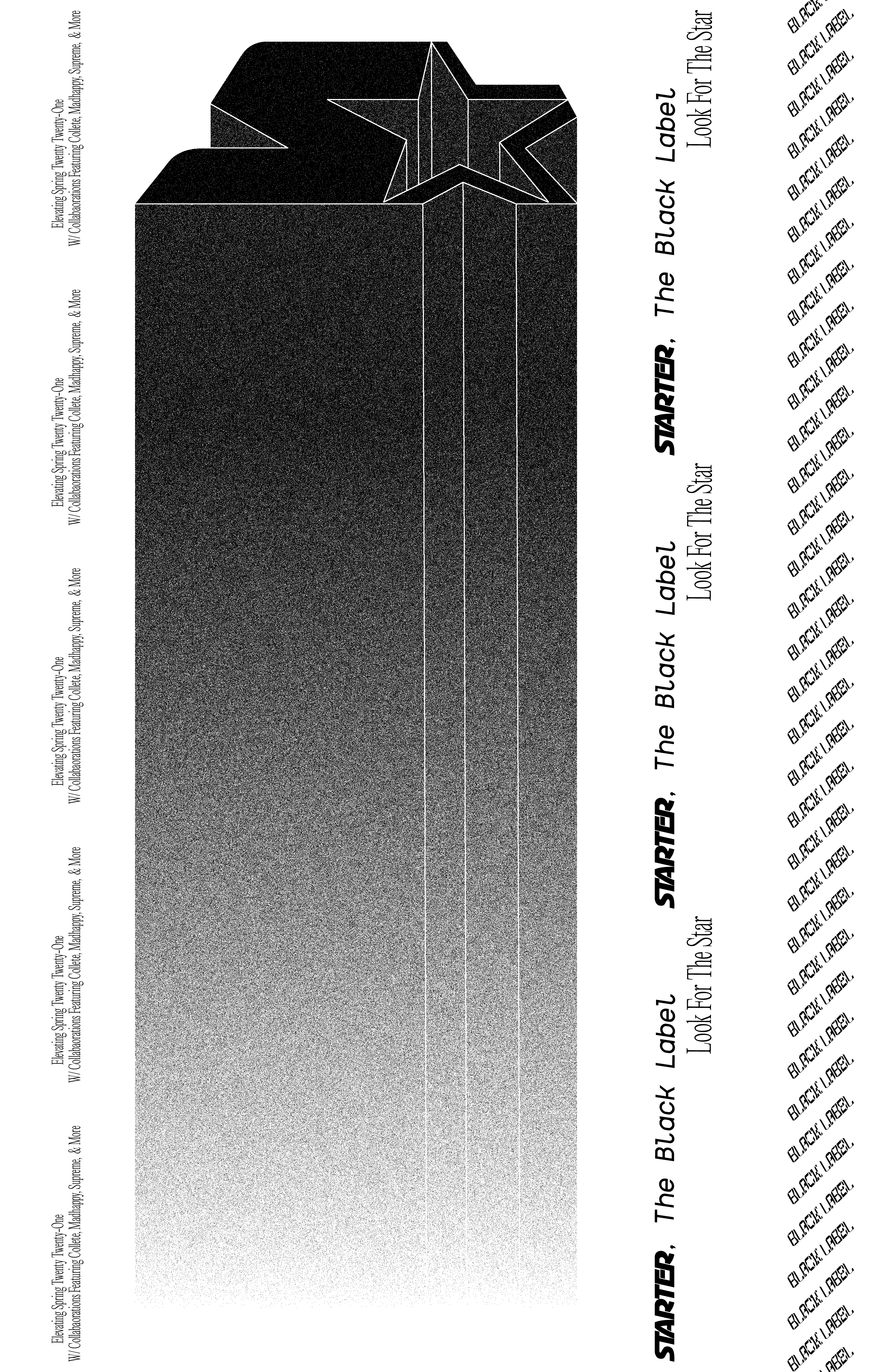
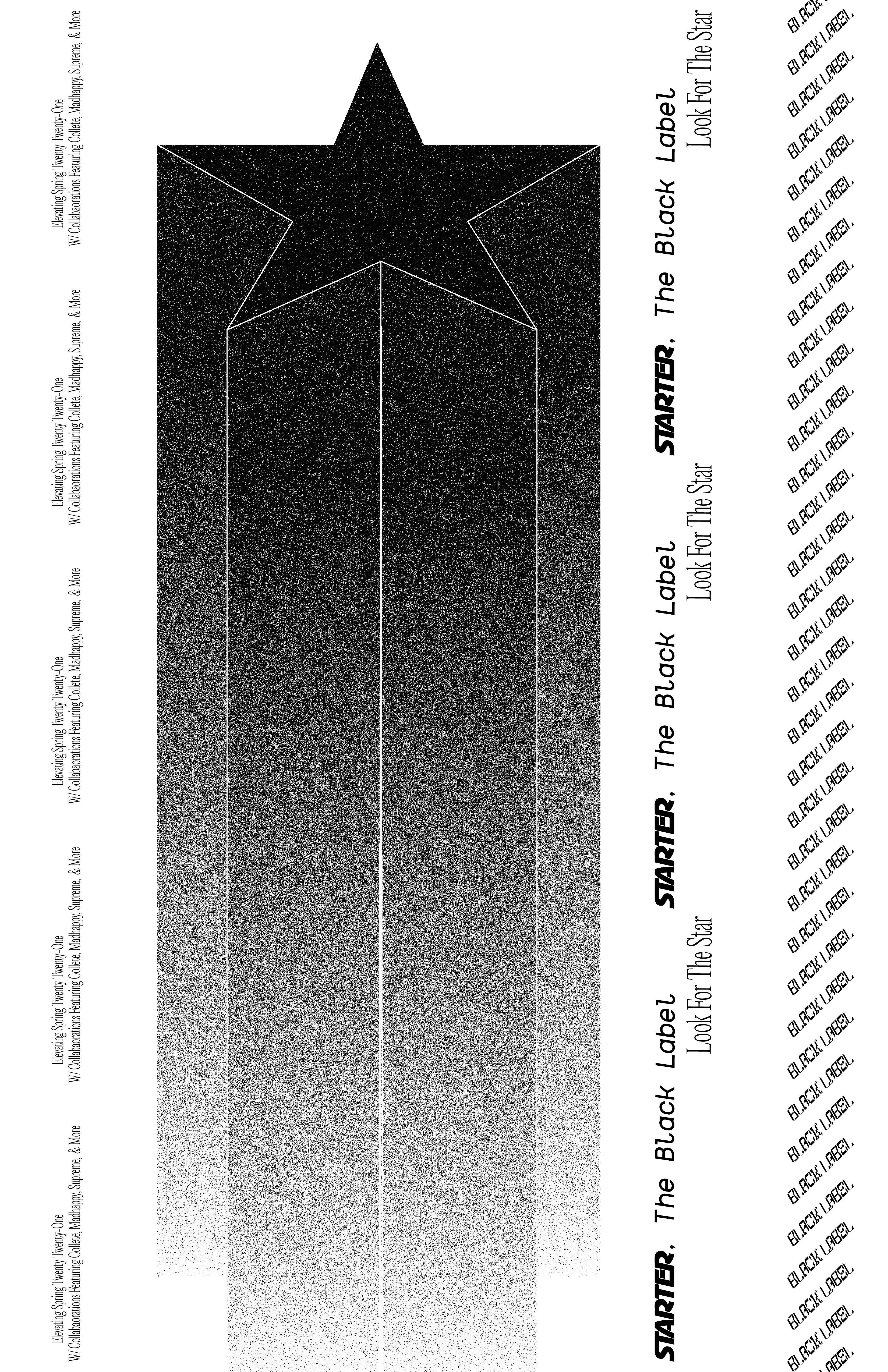
Pictured Above: Tabloids, Letter Posters, and Web Banners.

Pictured Below: Supporting Print Pieces For
Wildpostings
Wildpostings


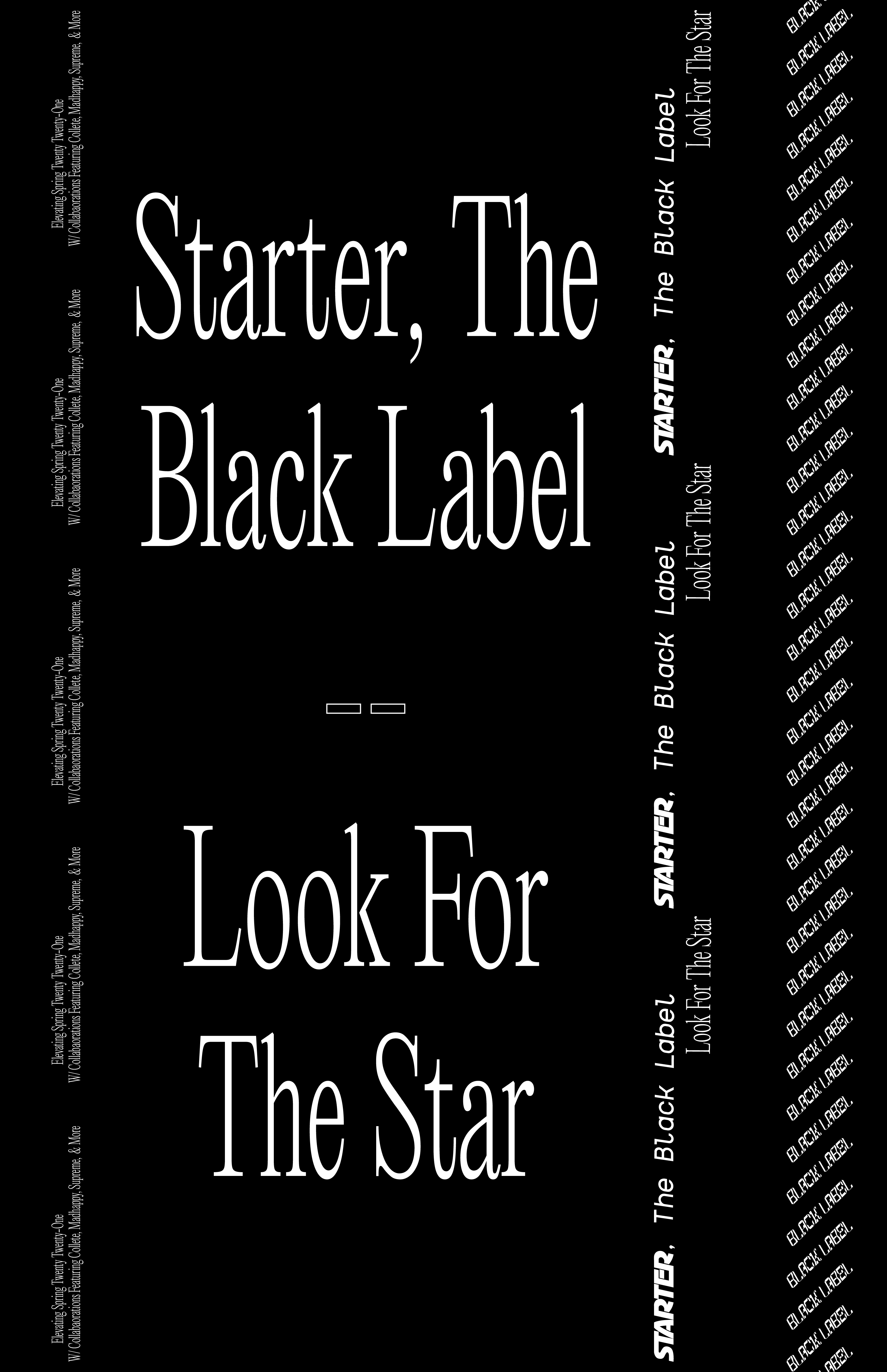


Mock-Ups


ART - DIR. 2
In Art Direction 2, our layouts become more and more colorful. They’re, letter sized, meant for placement in sports magazines and skating editorials. They’re not meant to be as fashionable as the previous direction.
We see the chrome type treatment take center stage. Next, we’re introduced to the Startooth pattern which is memorable and can be used in a variety of contexts, all of which fuel brand recognition. Finally, a simplified, siloutted, logo outline futhers brand recognition while our black label pattern lets you know that this aspect of the brand is really something special.


WEB
The webpage is very simple, it hosts the brand’s history (socials linked), the lookbook for the current season, and stores where our products will be available. For the brighter, ascendant mode, one fashion film plays in the background while an ad from the brand’s past plays as a color-overlay which is available via hover. Elevated mode, more simple and better aligned with the first art direction, has the stationary elevated Starter logo treatment taking up much of the foreground while the second version of the fashion film plays in the background.
![Mode 1 - Ascendant]()
![Mode 2 - Elevated]()

