Projects
Once you tap a link the selected page
will appear below this list.
Once you tap a link the selected page
will appear below this list.
Local Host Daily
Film/Installation
2023
Goodfellow Grooming [WIP]
Andrew Grant - Creative Strategy / Social Strategy
Andrew Grant - Creative Strategy / Social Strategy
Print, Web, Digital, Spark AR
[Fall 2020]
[Fall 2020]
Write-Up
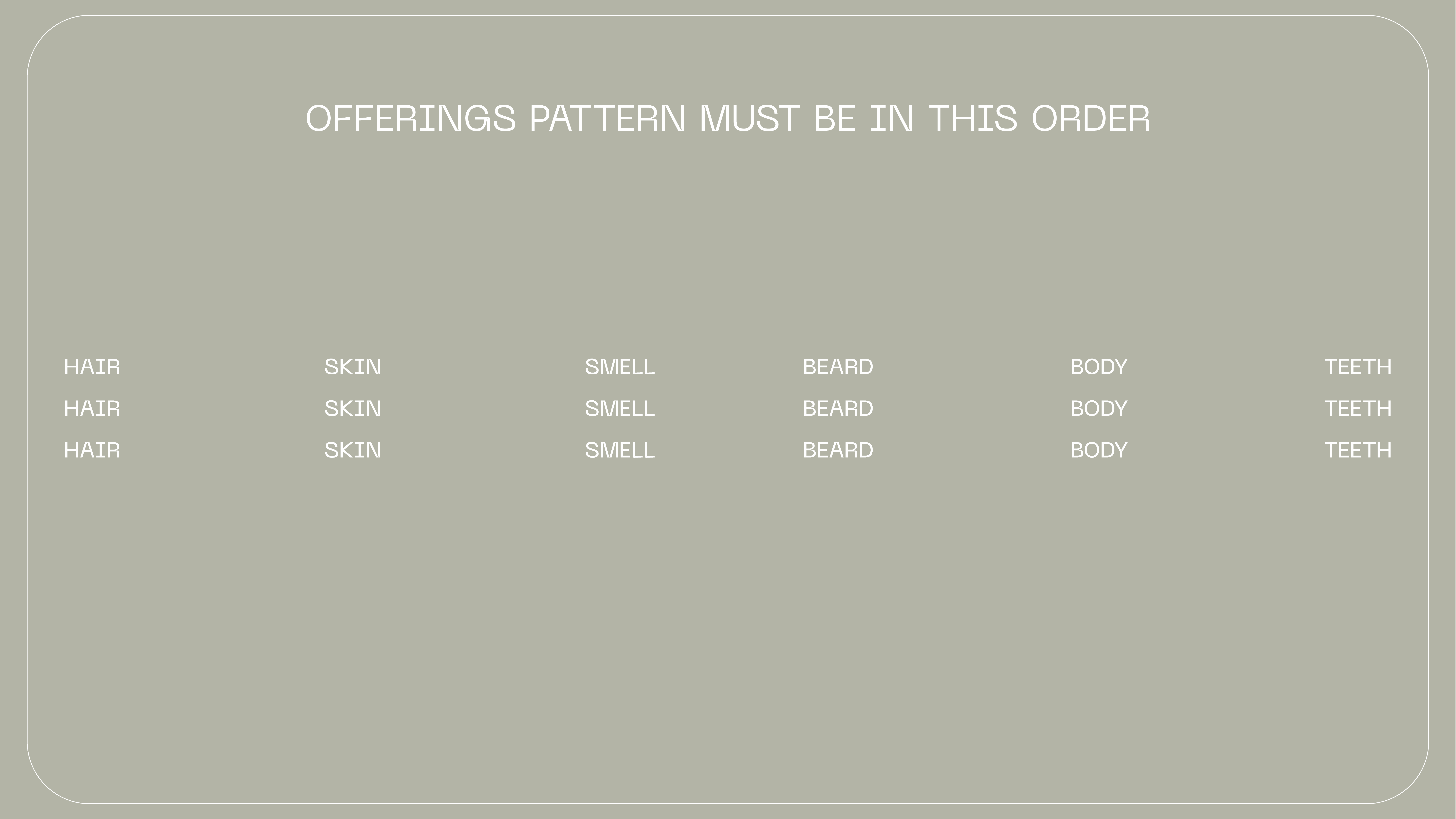
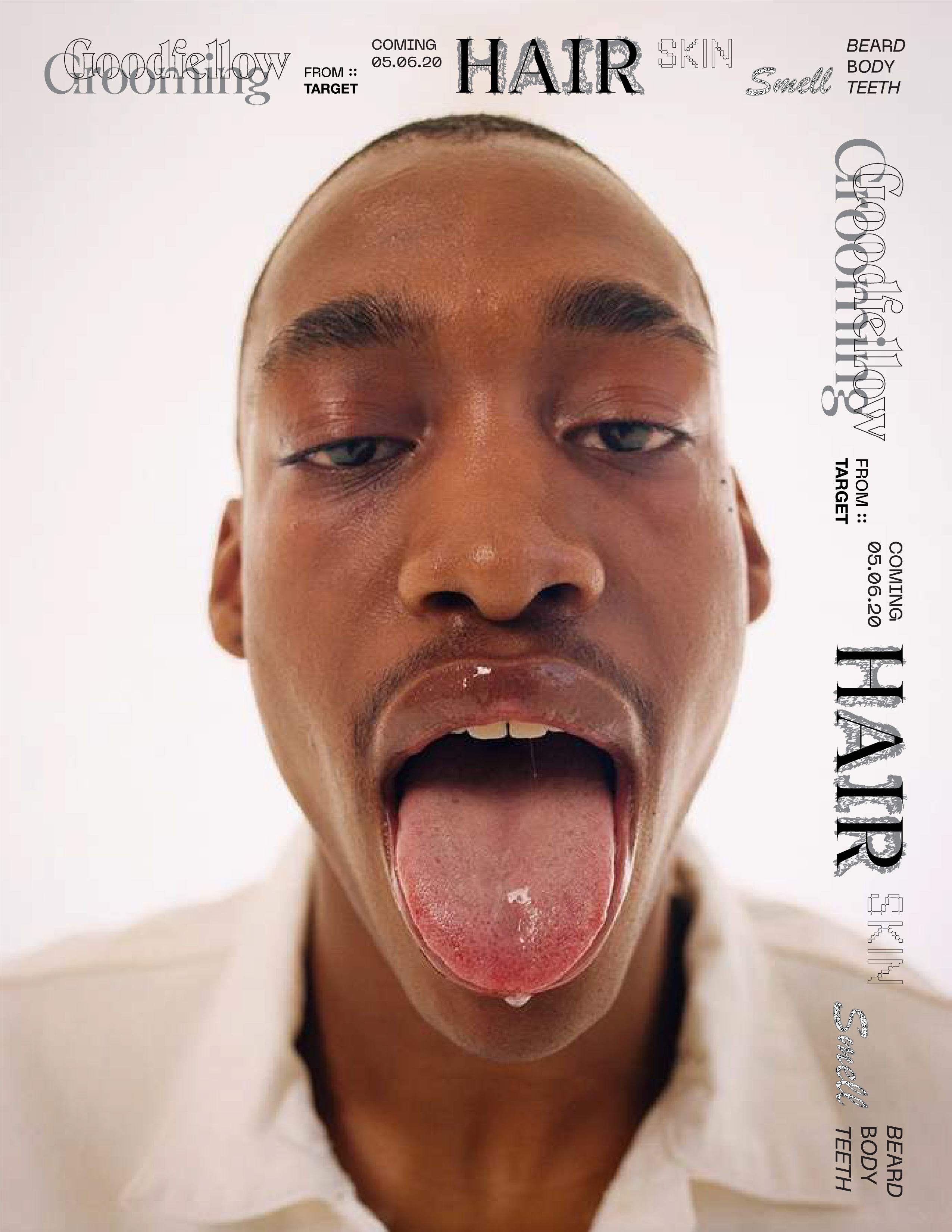
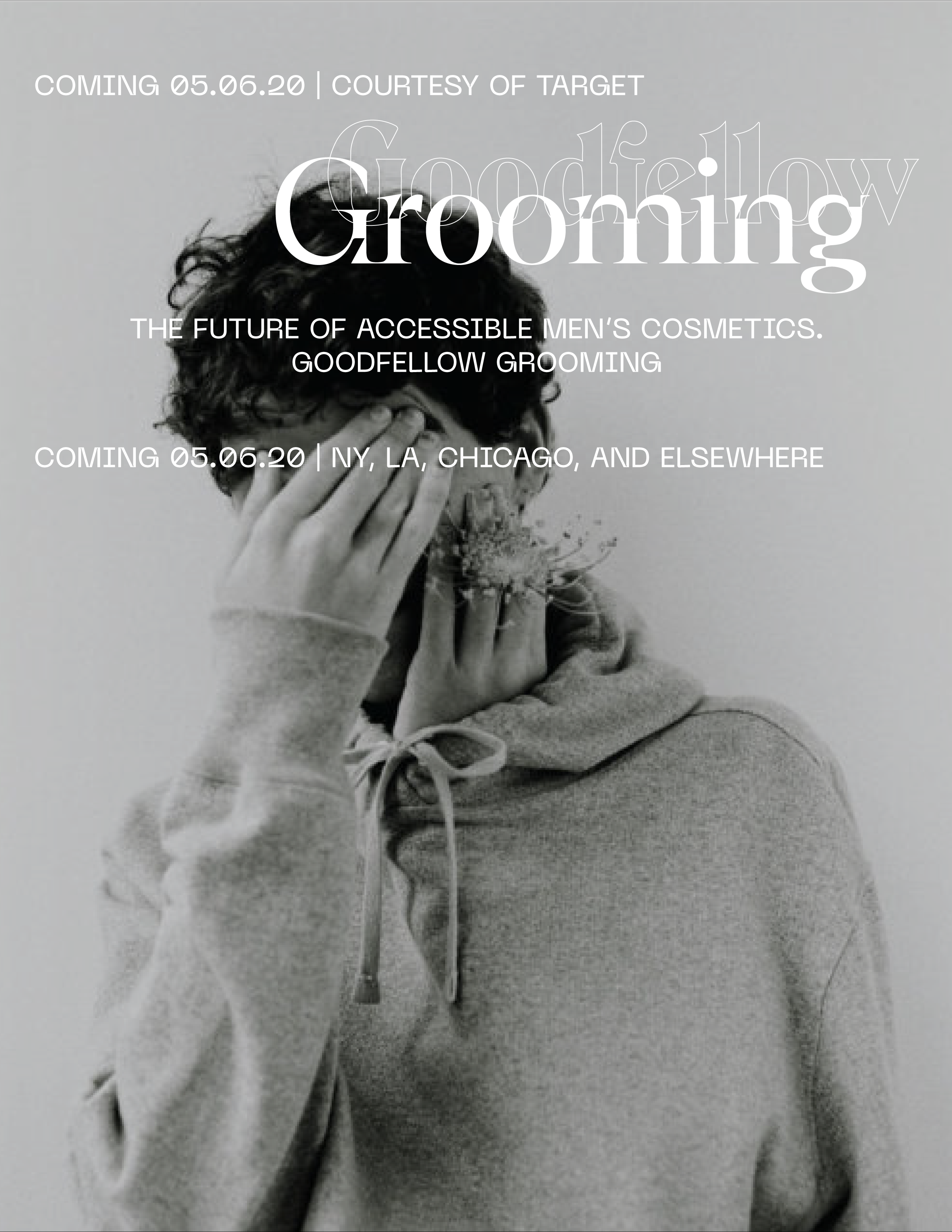
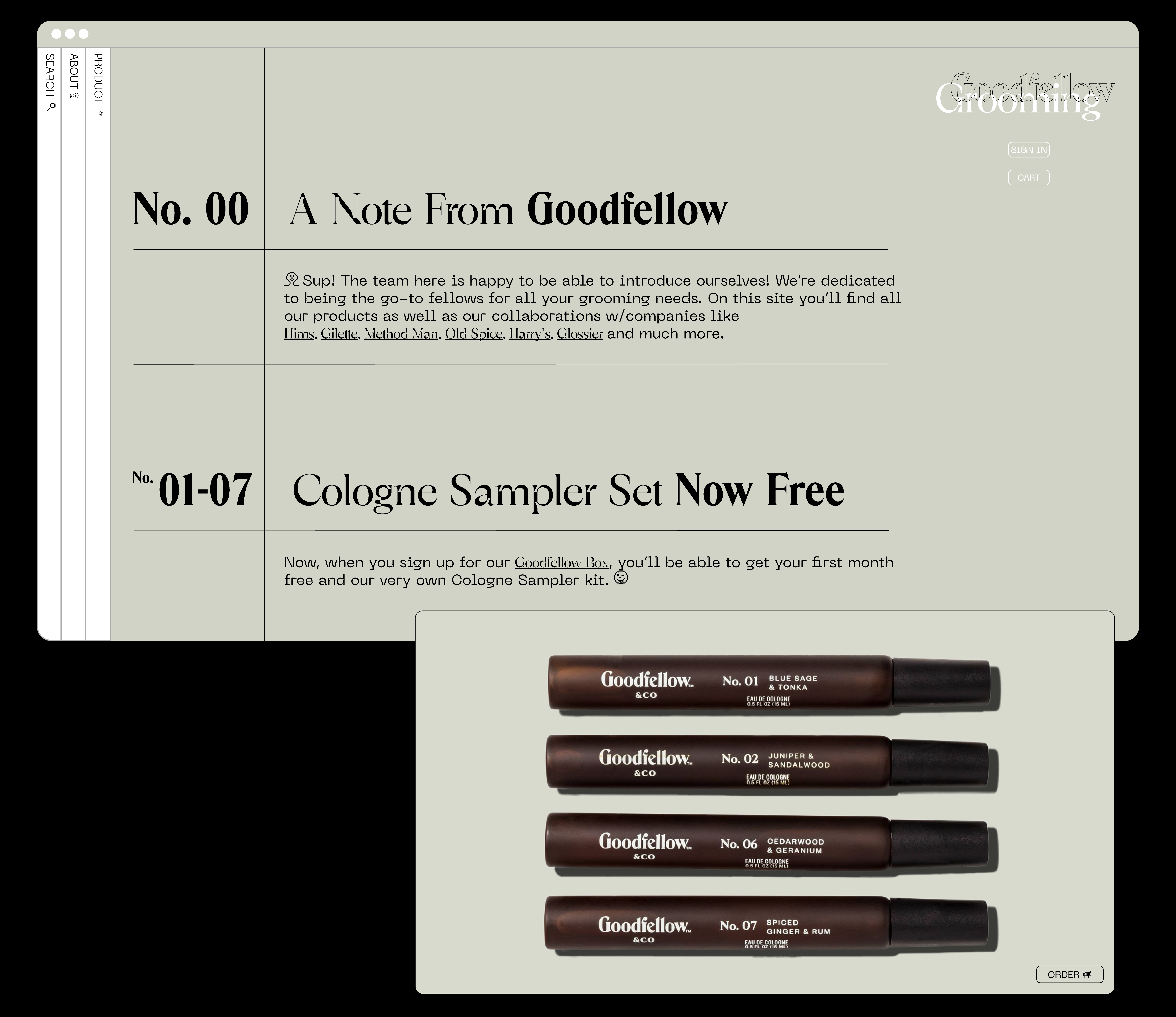
With Goodfellow Grooming, we saw an opportunity for Target to move an impressive subsidiary brand into a space that’s virtually empty: affordable, contemporary, men’s grooming. Our goal here was to create an identity for this Goodfellow, spin-off, brand which would target Gen-Z. In time, we hope that this brand would be able to open brick-and-mortar locations but for now, in today’s current e-commerce climate where smaller entities are able to release quality goods at cost-effective price points, Goodfellow Grooming would be most effective online.
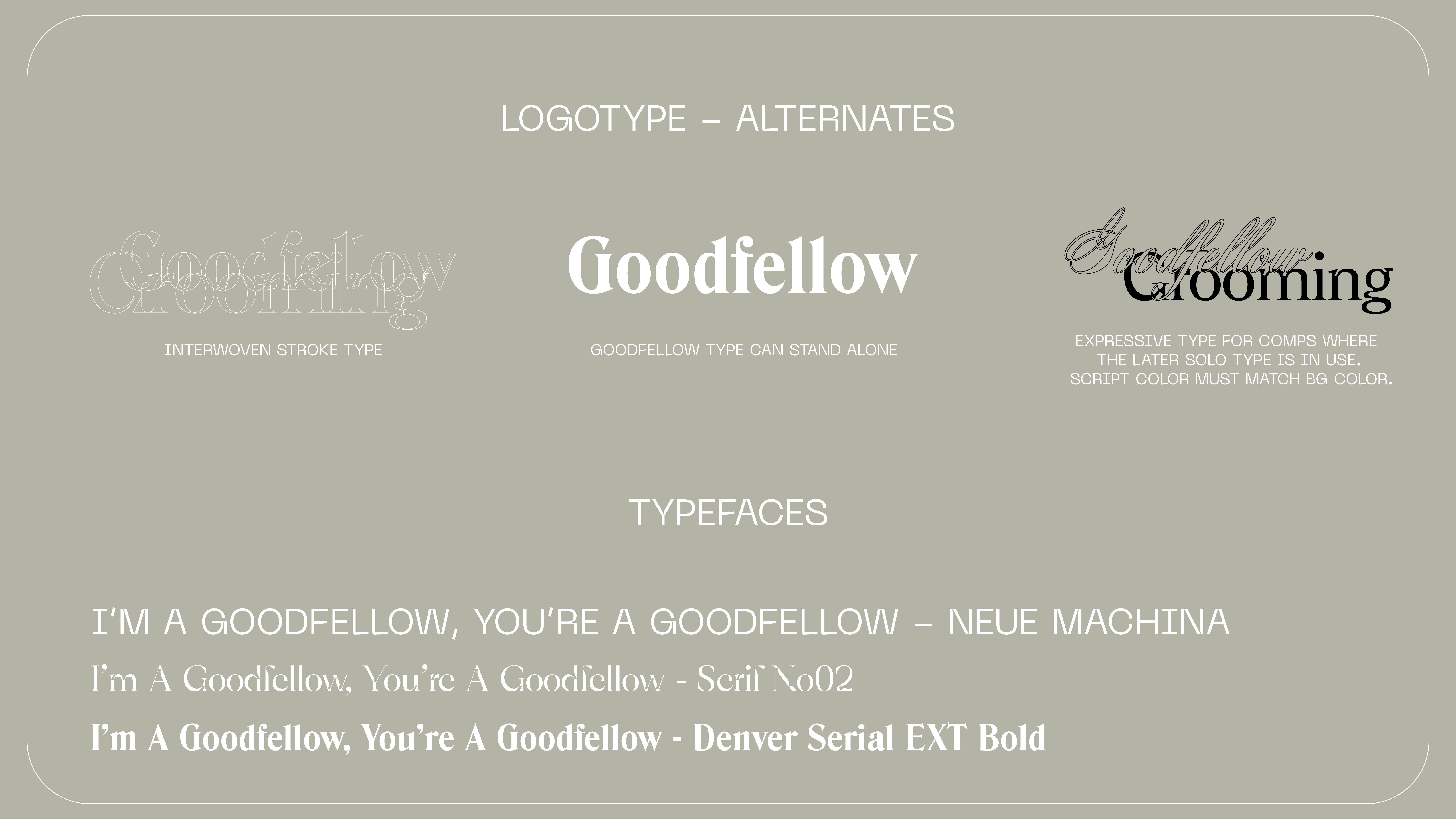
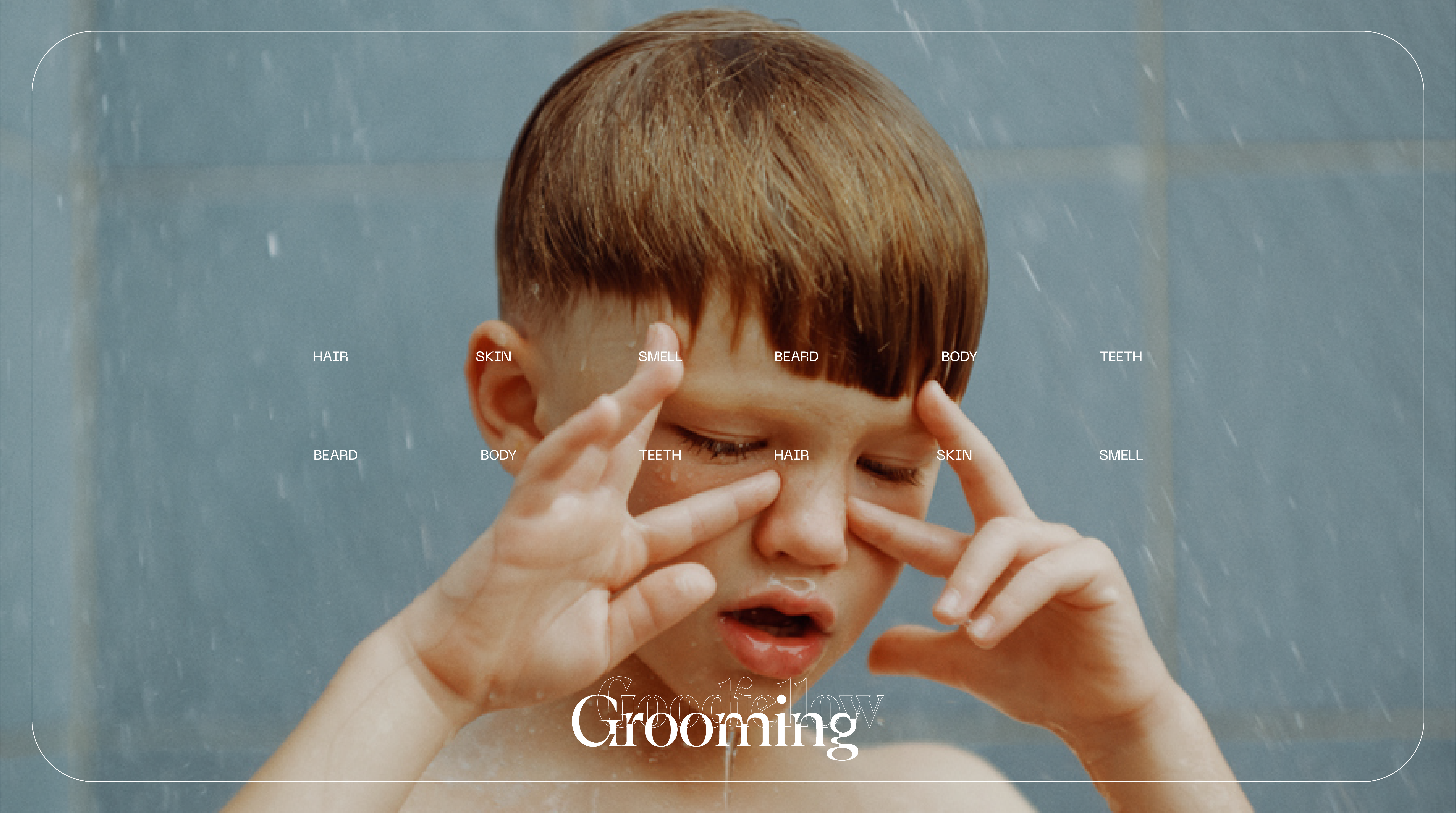
Creatively, we wanted a clean, relaxed style of photography and design that hinged itself on simplicity. We wanted to put the guys of Gen-Z into a different, more natural, light that showed the softer side of masculinity while shedding the drama, bravado, and hyper-masculinity typically found in this vertical. We wanted everything to feel timeless but also appealing to the kids of Gen-Z. The pairing of two serifs in the logo is goes to show the personality of this brand which can best be described as an off-kilter, modern classic.
Digital Banners







Video
Webpage


Notes

