Local Host Daily
24 Hour Film/Installation
2023
Buffy Design Project
Brand Extension [Summer 2020]
Mediums - Print/UI
Mediums - Print/UI
Write-Up
The Buffy branding, by Pentagram, is one of the most fun and exciting pieces of IP out there. For this project I just wanted to play with what they had already done while also adding a few new tricks here and there.
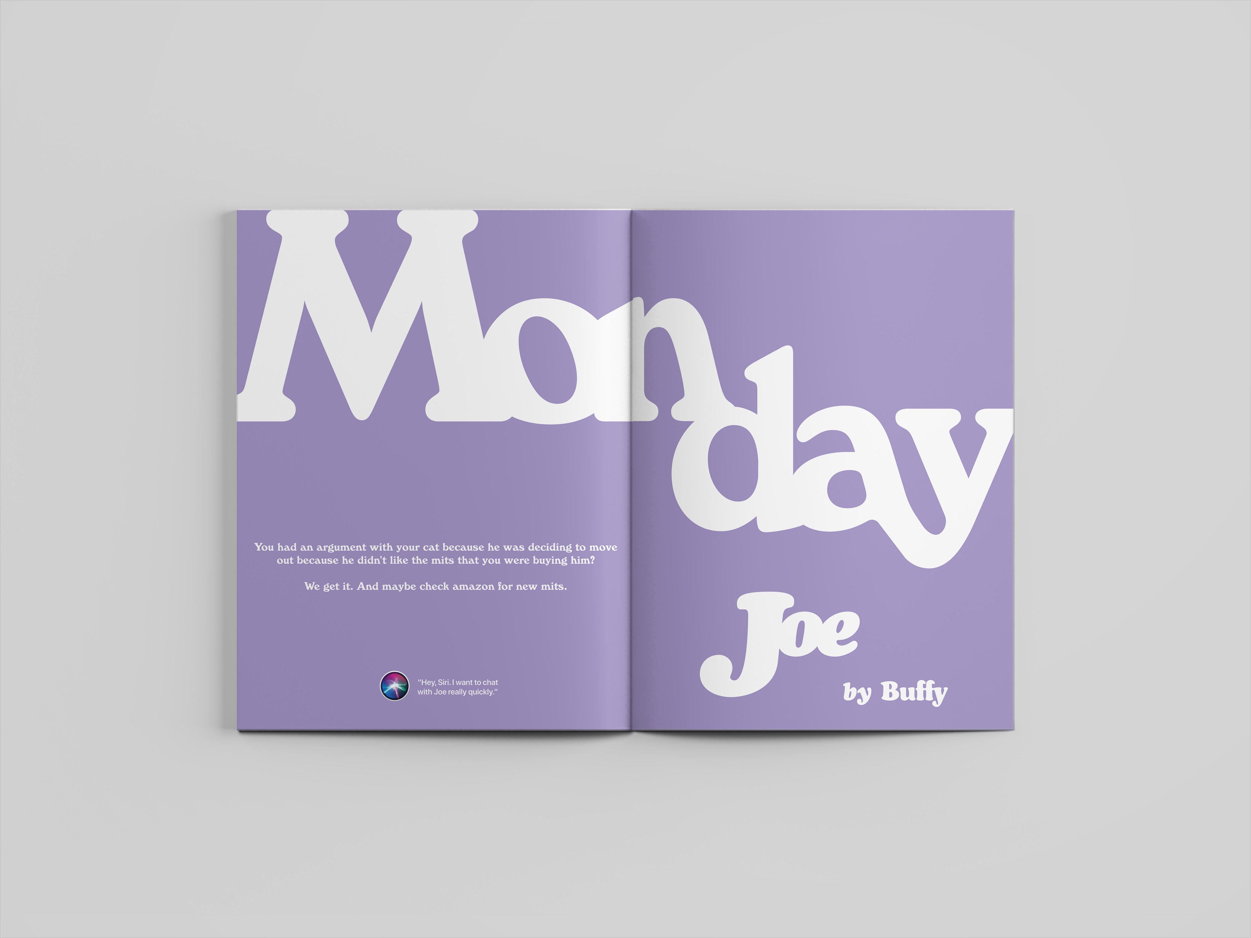
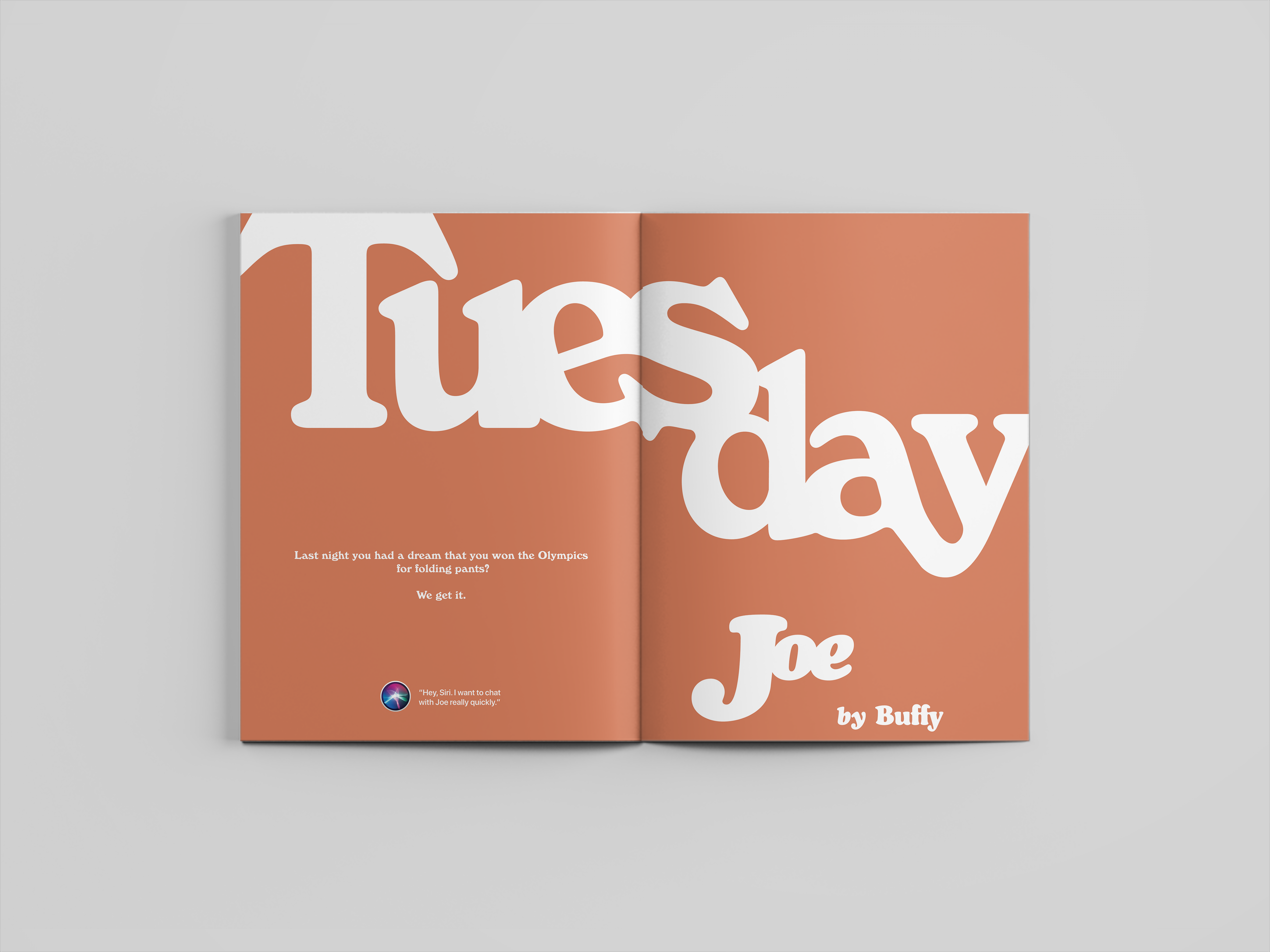
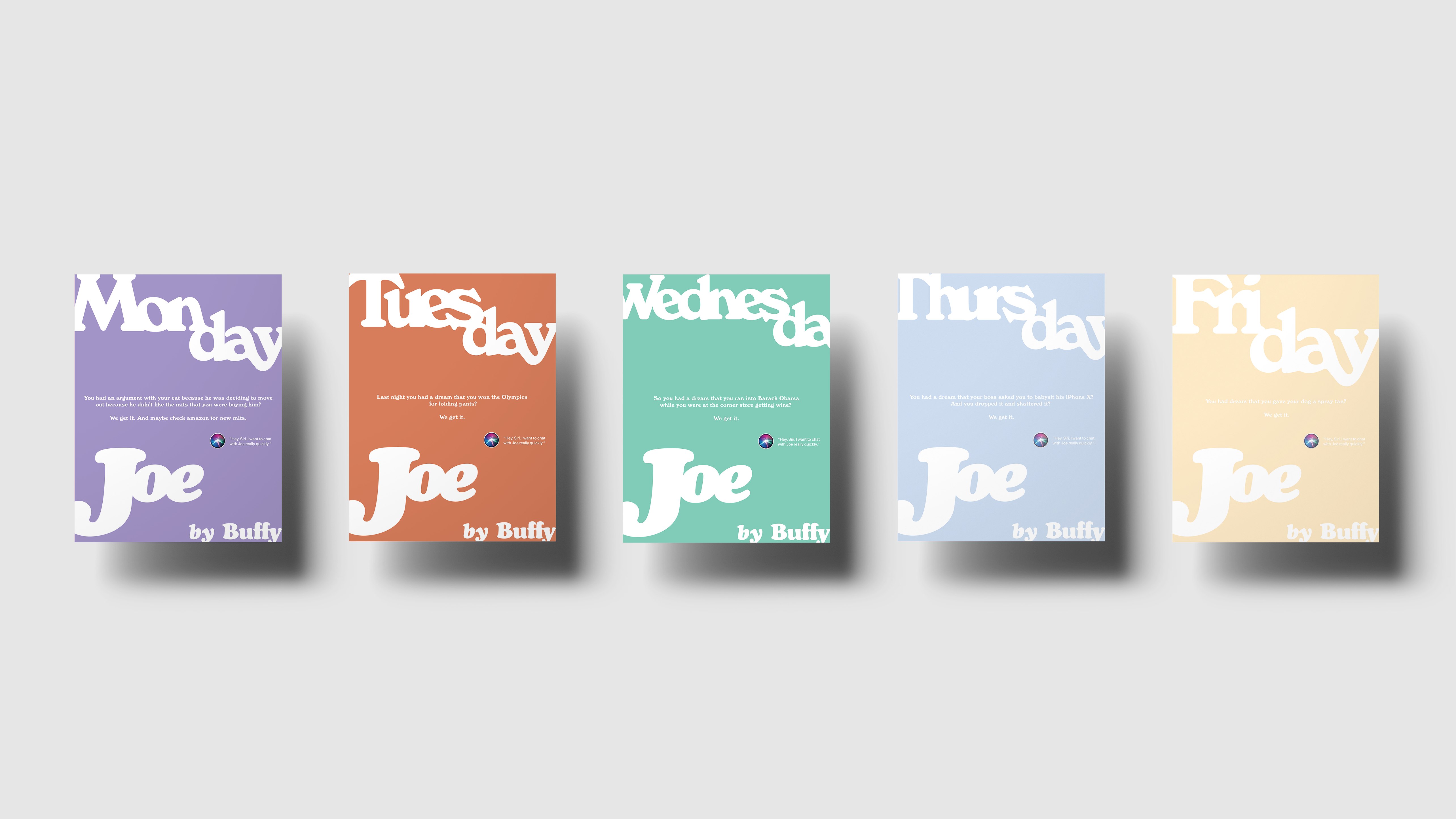
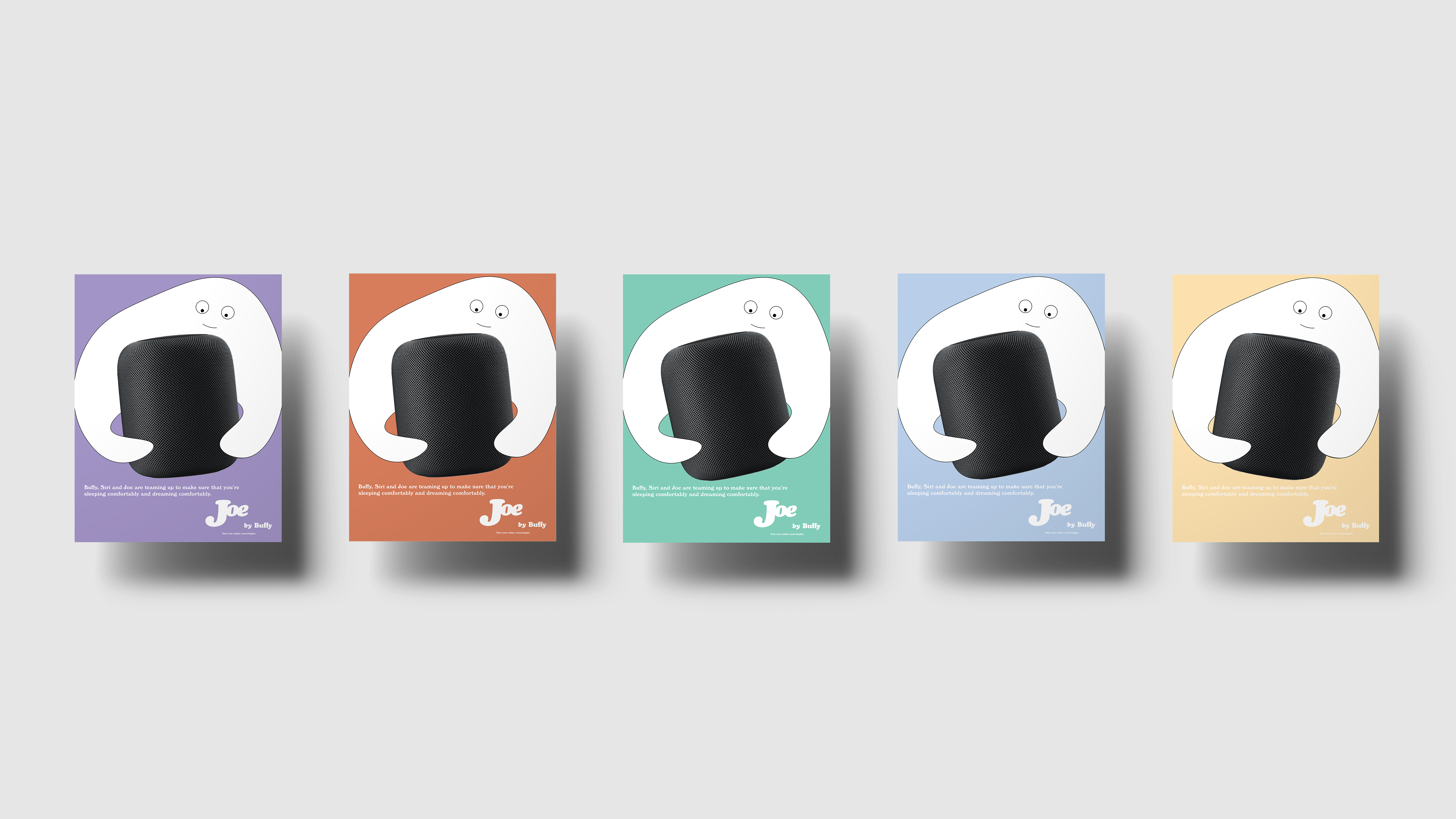
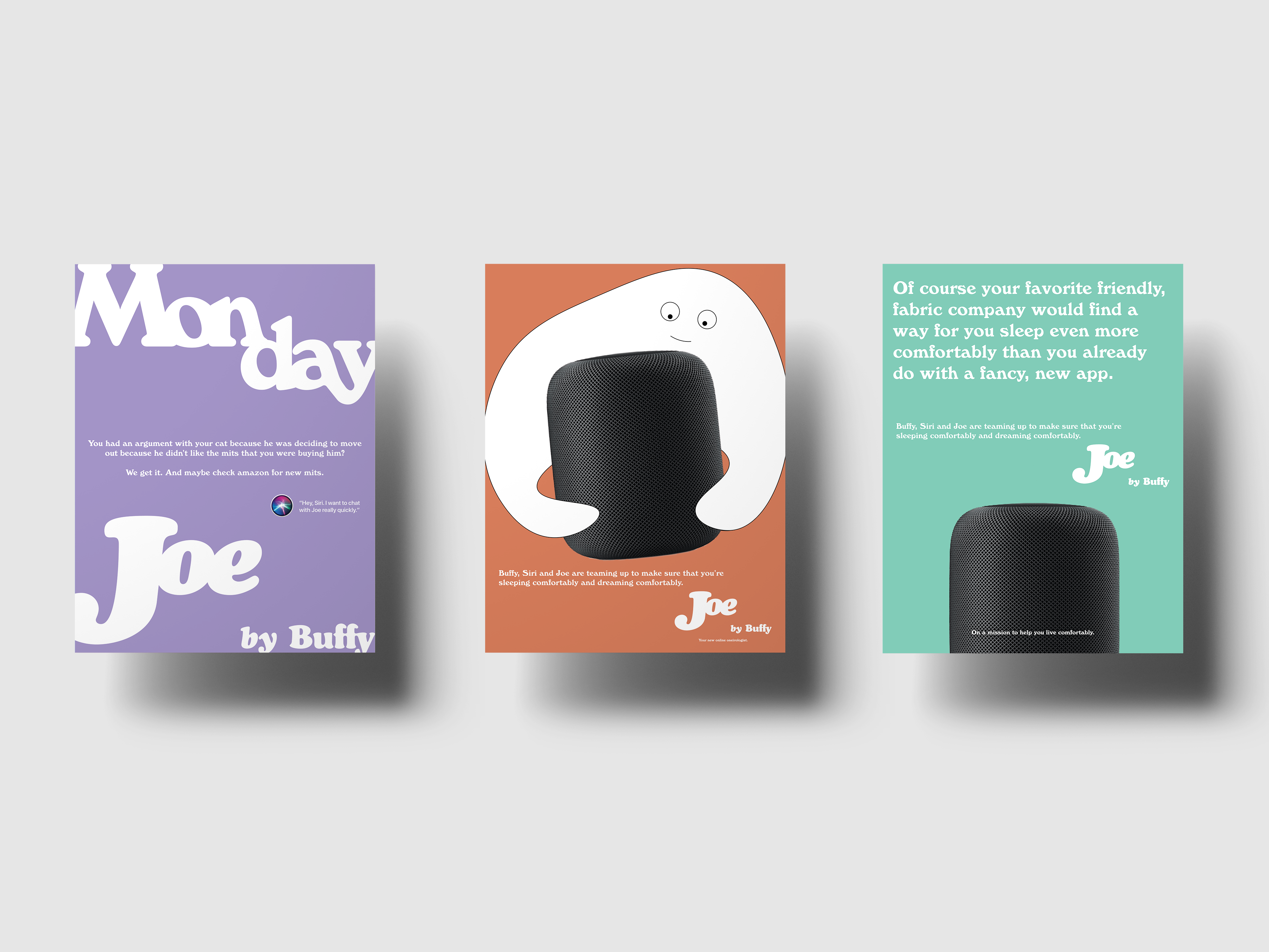
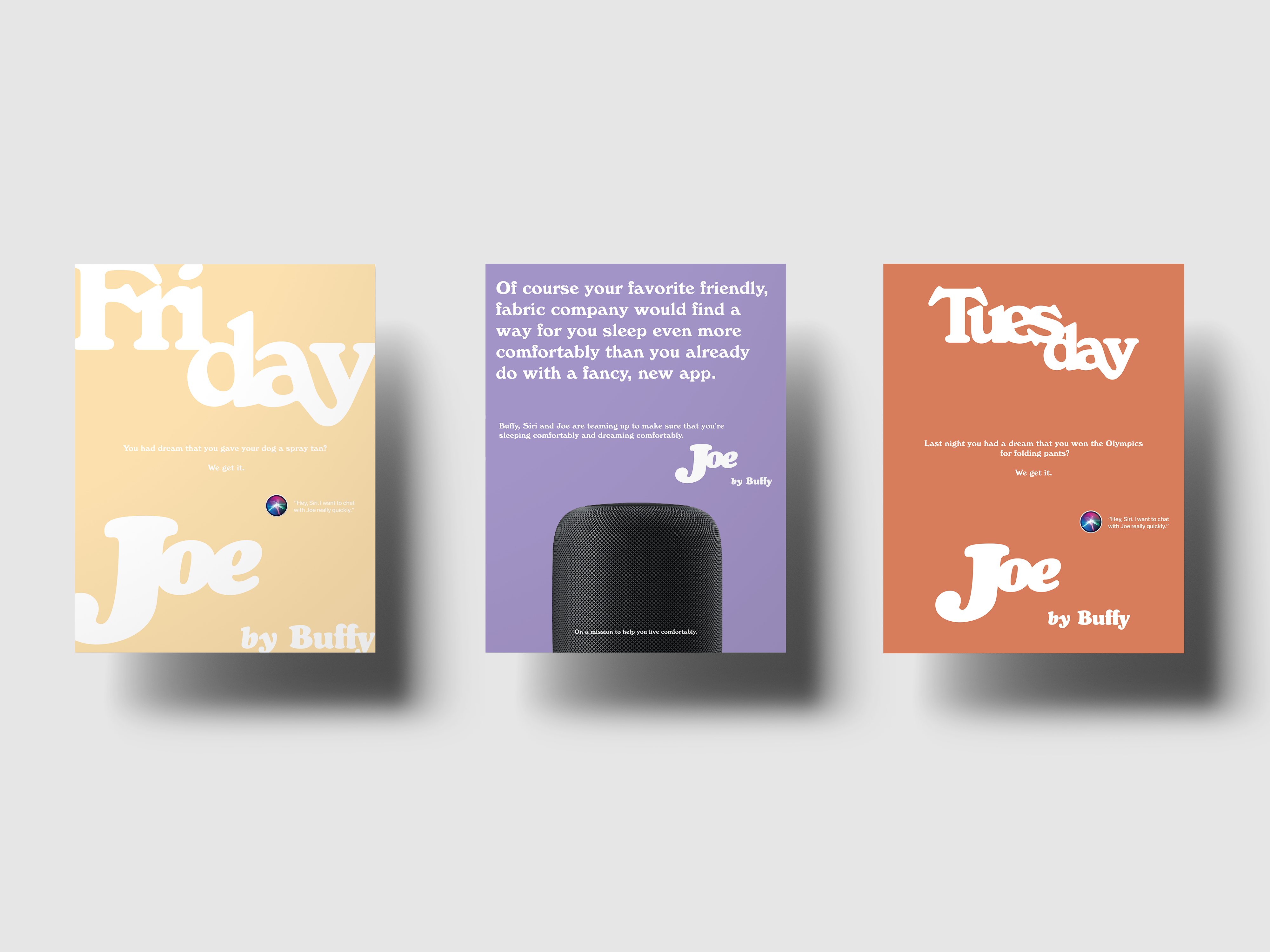
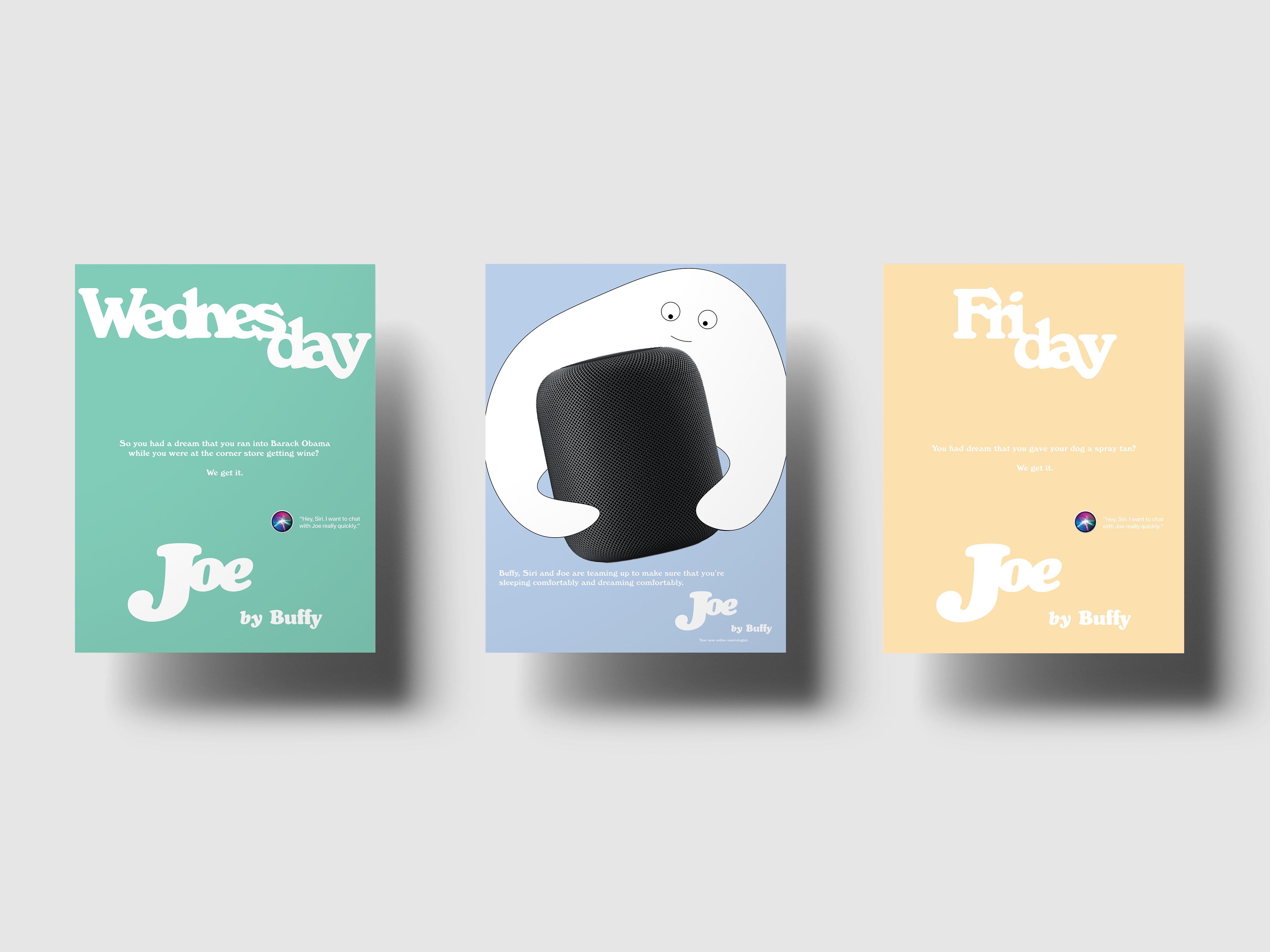
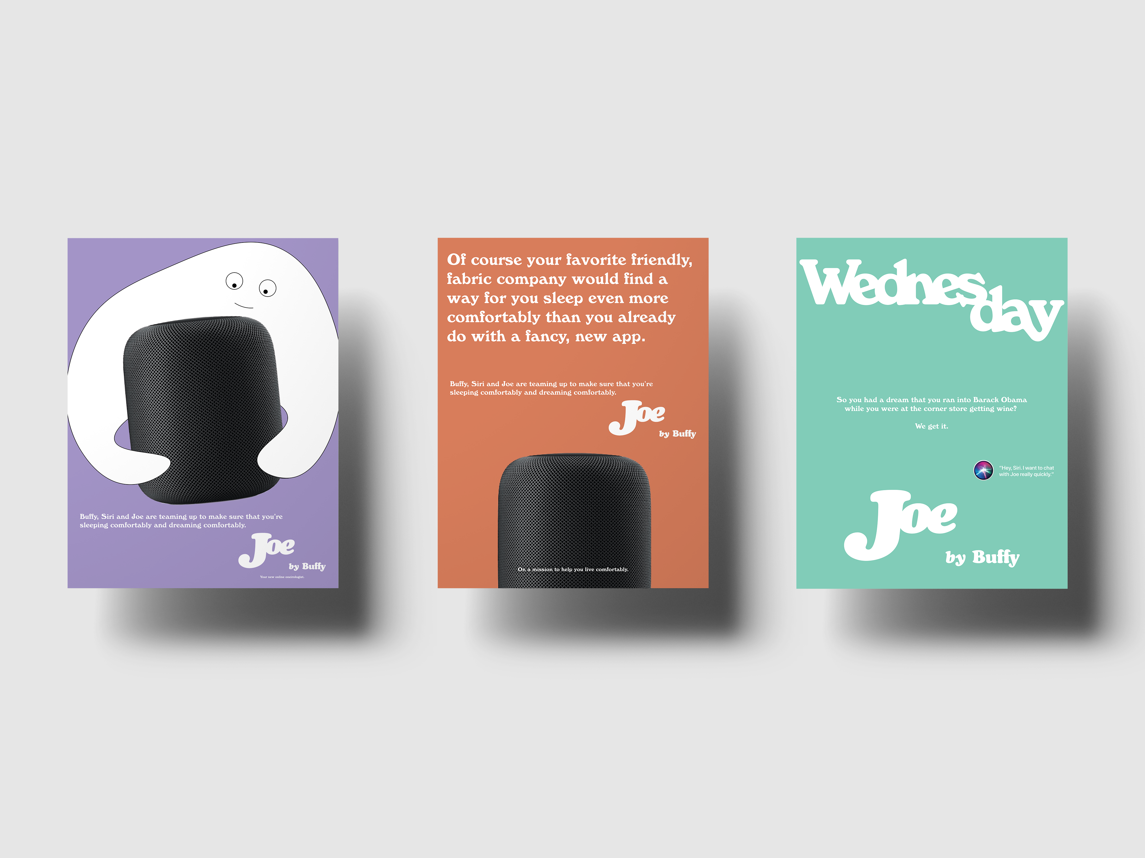
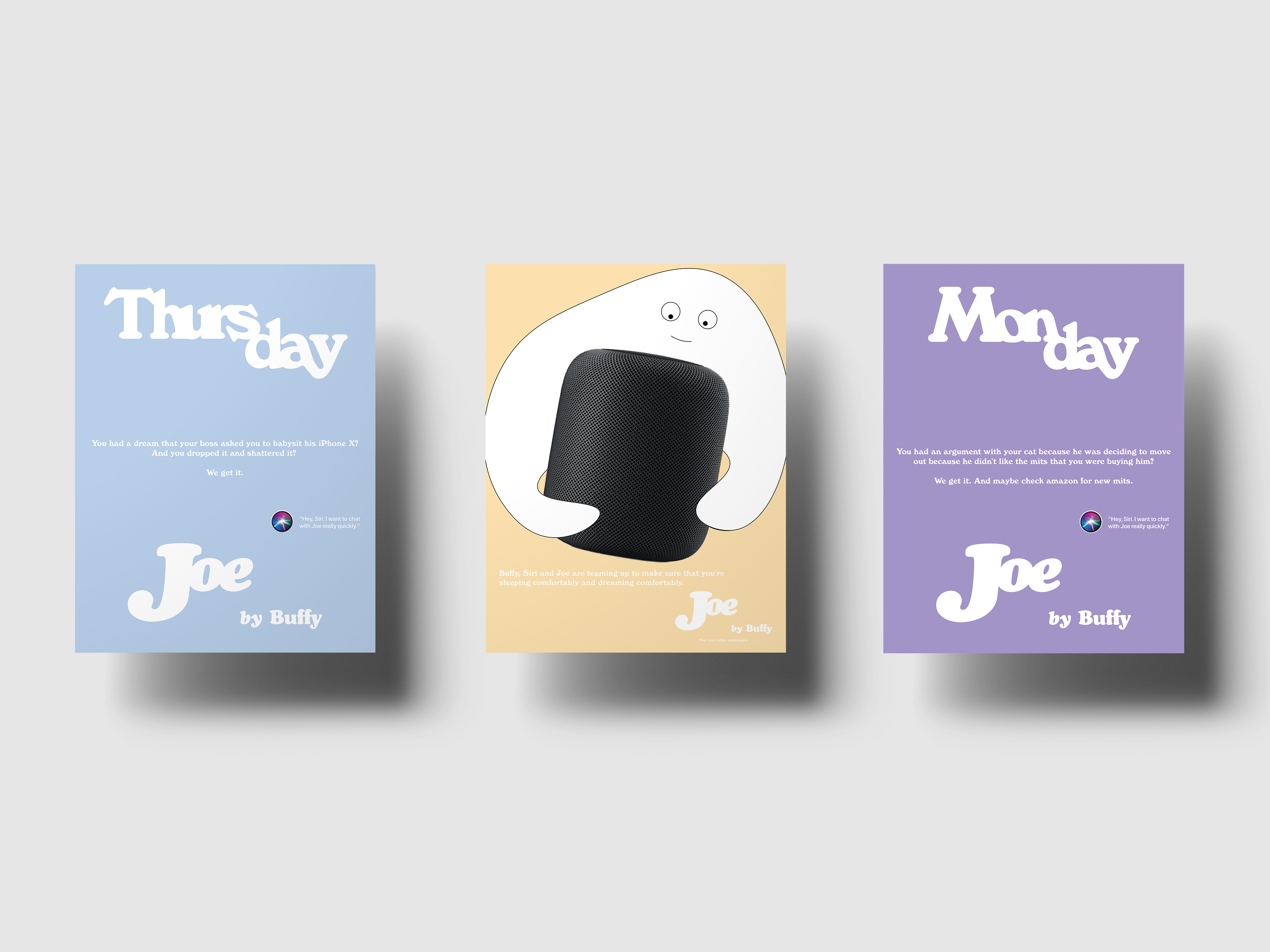
The idea behind the project is that your relationship with sleep should go beyond the sheets. What if Buffy became the first fabric company to make sure that people were comfortable in body and mind? To answer that question I mocked up a rough version of what an app for this brand extension could look like and did a few print ads.
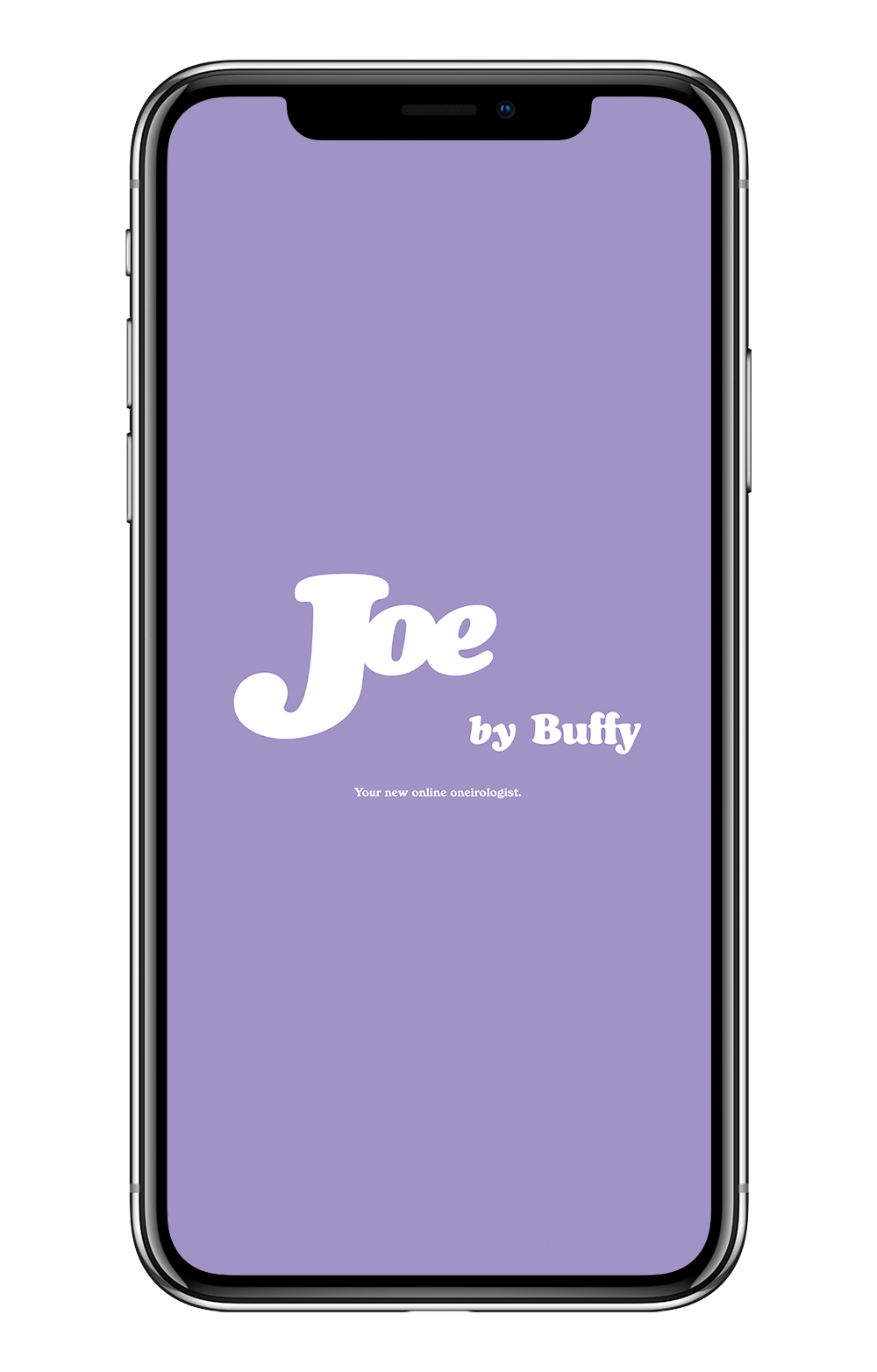
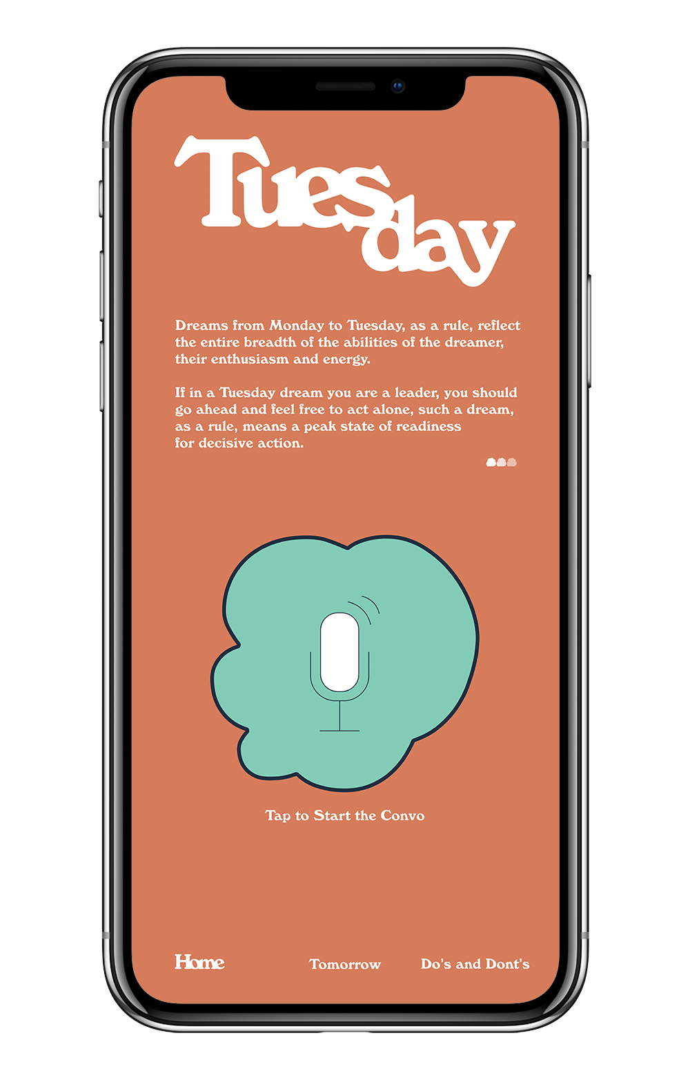
App Design
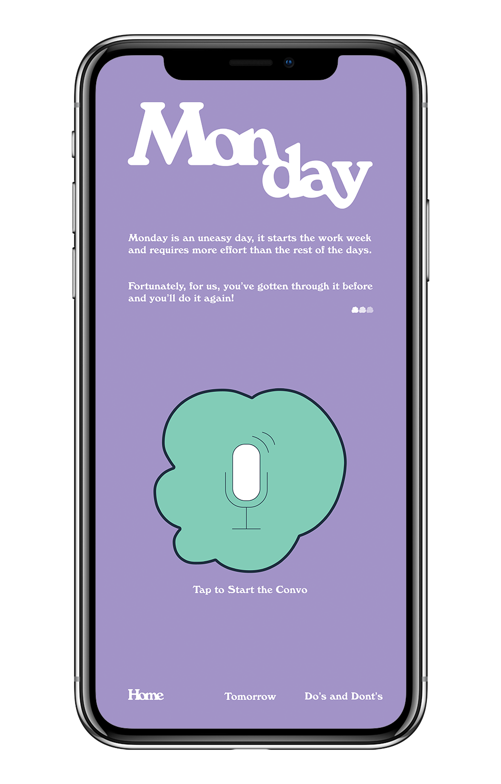
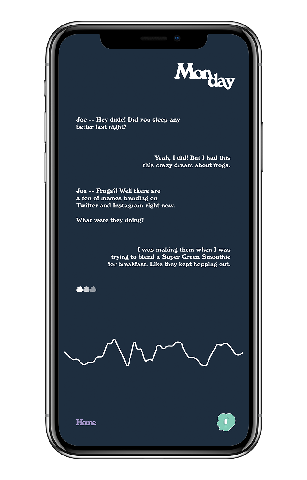
Here, I imagined an app revolving around a friendly conversational UI named Joe that people could talk to every morning when they woke up... like in the movie Her but without the all the relationship stuff. The UI would keep transcripts of the dreams, have access to dream interpretation databases, and through those two things, make connections in-order to talk users about their life experiences and give them answers to whatever they’re dreaming about.
The color of the UI would change every day and our advertising would be based around those colors and the general public’s shared experiences.
For the print, I wanted to play with the color palette by showing the a week in the life of a crazy dreamer while also bringing design from the app into the print so that people are accustomed to both.