Local Host Daily
24 Hour Film/Installation
2023
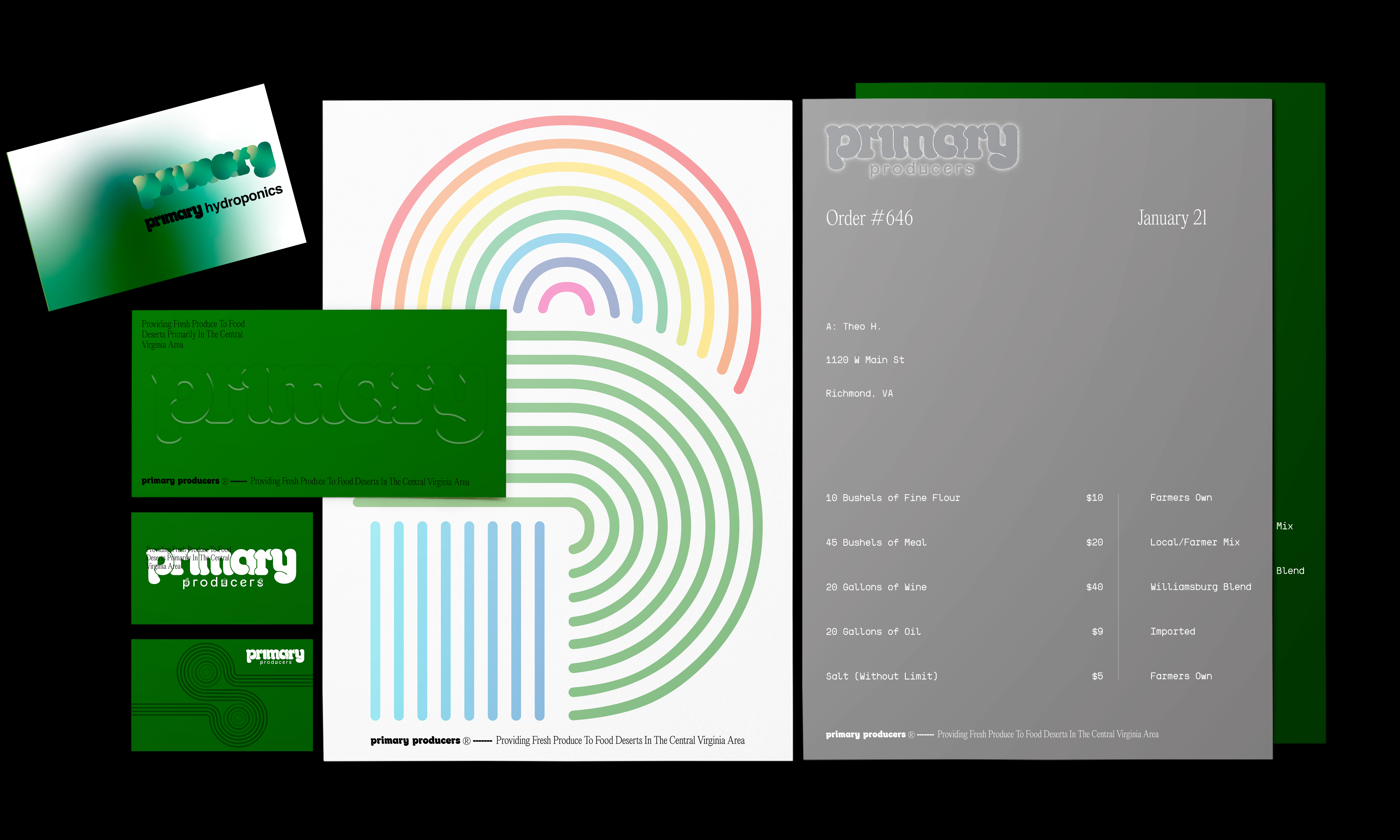
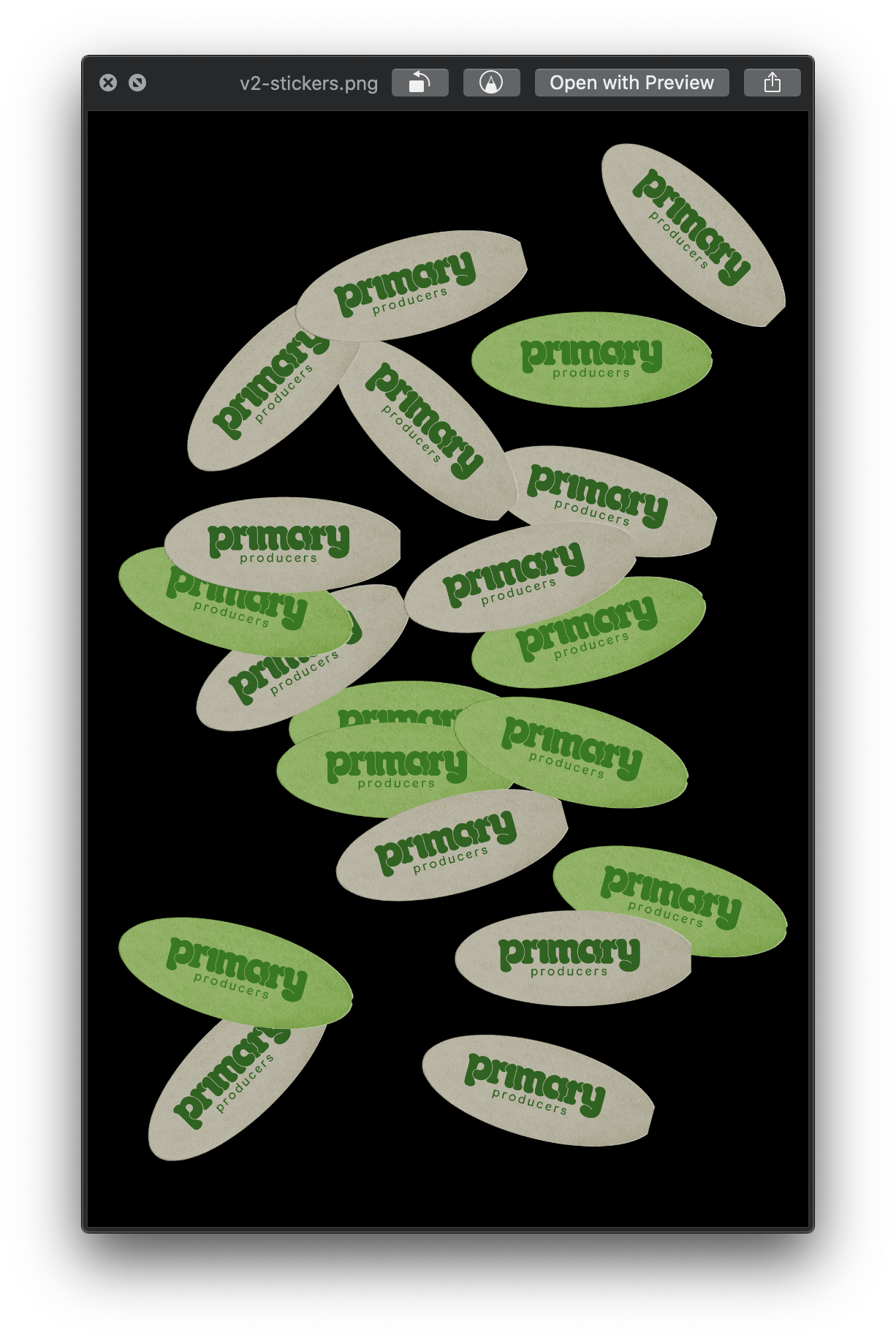
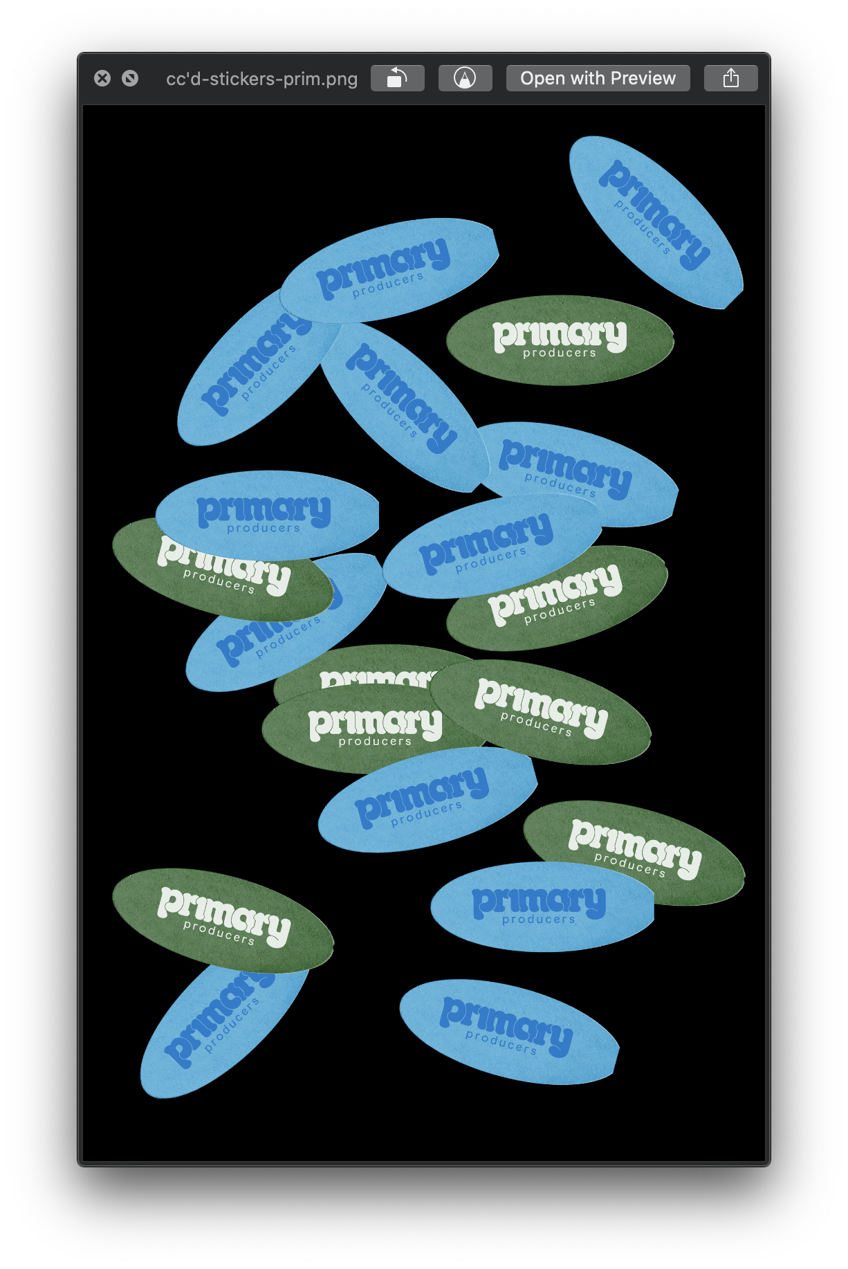
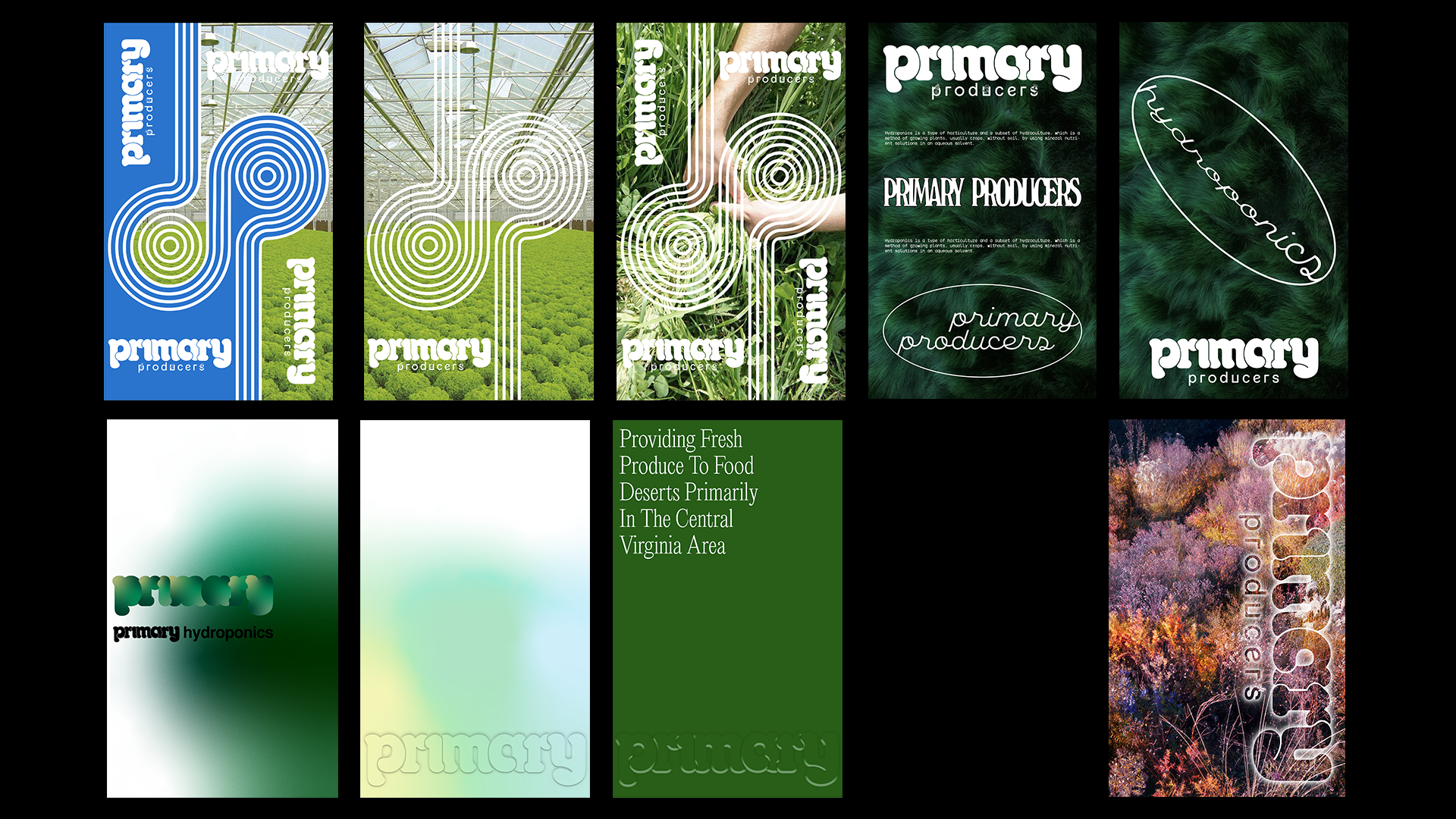
Primary Producers
Logo Design [Spring 2021]
Write-Up
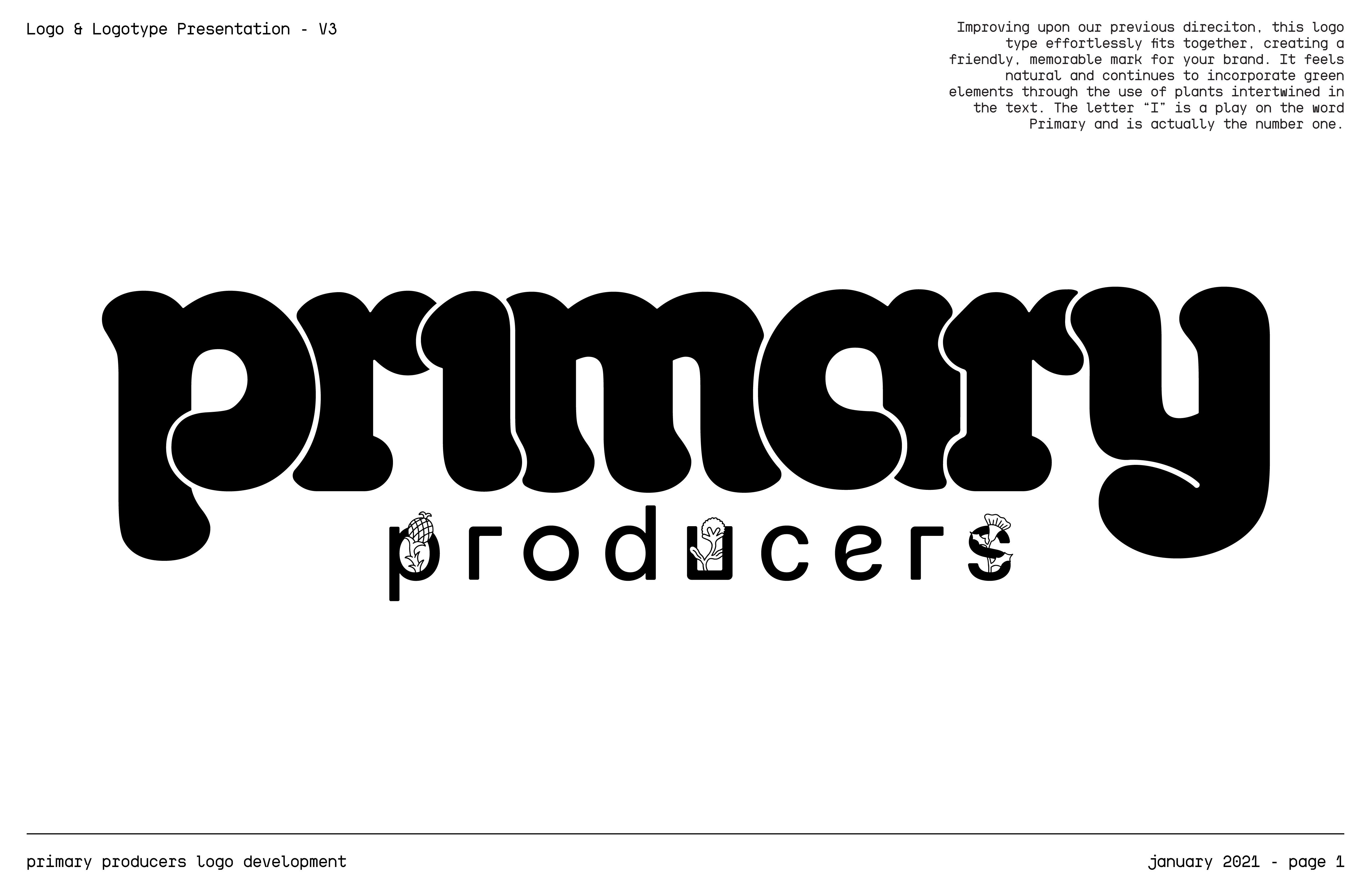
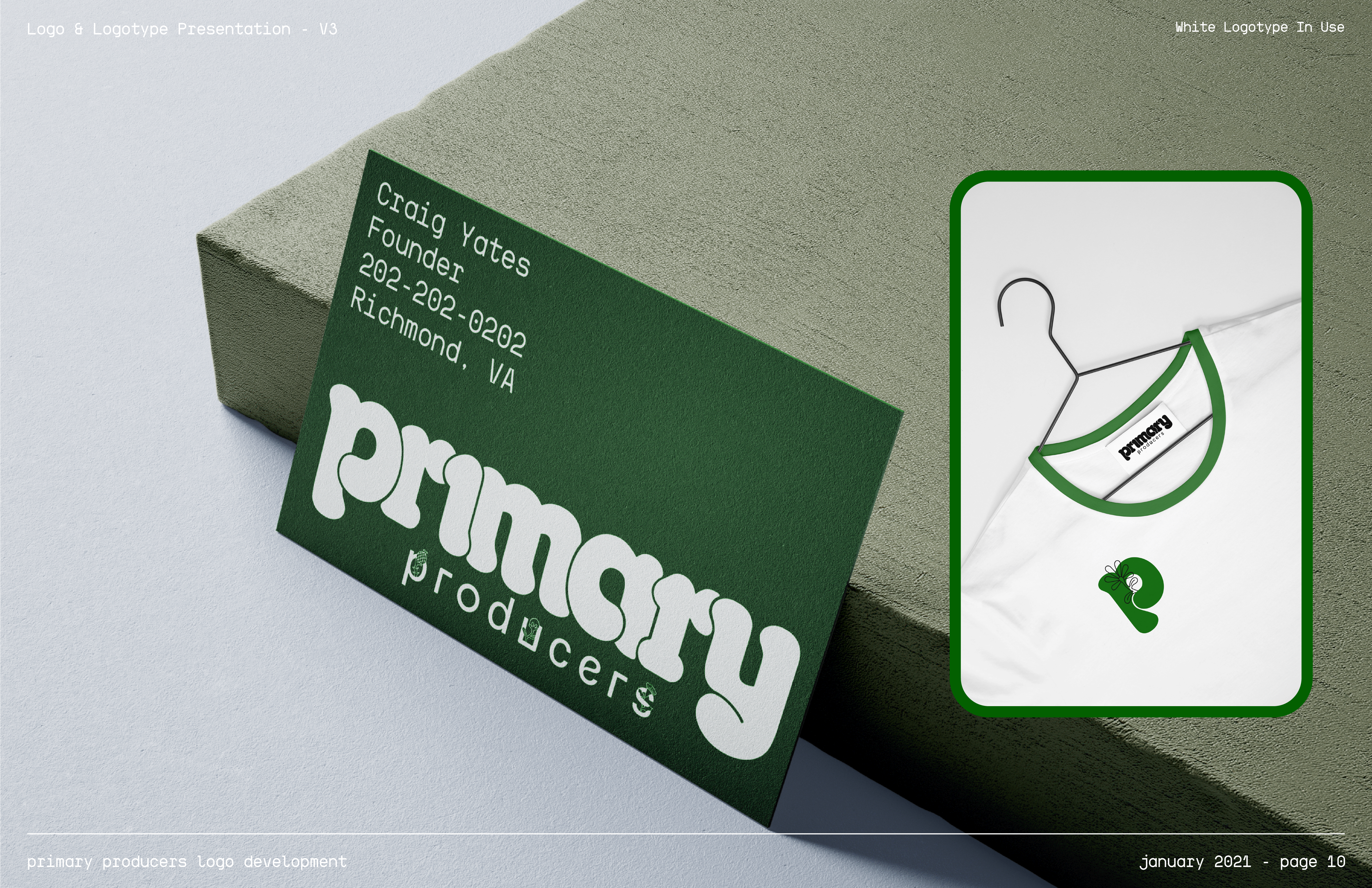
Over winter break, I was reached out to for a logo design. The company was Primary Producers a company which uses a mix of sustainable urban agricultural practices like hydroponics, vertical growing, and some more traditional farming techniques. Their primary objective is to provide fresh produce to food deserts primarily in the Central Virginia Area and they wanted a black designer to do their logo.
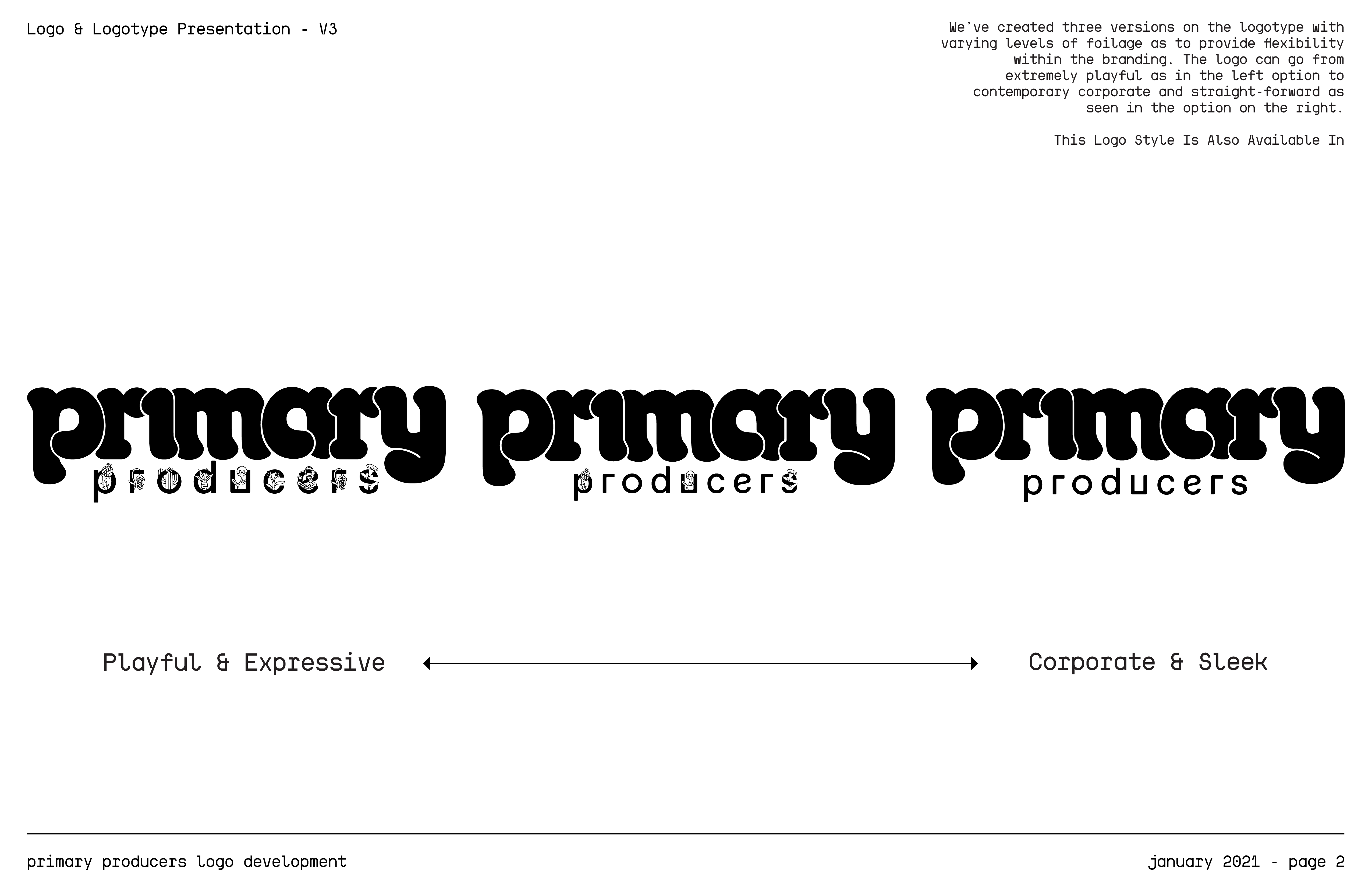
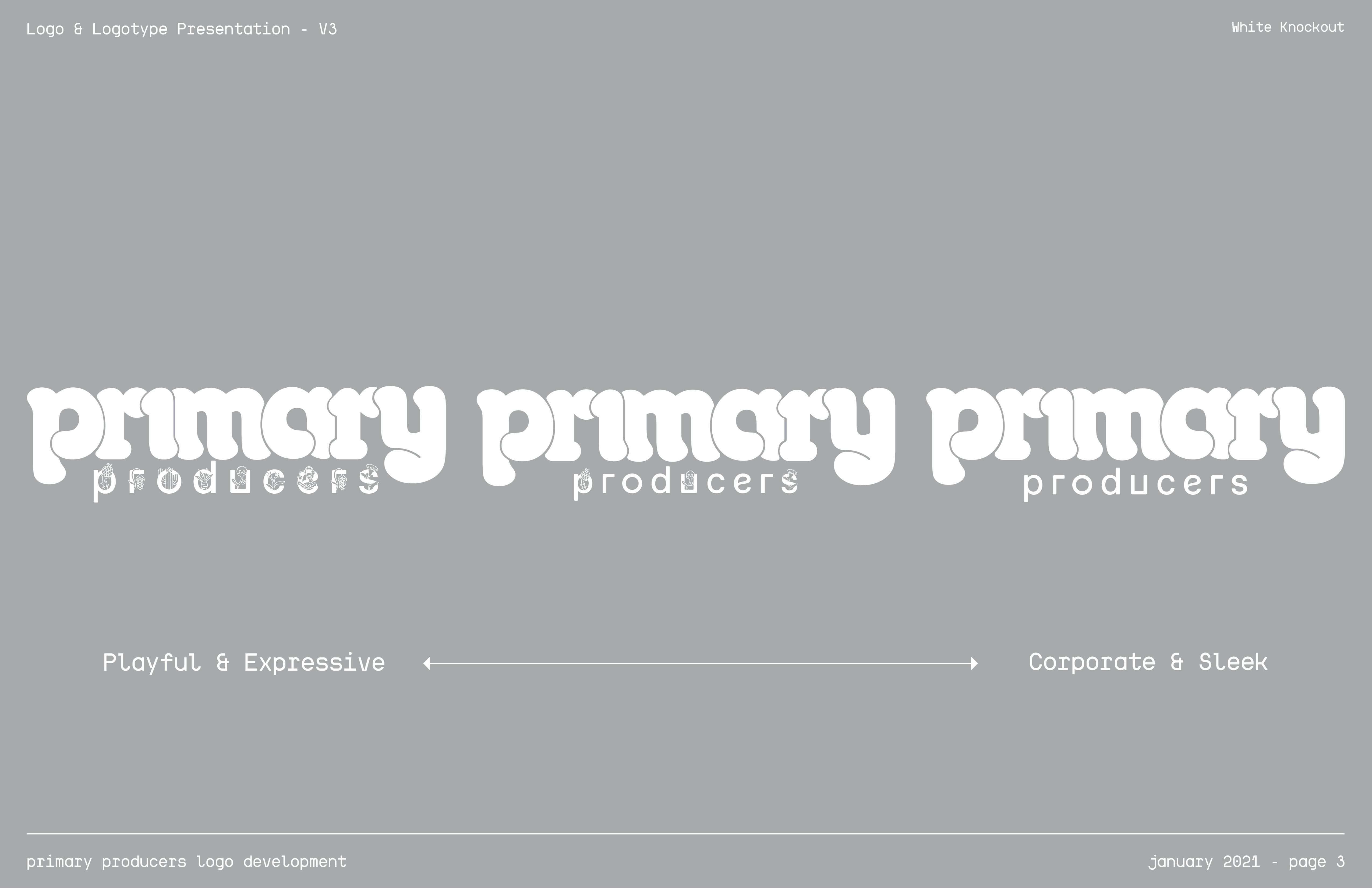
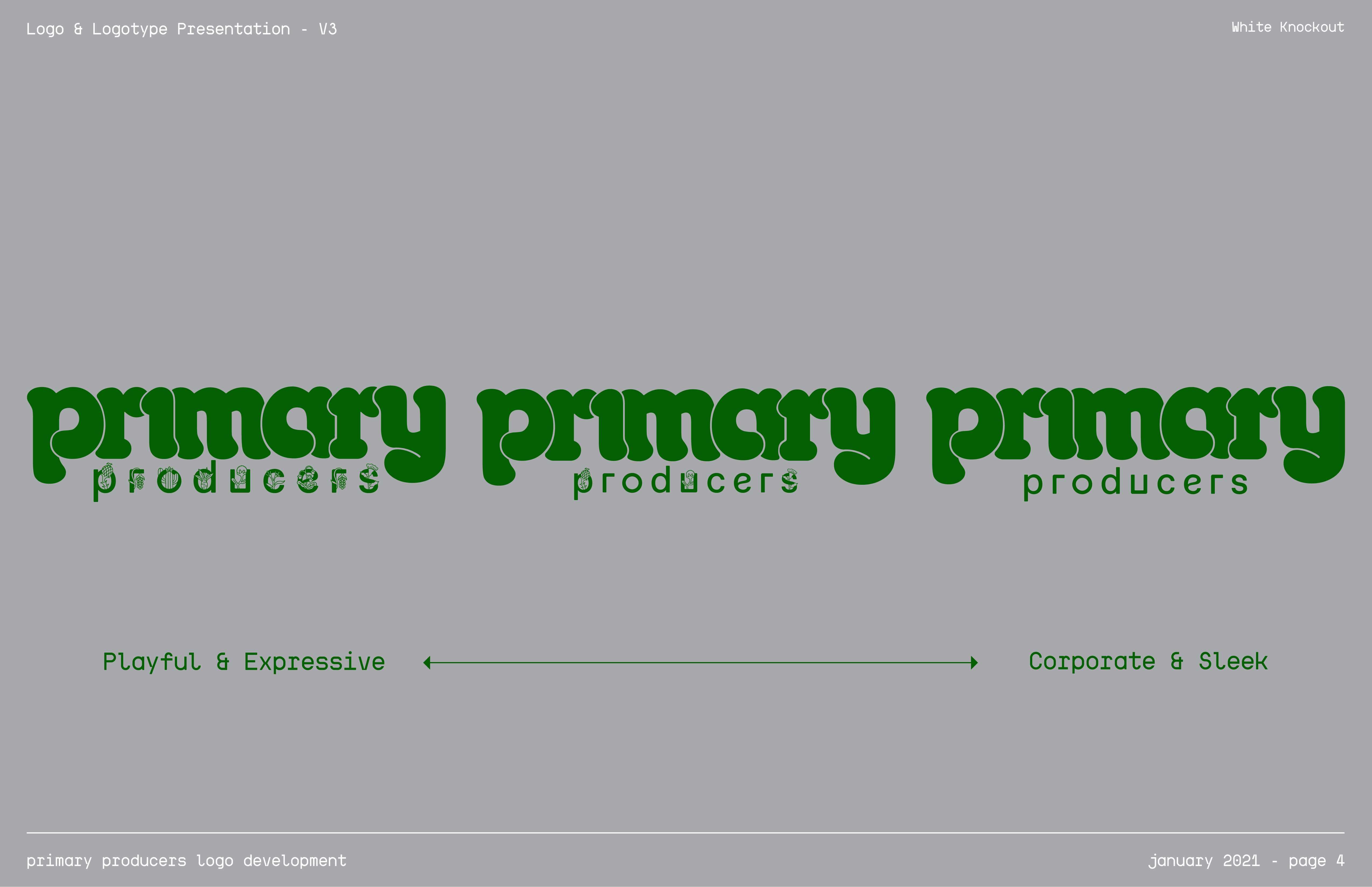
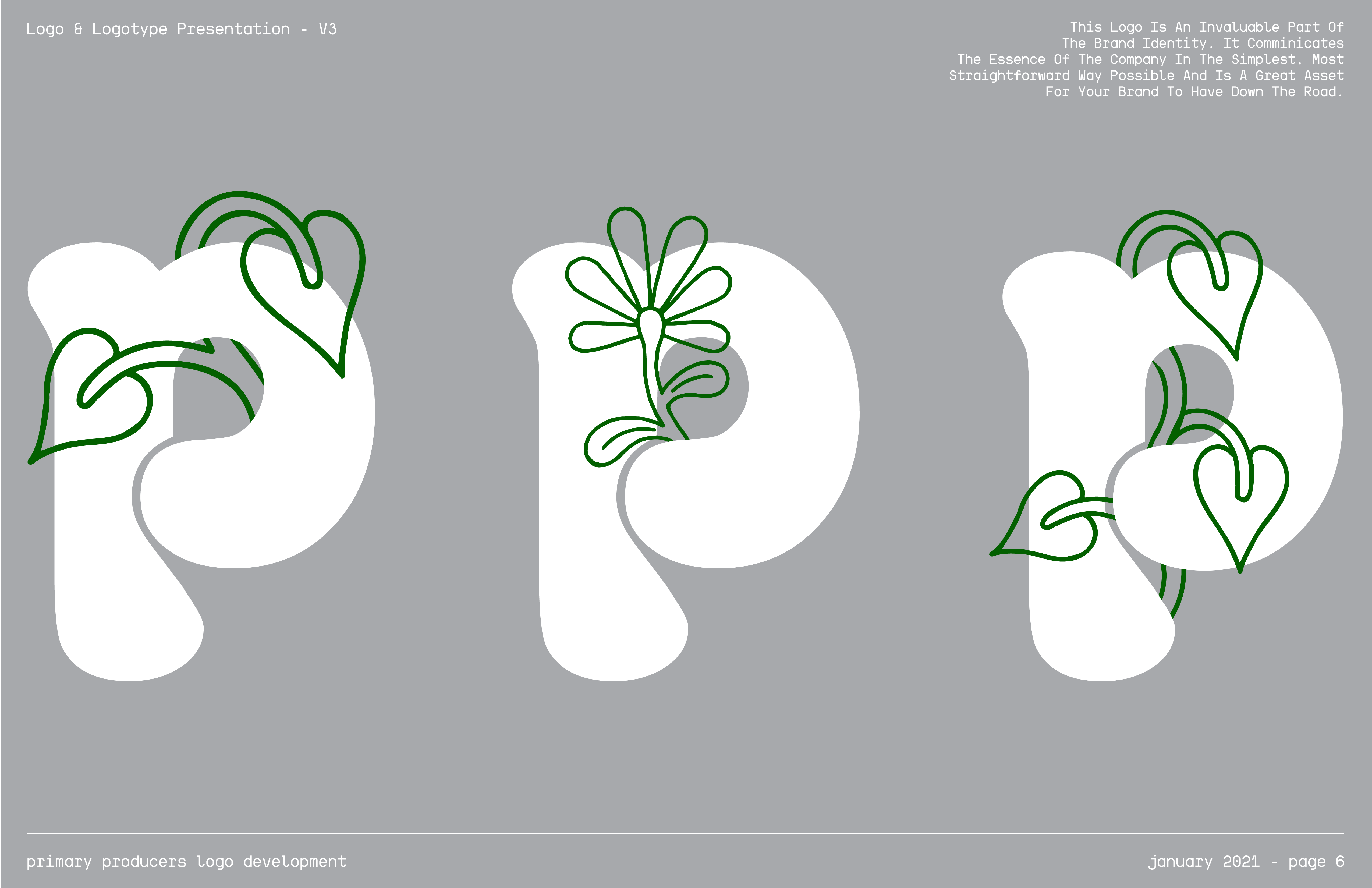
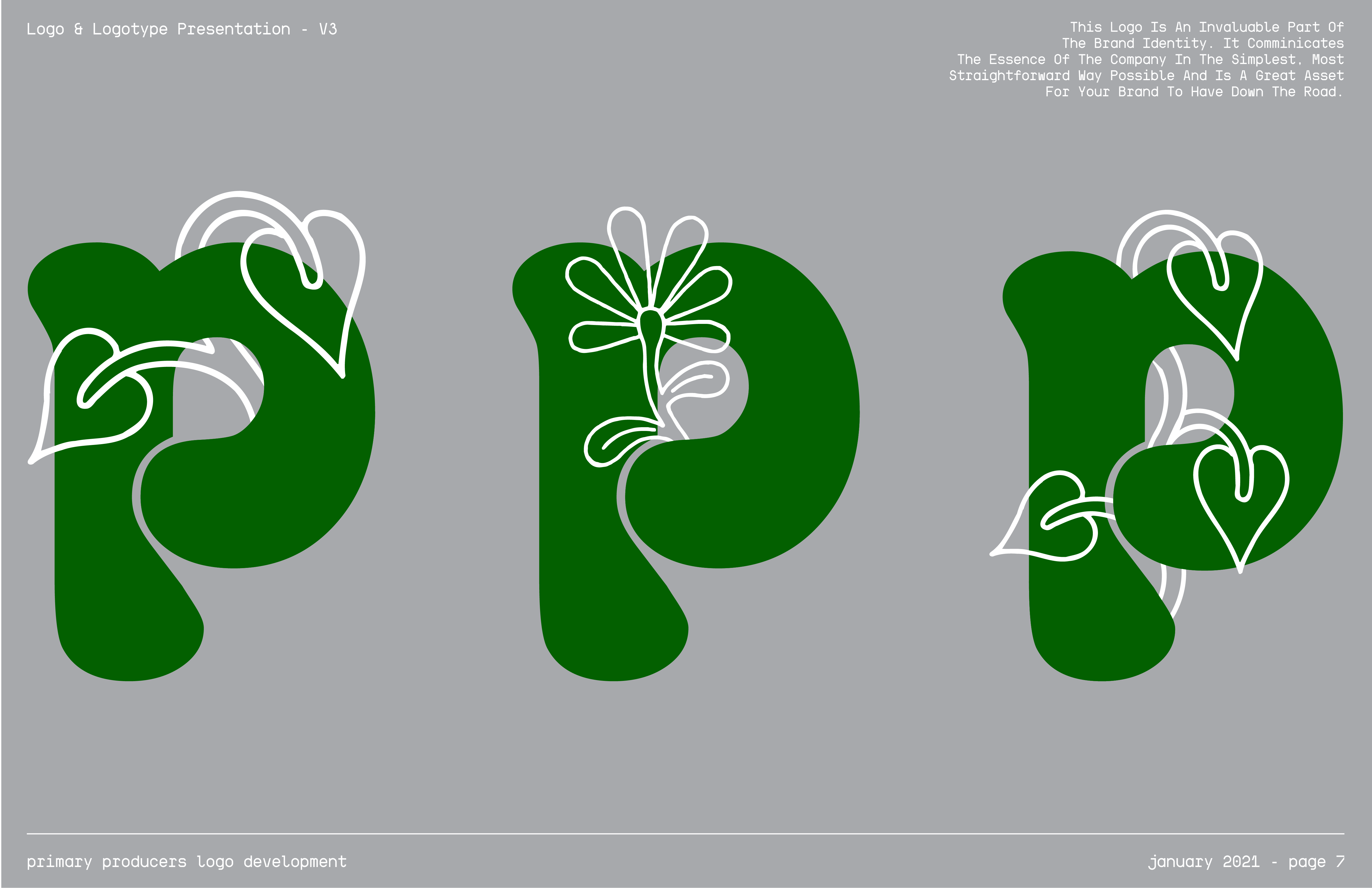
With this information, I wanted to create a logo which would standout in the aisle of a grocery store. Something simple, that felt friendly, familiar, comforting, slightly industrial but also tech. The type of thing that you’d want to bring home to your children, and the type of thing that would linger in their memories as a memento of childhood and the joy and comfort that a meal can bring.
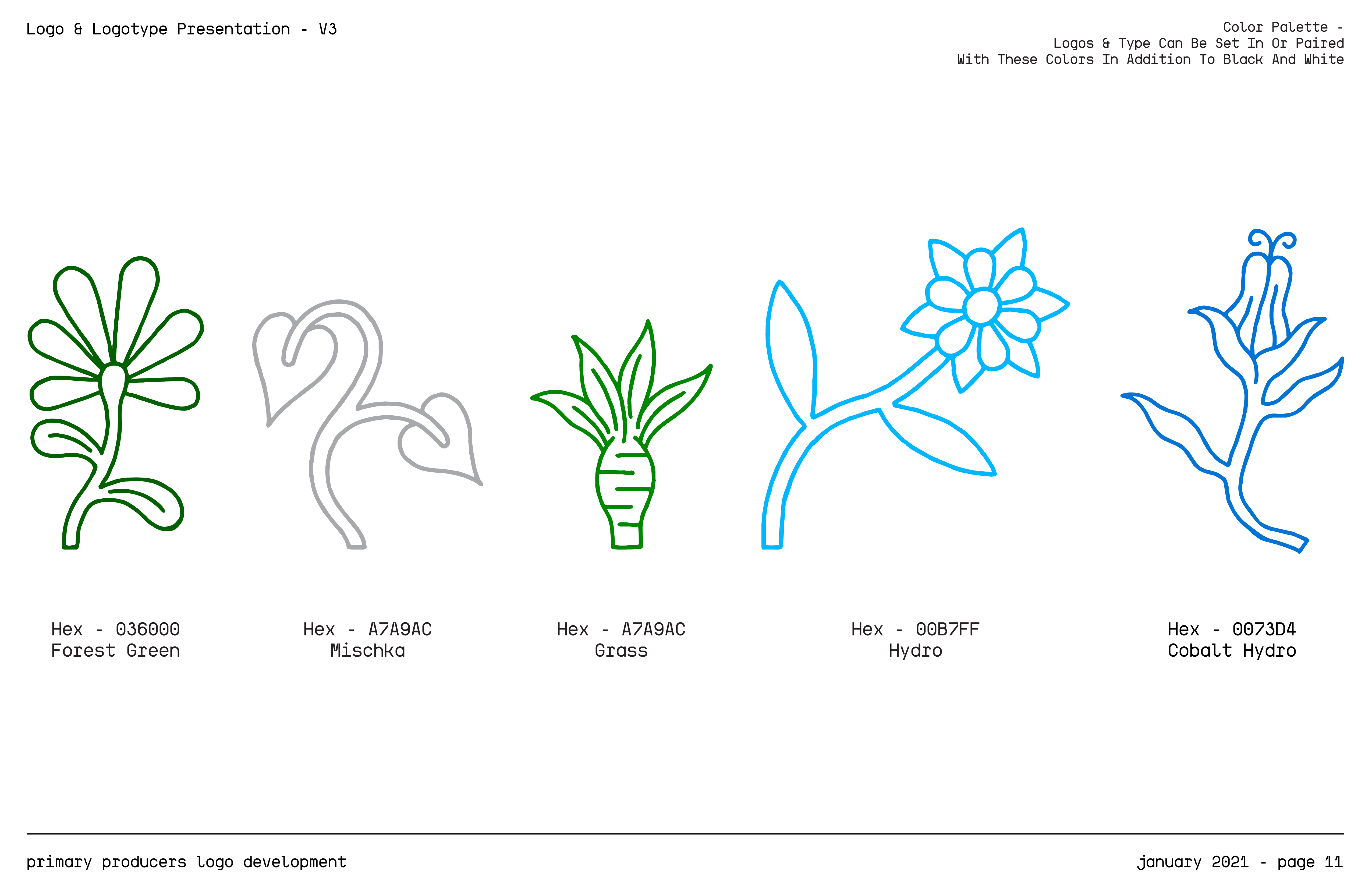
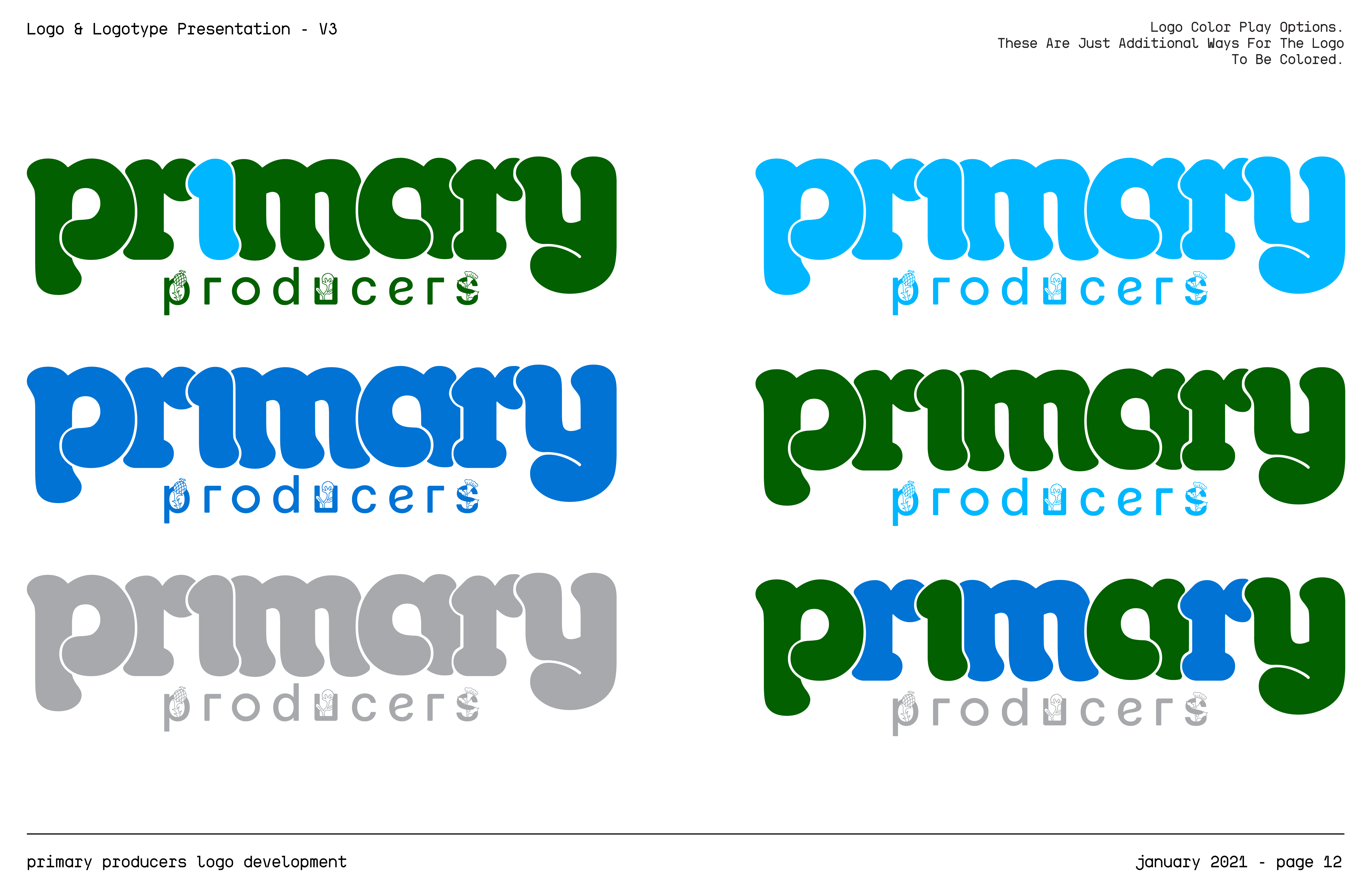
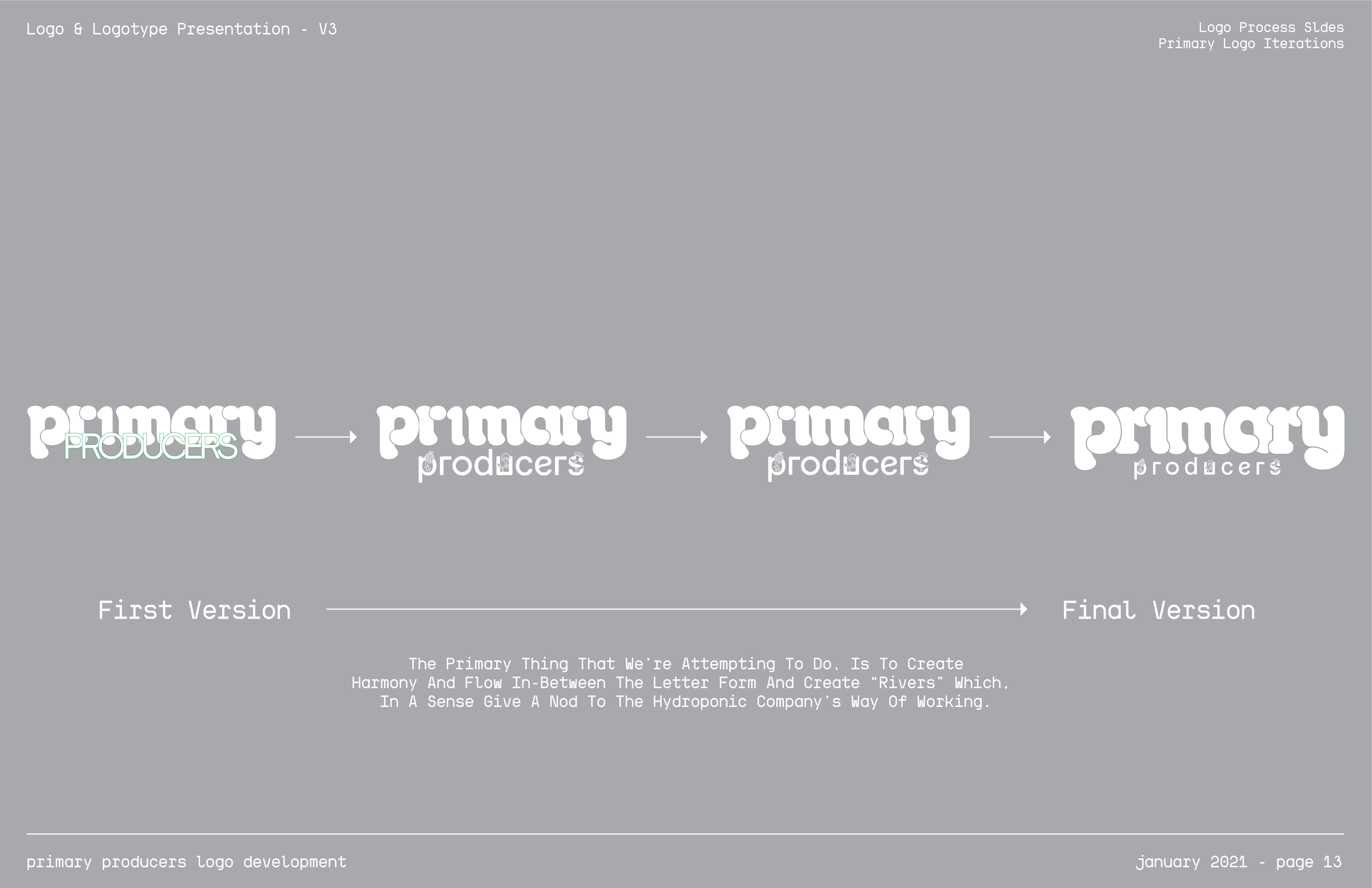
To give the primary logotype a timeless quality, I explored a lot of the old letraset families before landing on the one which you see in this project, Octopuss. To get the negative space to flow through the type and the psuedo-hedges on the arcs, ascenders and caps, the typeface had to be customized and edited meticulously. In terms of color, I thought (once again) that the simplicity of a white knock-out would communicate cleanliness and health.
Logo & Logotype Presentation

Logo & Logotype Presentation
(Slide Show; Click Arrows Or Image Edges)


Logo & Logotype As Design Elements