Column Two, Projects

Photo/Imagemaking
2025
Type/Web Design
2025
Type Design
2024
Type Design
2024
Brand Identity
2024
Publication Design
2024
Illustration
2024
Film
2024
Type Design
2024
OCR (WIP)
Type Design/Coding
2024
Web Design/Radio
2024
Printmaking
2024
Publication Design/
Type Design
2023
Local Host Daily
24 Hour Film/Installation
2023
Publication Design
2023
Film
2023
Imagemaking/Book
2023
Printmaking/Book
Ongoing
Printmaking
2022
Publication Design
2022
Publication Design
2022
Editorial/Web Design
2022
Augmented Reality
2021
Game Design
2021
Brand Experience
2020
Brand Platform
2020
Brand Identity
2020
Product Innovation
2020
Web Tool
2021
Brand Identity
2020
Augmented Reality
2020
Brand Identity
2021
Print
2019
Children’s Book
2020
Web Tool
2020


Theo France-Haggi

Projects 

Once you tap a link the selected page
will appear below this list.

Type Design/Programming
2024
Publication Design
2024
Illustration
2024
Film
2024
Type Design
2024
OCR (WIP)
Type Design/Coding
2024
Publication Design/
Type Design
2023
Local Host Daily
Film/Installation
2023
Publication Design
2023
Film
2023
Imagemaking/Book
2023
Tree Act
Installation/Book
2023
Printmaking
2022
Publication Design
2022
Publication Design
2022
Editorial/Web Design
2022
Augmented Reality
2021
Game Design
2021
Brand Experience
2020
Brand Platform
2020
Brand Identity
2020
Product Innovation
2020
Education/Activation
2020
Web Tool
2021
Brand Identity
2020
Augmented Reality
2020
Brand Identity
2021
Print
2019
Children’s Book
2020
Web Tool
2020


Steady Sounds Record Shop
Mediums - Print, Digital, Branding, OLV
[Summer 2019]

CAMPAIGN CONCEPT

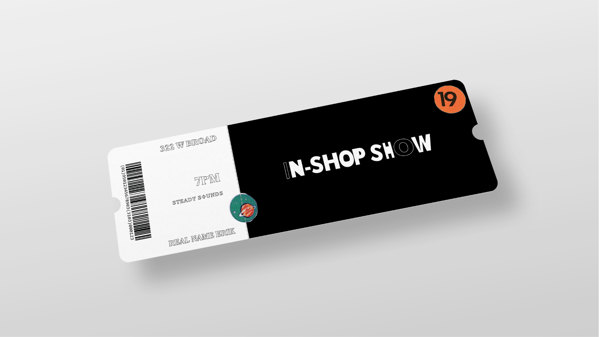
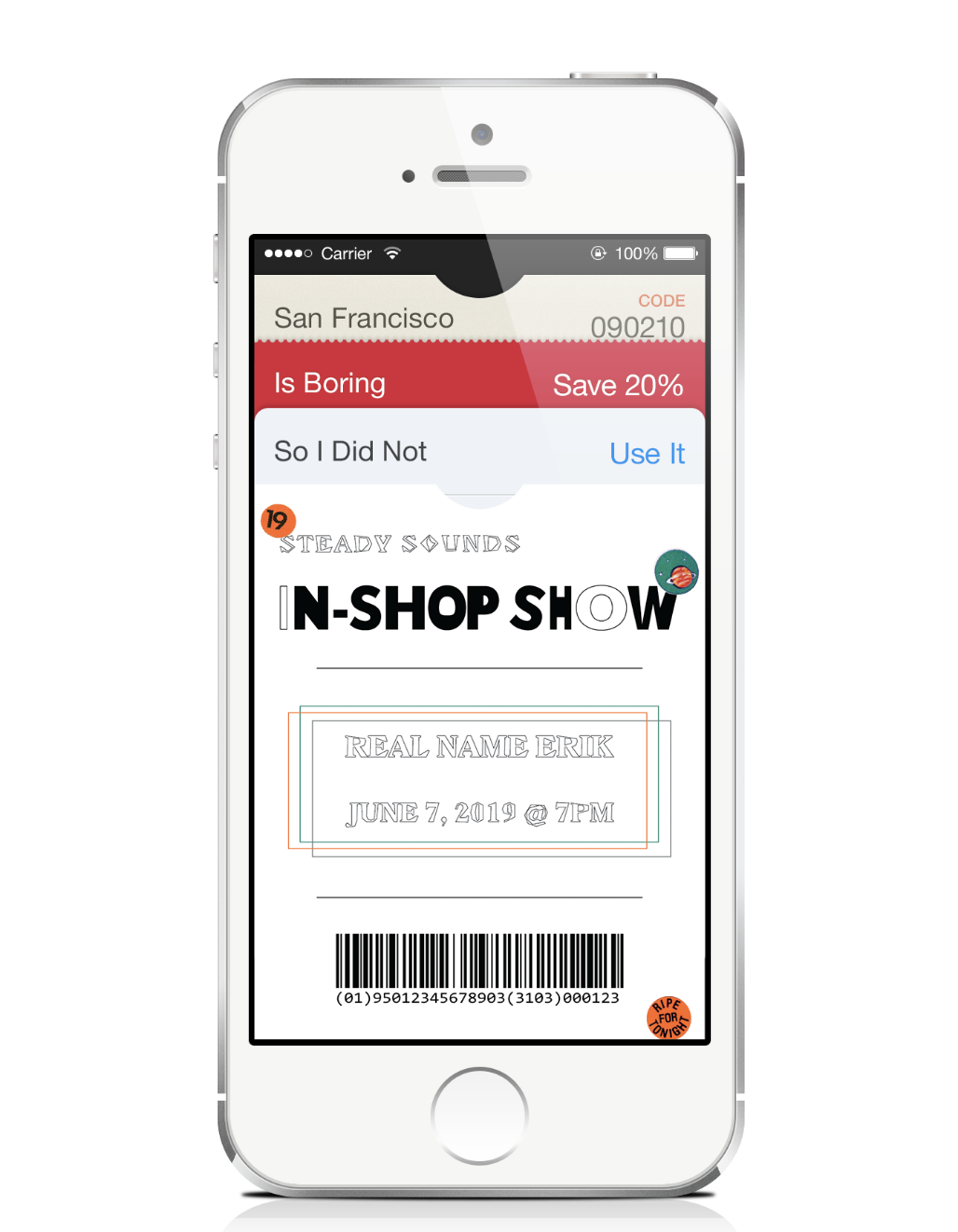
This is a branding project for a local, Richmond, record shop. I wanted to create a set of fun deliverables that would drive brand recognition. My intention was for Steady Sounds to have a strong visual identity and culture to build off of in the future. The choice was also made not to have a set color palette because of the fluidity and variety of the music in-store. I wanted a brand identity that could more easily match the moods and aesthetics of the music and customer, so colors are dictated by the artist and customer. [WIP]

IN-SHOP SHOW #1

ARTIST - REAL  NAME ERIK
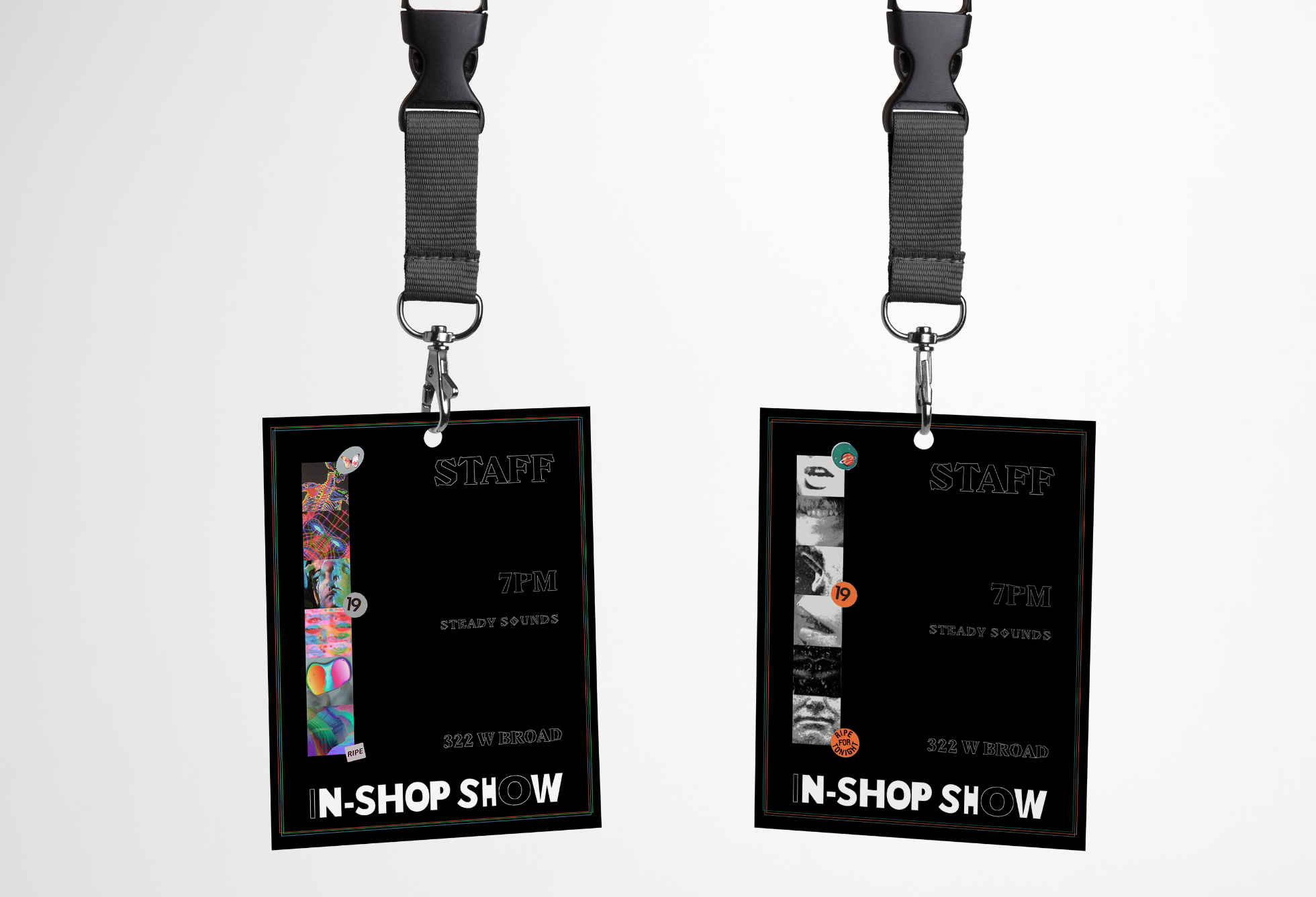


IN-SHOP SHOW #2

ARTIST - KOUTOUUKOOU


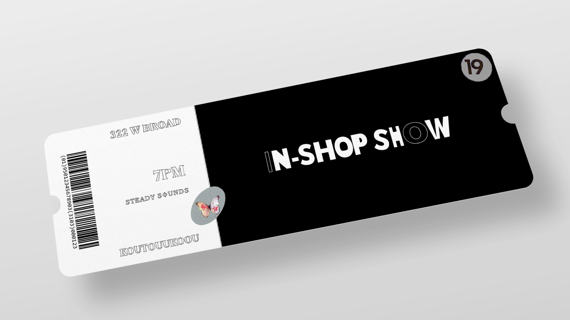
PASSES WOULD ALSO BE BRANDED ON AN EVENT-BY-EVENT BASIS.


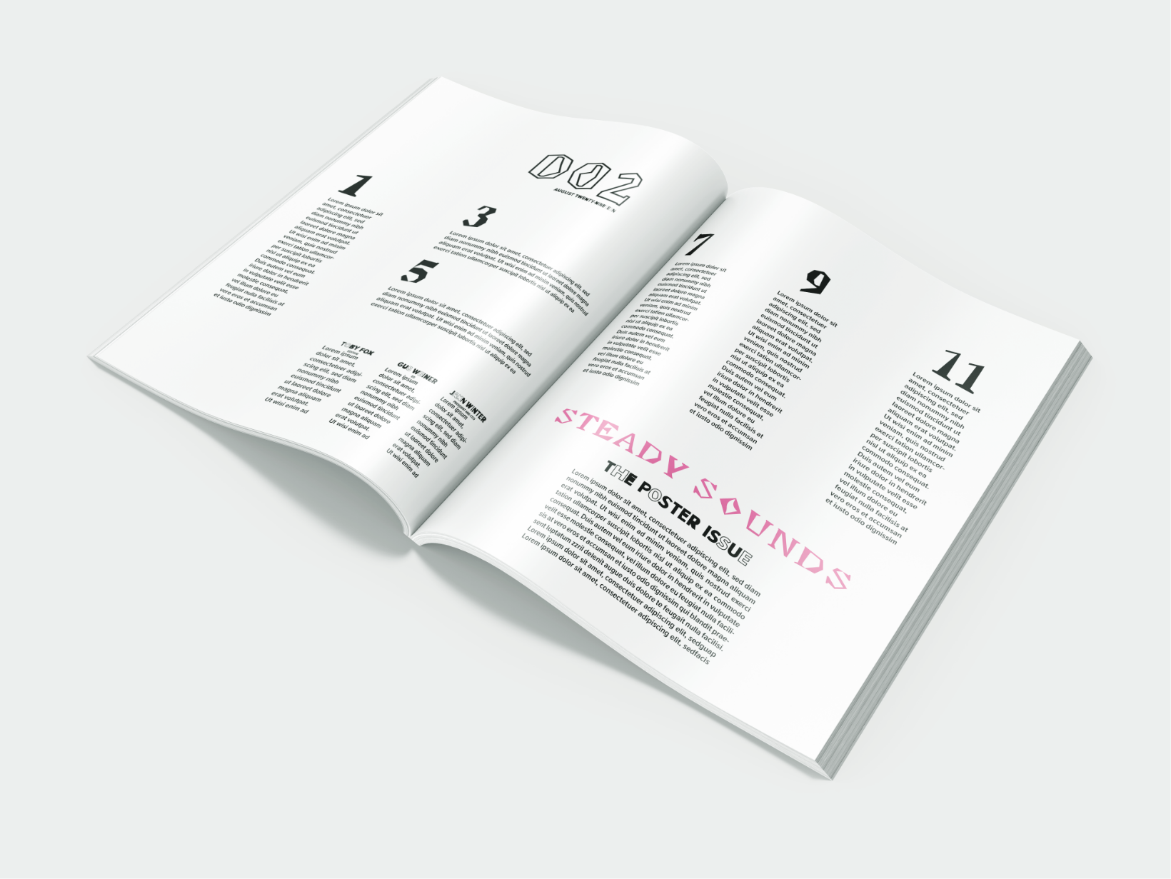
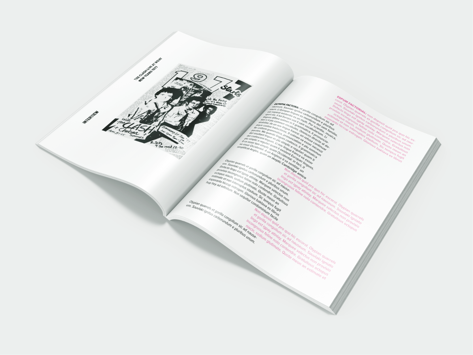
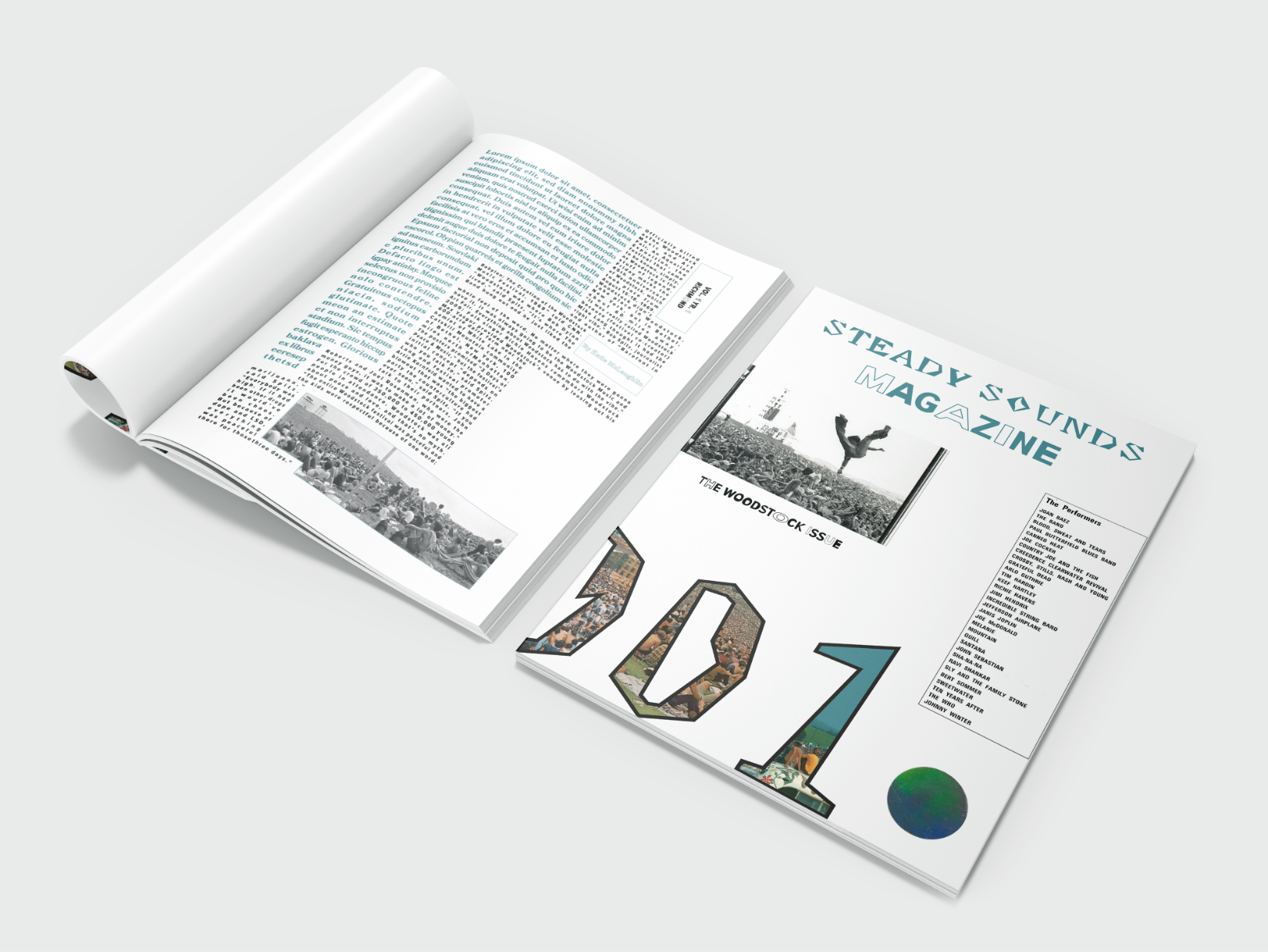
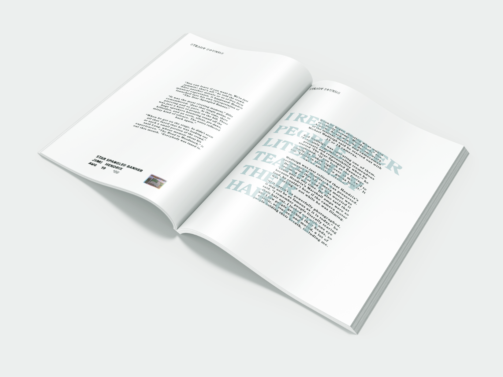
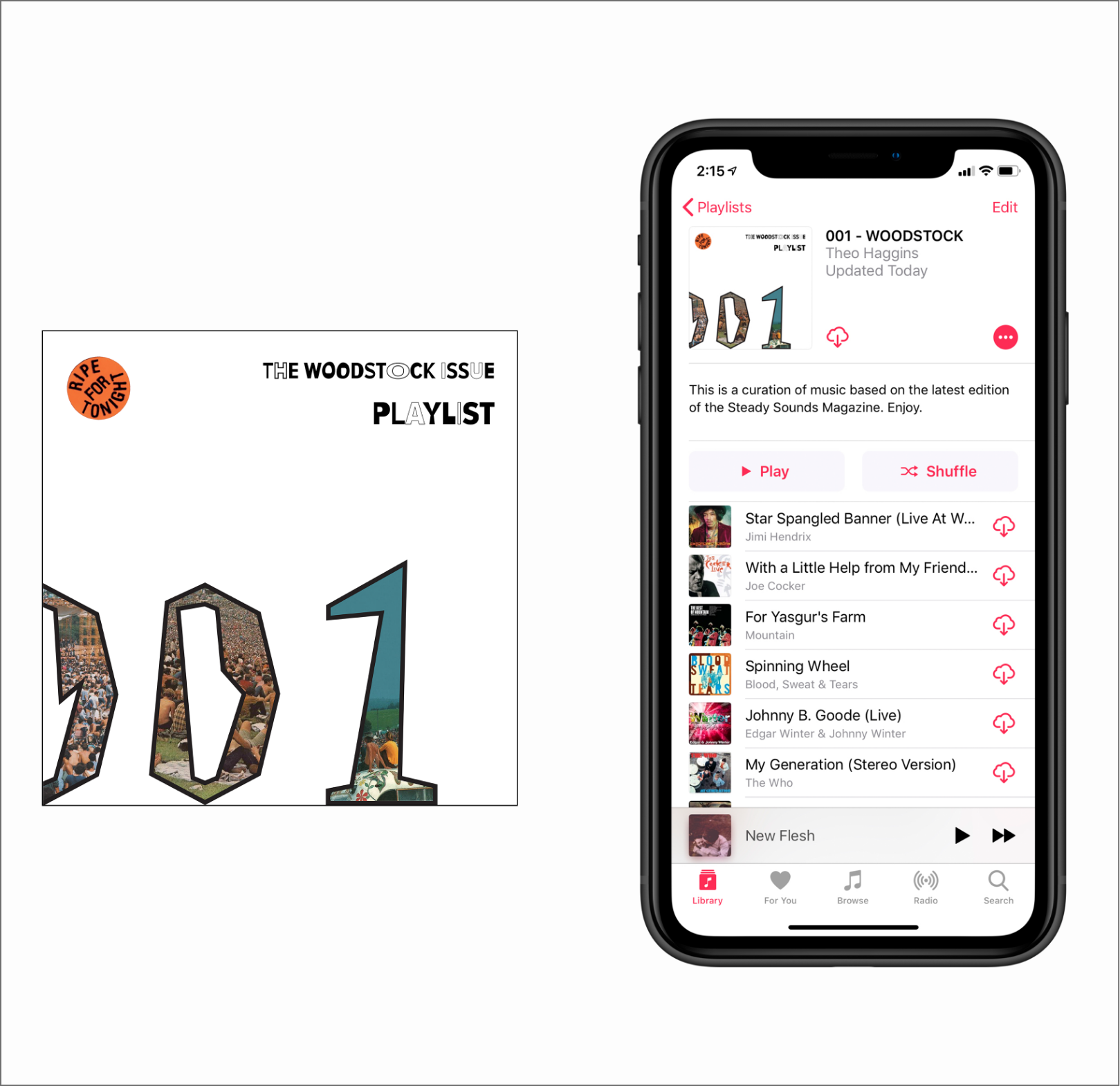
STEADY SOUNDS MAGAZINE 001

In addition to the In-Shop Shows, it’d be good to have a publication for the brand that could serve to educate the young people interested in the music of the past. This was also a great oppotunity to practice publication typography and study vintage design aesthetics.
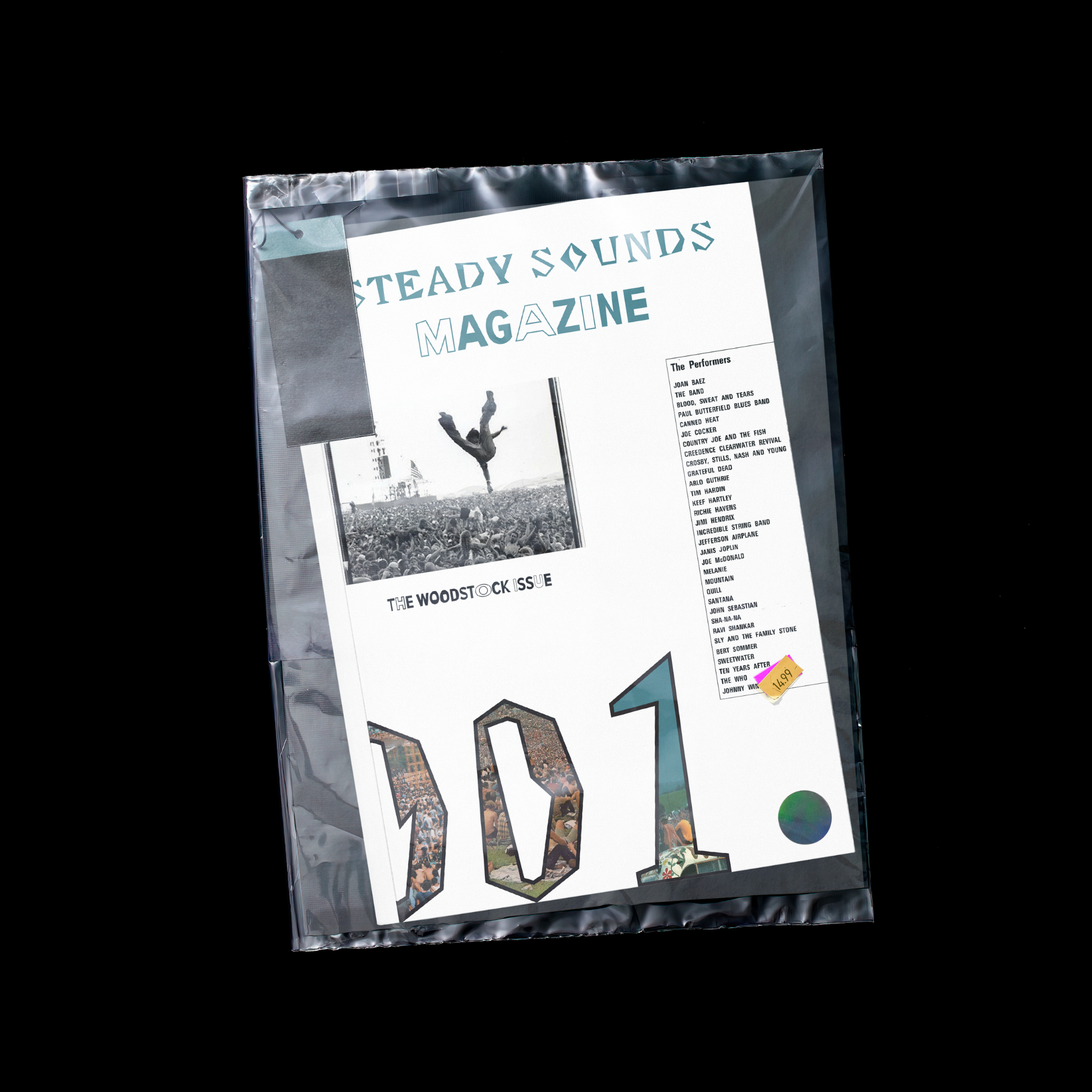
                                             

IG STORY - 001


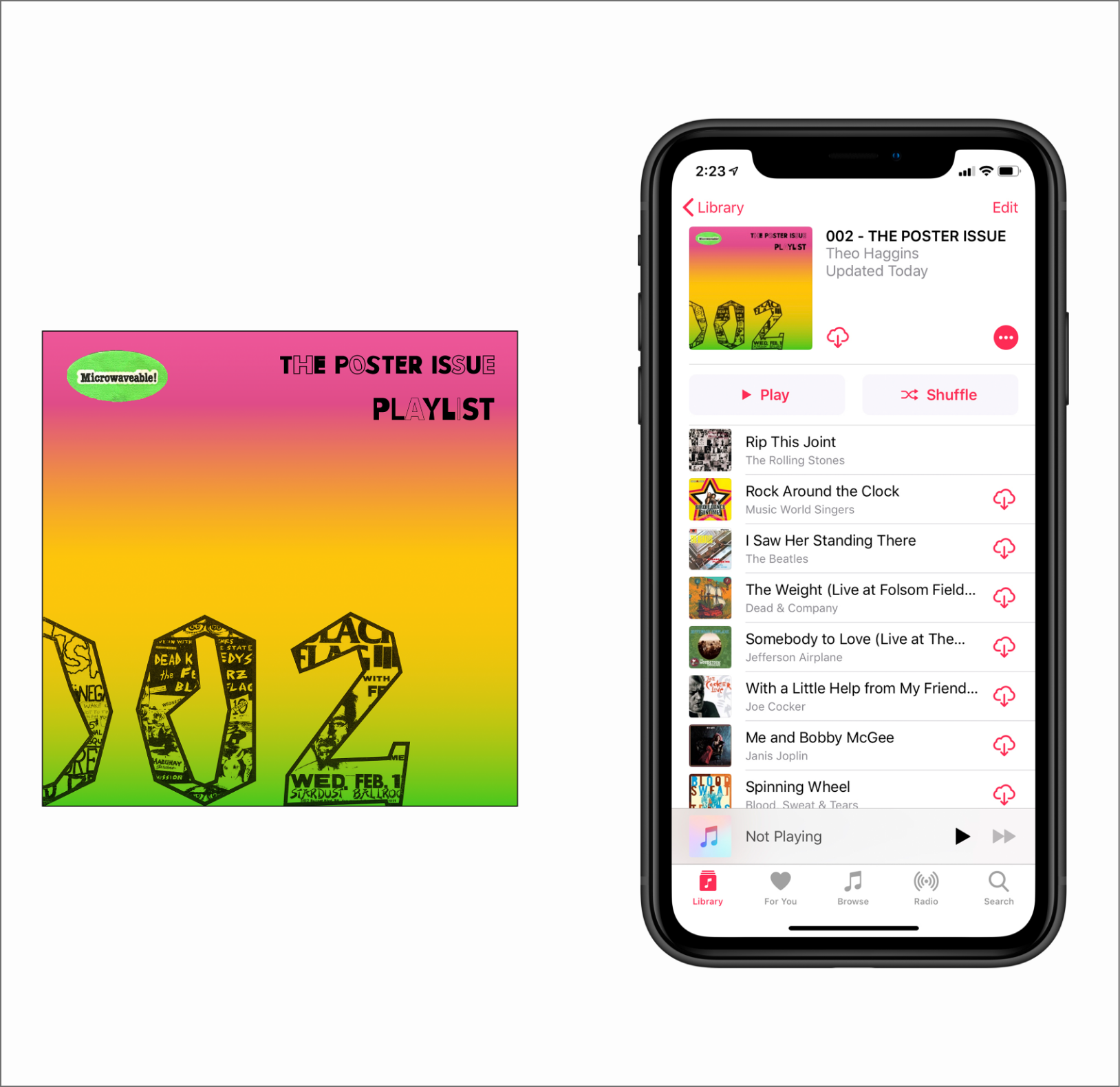
STEADY SOUNDS MAGAZINE 002

This design was based on the vintage gradient posters that were common in the sixties. I think that starting off the issue with this design would really set a nostalgic tone for the rest of the article.


LOGO MNEMONIC


Home