Projects
Local Host Daily
24 Hour Film/Installation
2023
Projects
Once you tap a link the selected page
will appear below this list.
Once you tap a link the selected page
will appear below this list.
Local Host Daily
Film/Installation
2023
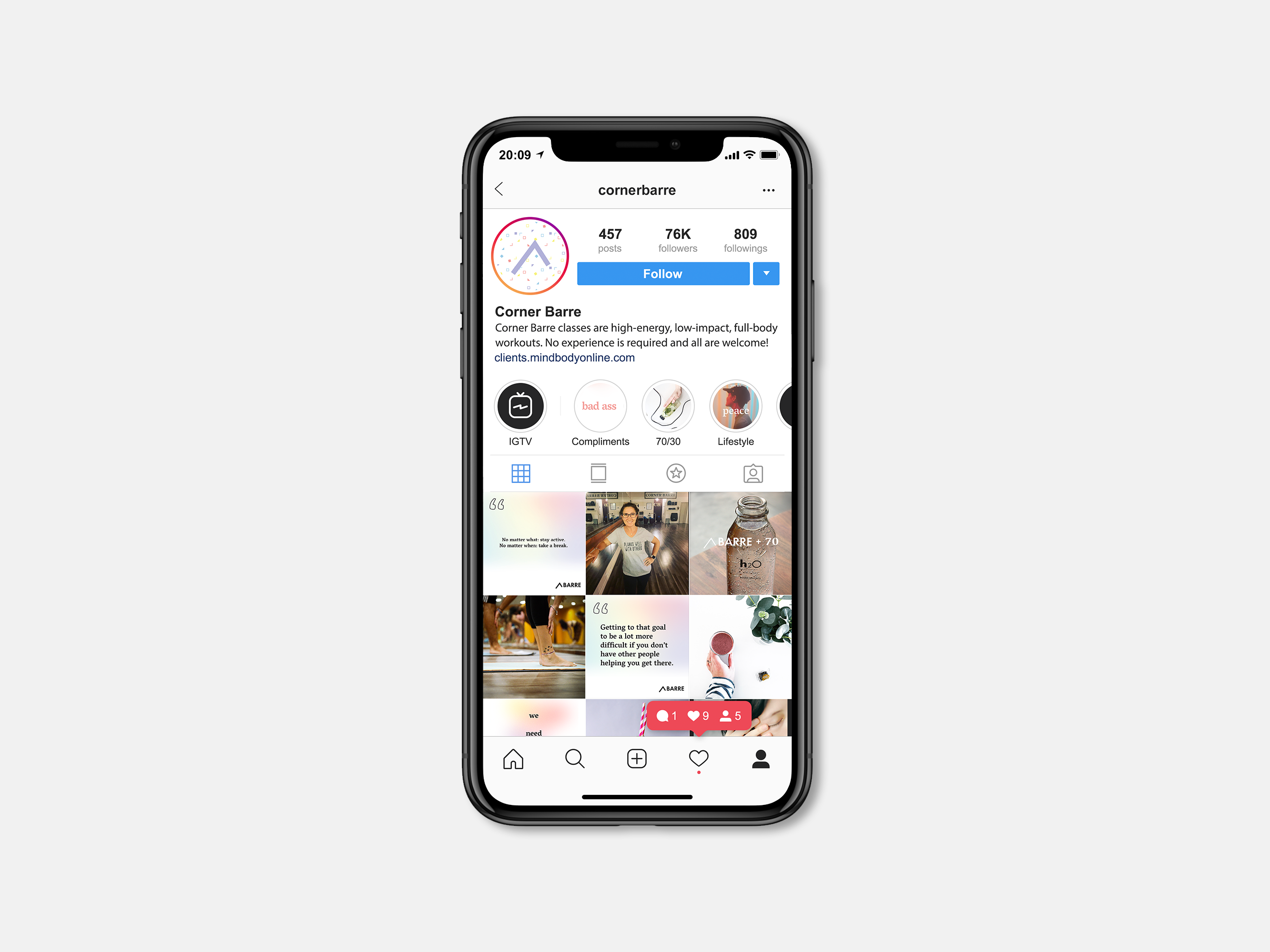
Client - Corner Barre
Team - Jimon B., Hannah V., Megan W., Cat T.
Team - Jimon B., Hannah V., Megan W., Cat T.
Mediums - Social, Digital, Collateral
[Fall 2019]
[Fall 2019]
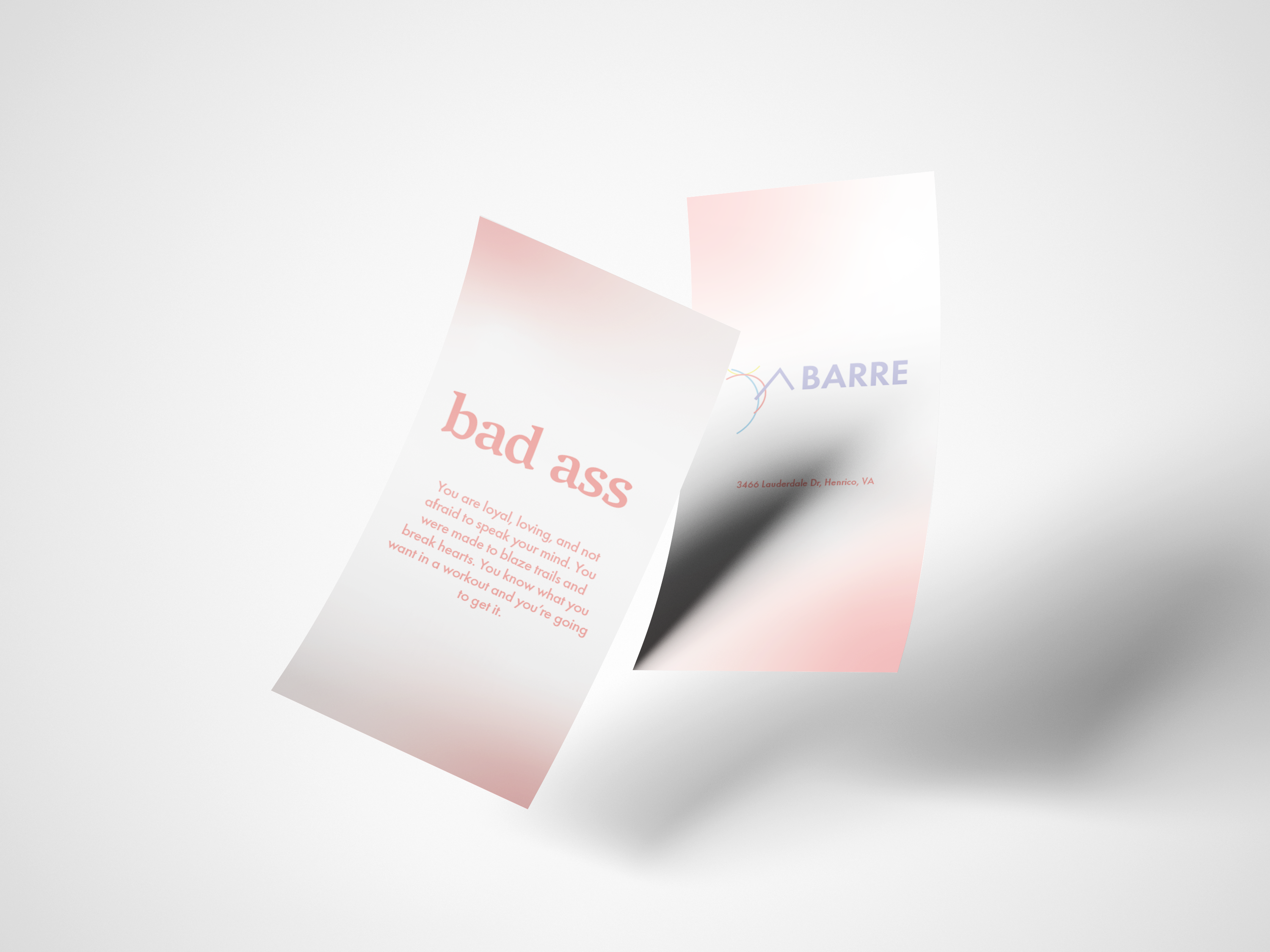
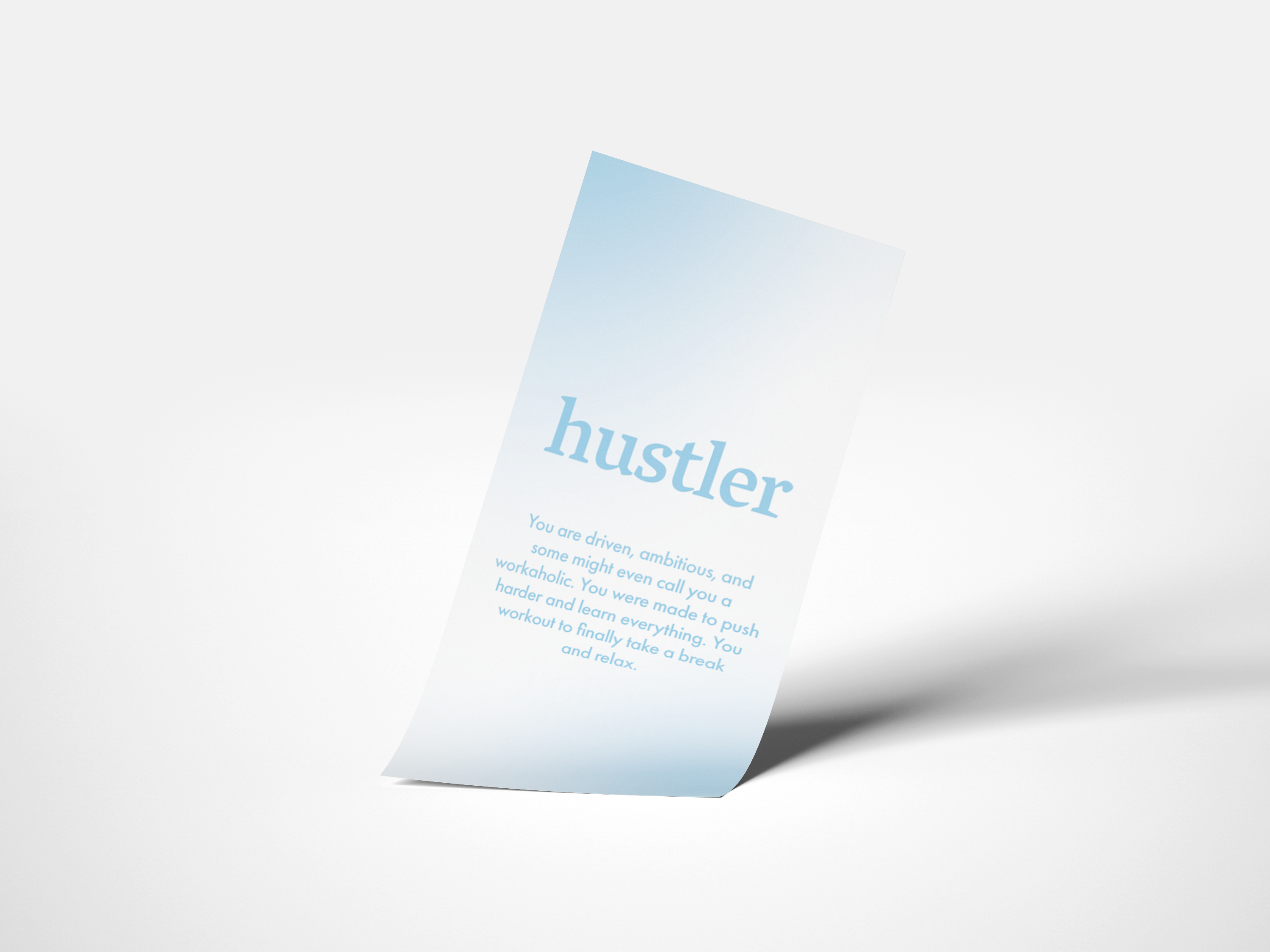
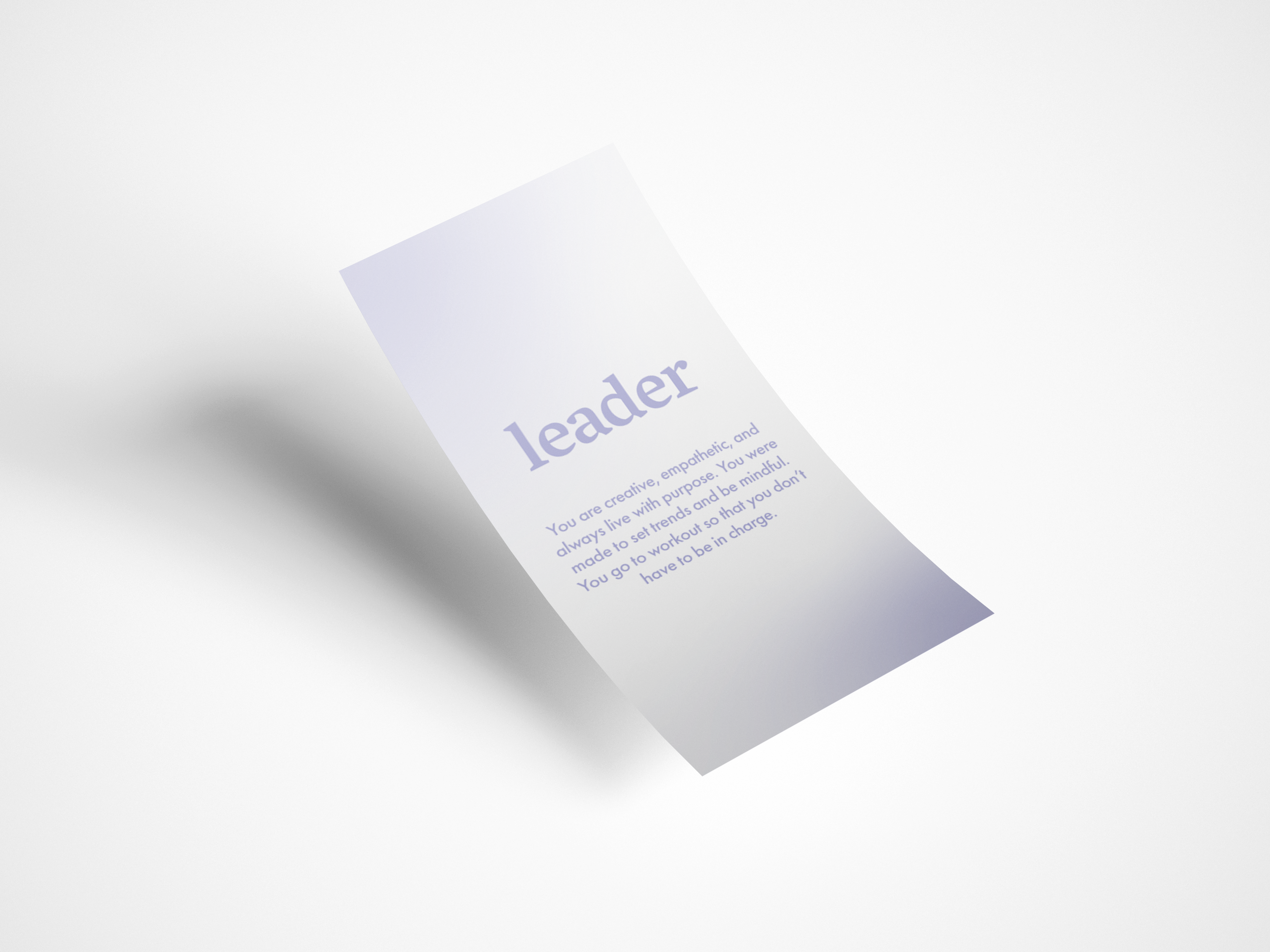
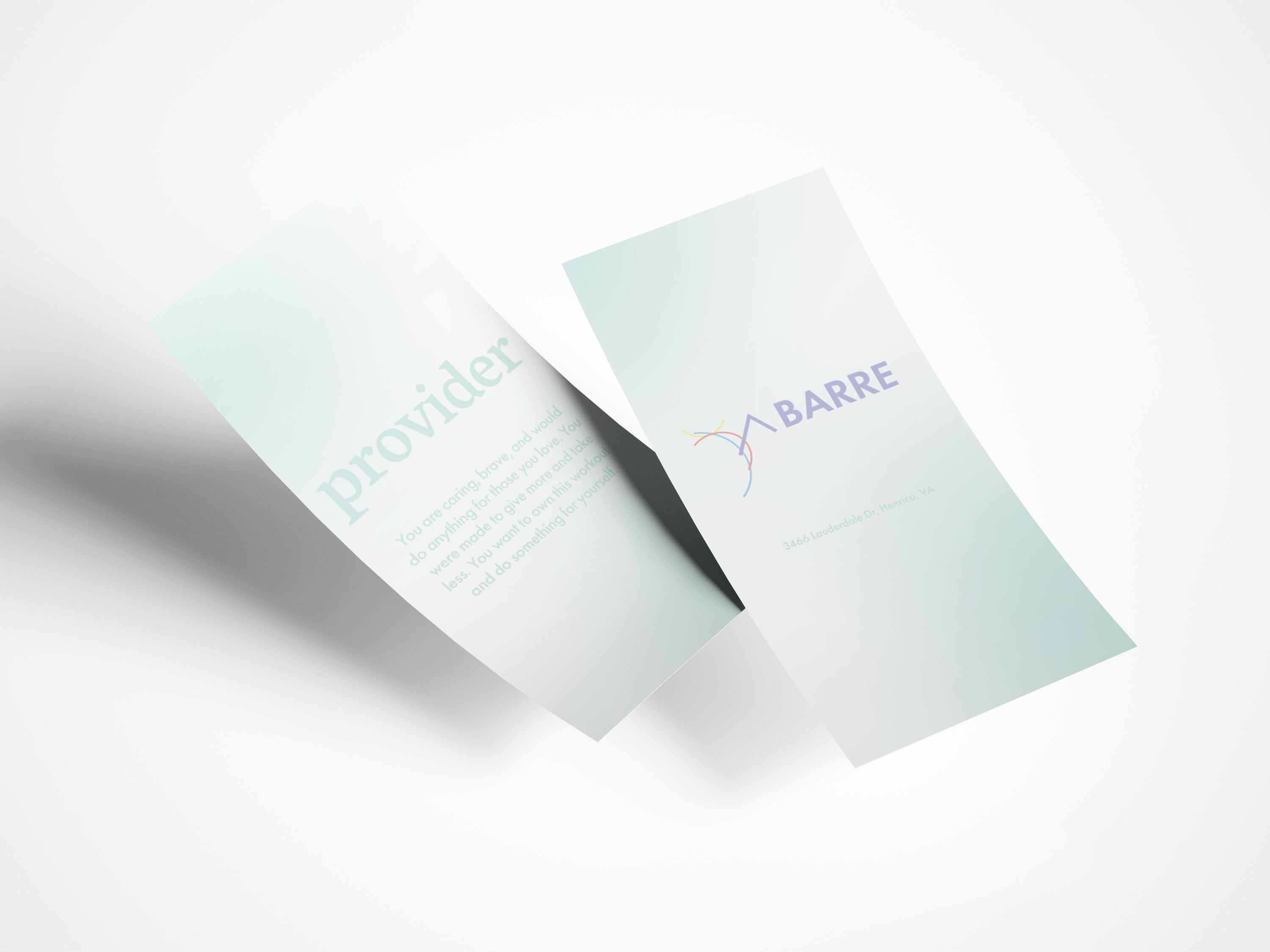
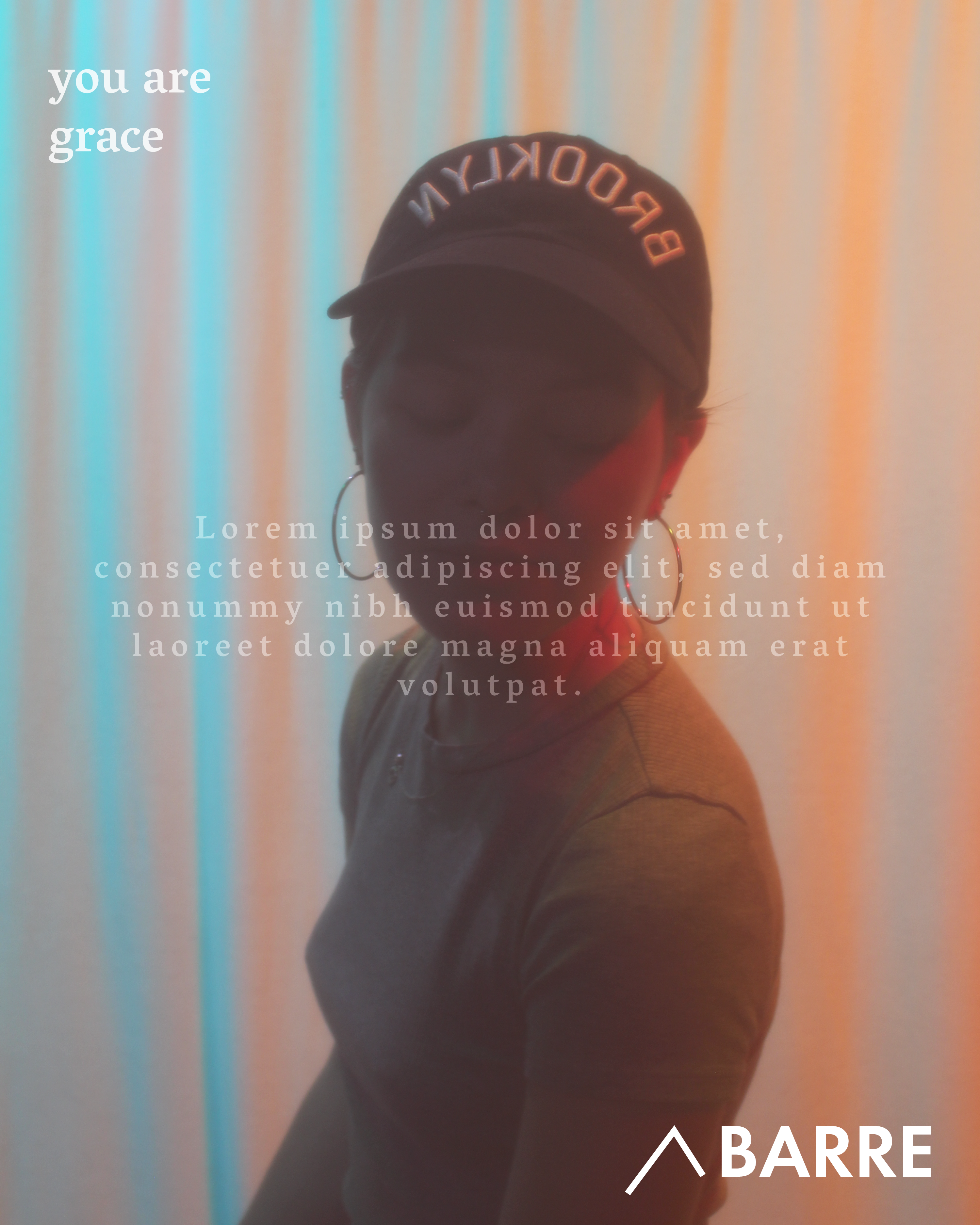
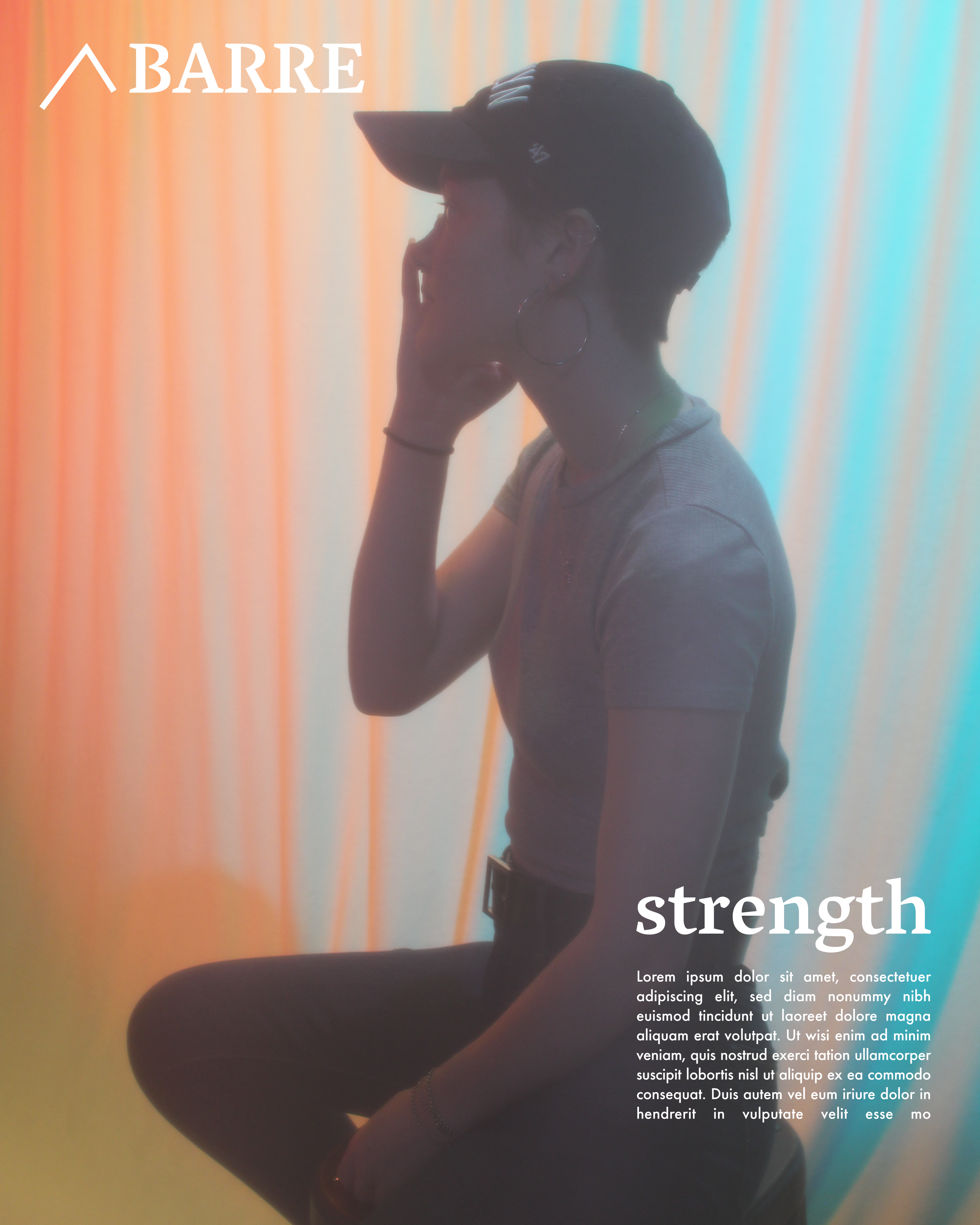
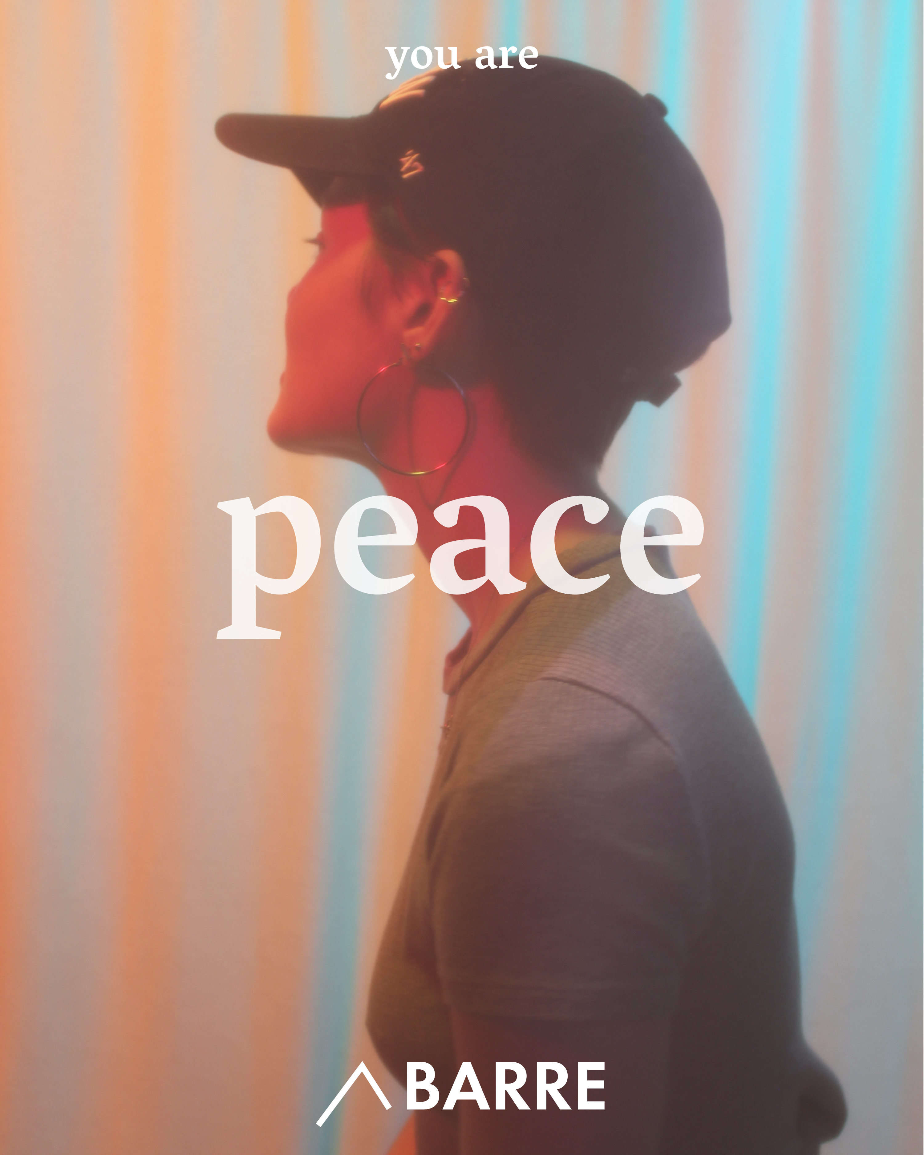
It’s good to know that someone cares.
The idea here was to strengthen the bonds between existing customers and the shop while also attracting a lot of new clients by showing Corner Barre as a haven and a get-away for these strong, giving women. We wanted Corner Barre to be a place where these women could be selfish for once.
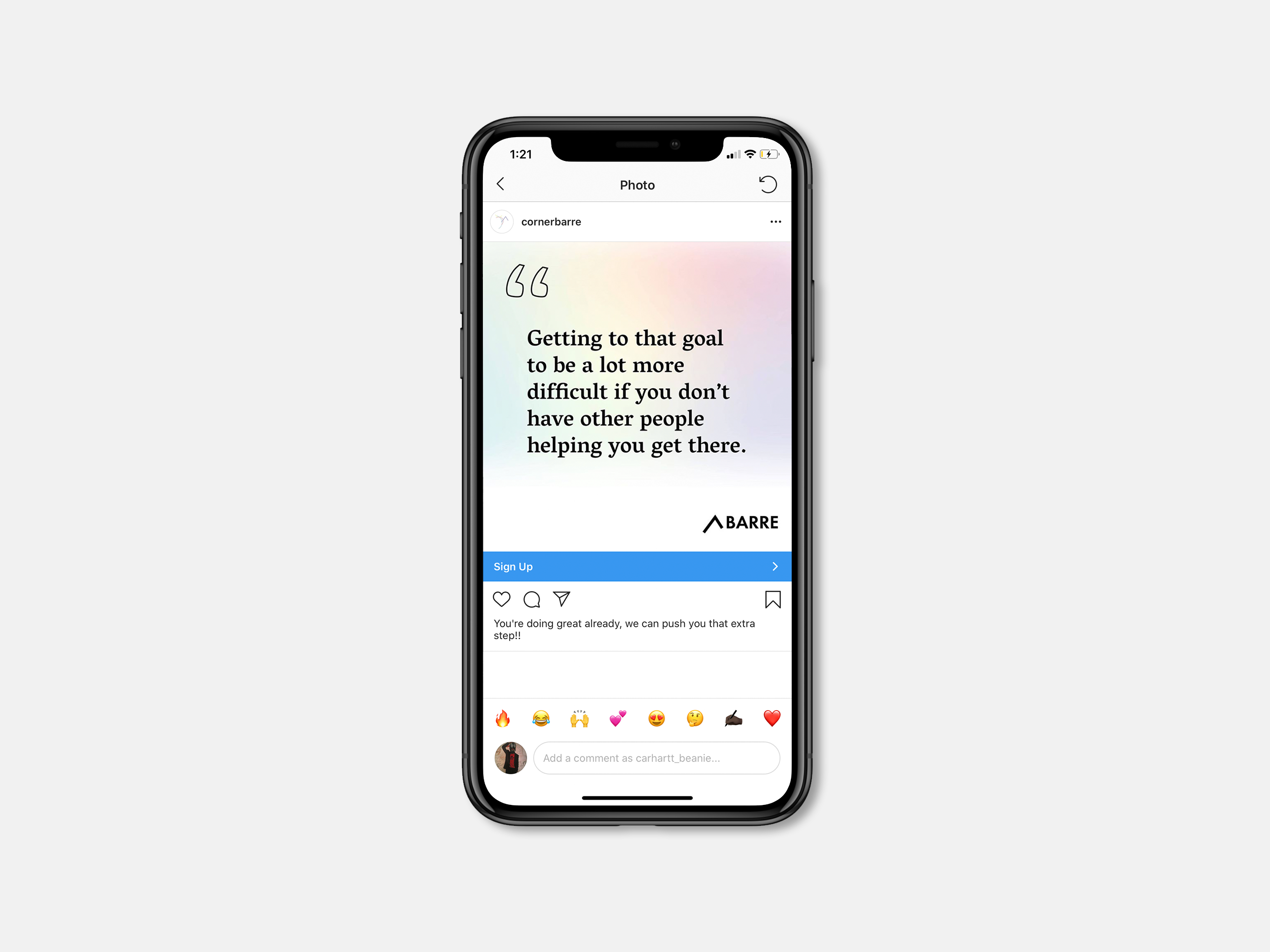
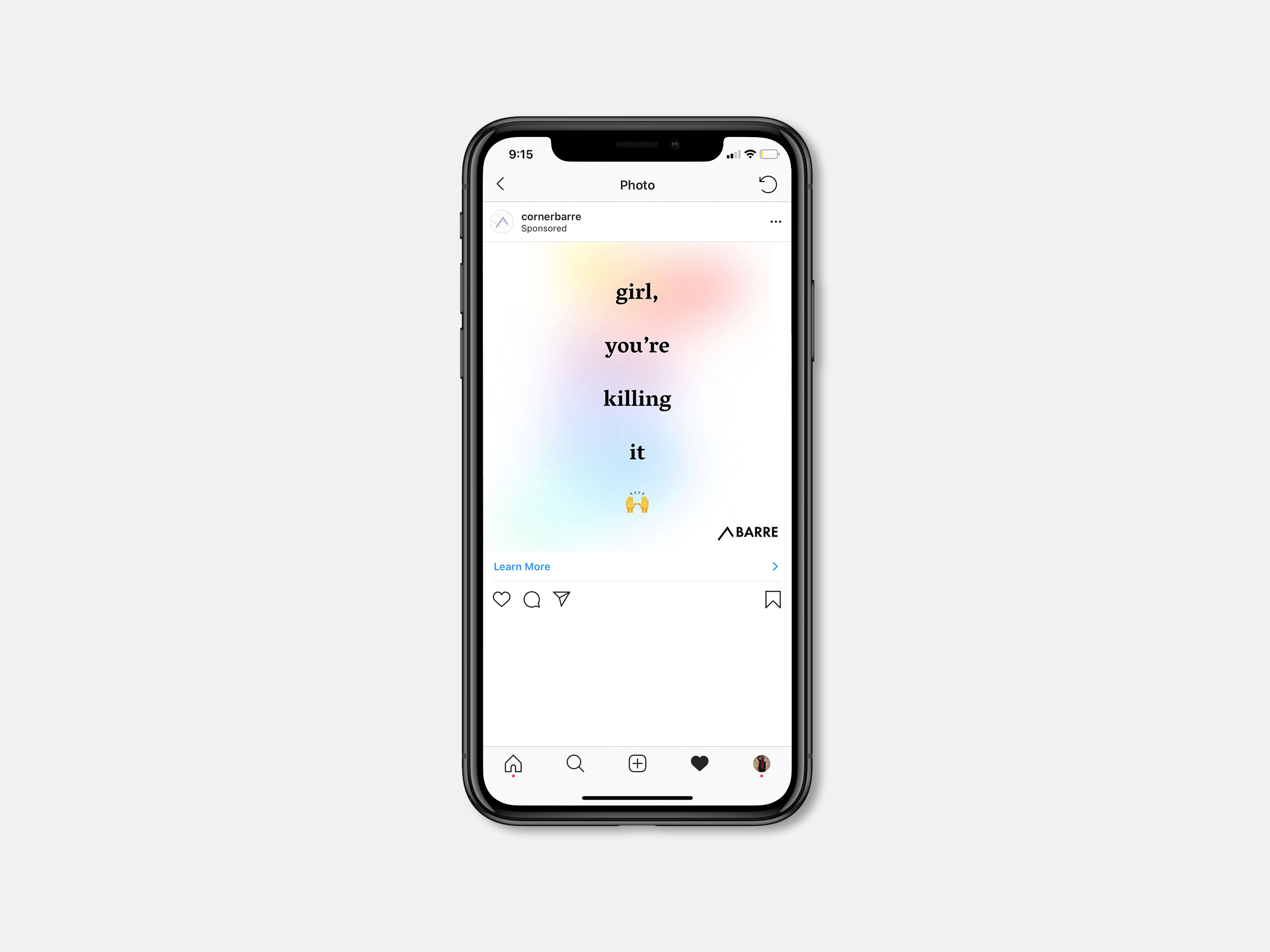
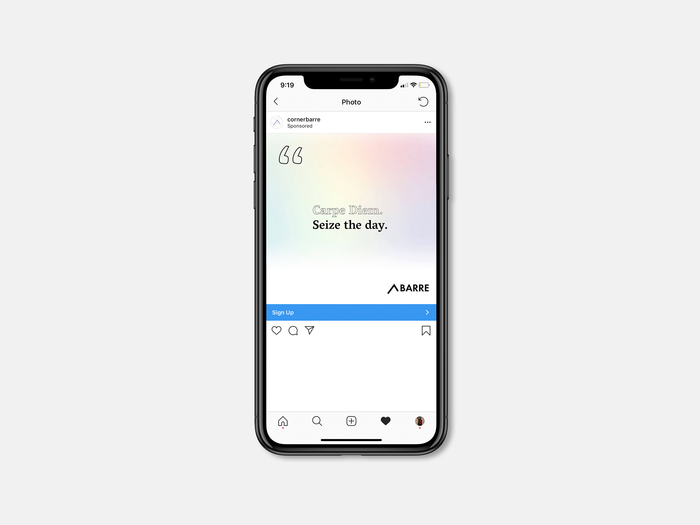
We knew that the community was a big part of Barre but we also wanted to highlight the ways in which this community is brought together. Through simply complimenting the women of Corner Barre and also incorporating the language that they use on a day-to-day basis, we were able to create work that offered the comfort, community, and calm of Corner Barre while keeping that upbeat, badass vibe that they really pride themselves on.
Visual Explanation
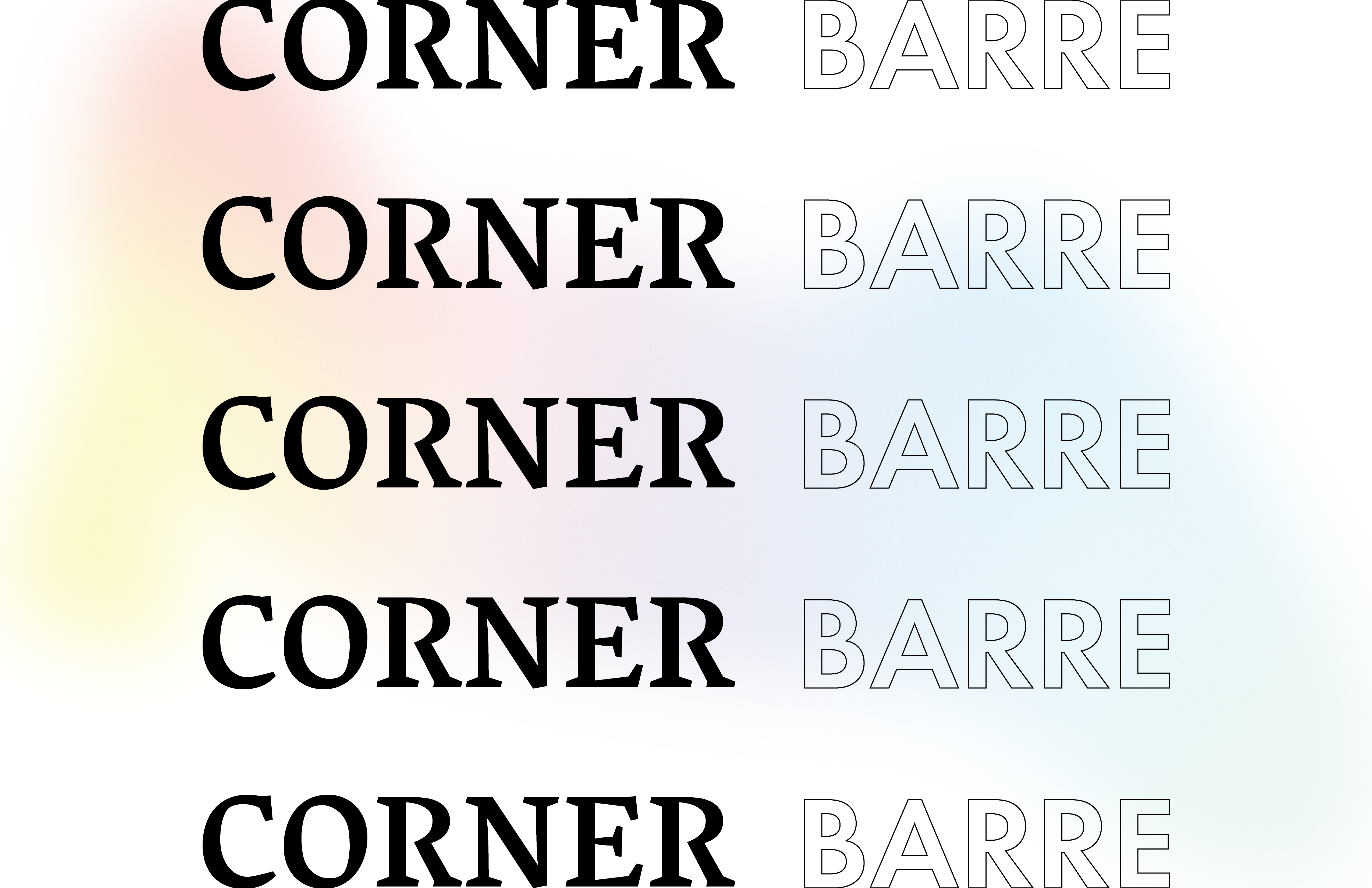
Barre is a combination of Yoga, Pilates, and Ballet. It draws it roots from practices which value movement, expression, emotion, connectivity, and progress. That’s why we felt that a gradient which symbolized livliness, a state of flow, and an almost ethereal feeling coupled with black and white images to represent a hard-working, classical, ballet, sensibility worked really well.
In-terms of the gradient, each color’s theory had a meaning that we felt deeply resonated with the people that visited the shop. We also really liked the way that together, the colors were much more beuatiful than they would have been alone. We felt like that was a really nice metaphor for Corner Barre.
We also knew that the use of language and type could be really pivotal in creating tension within a campaign where tranquillity was probably the most important emotion.
Color Theory
Printed on vellum, we developed our color theory sheets to hand to the client in-order to explain why each color in the campaign is the way it is.


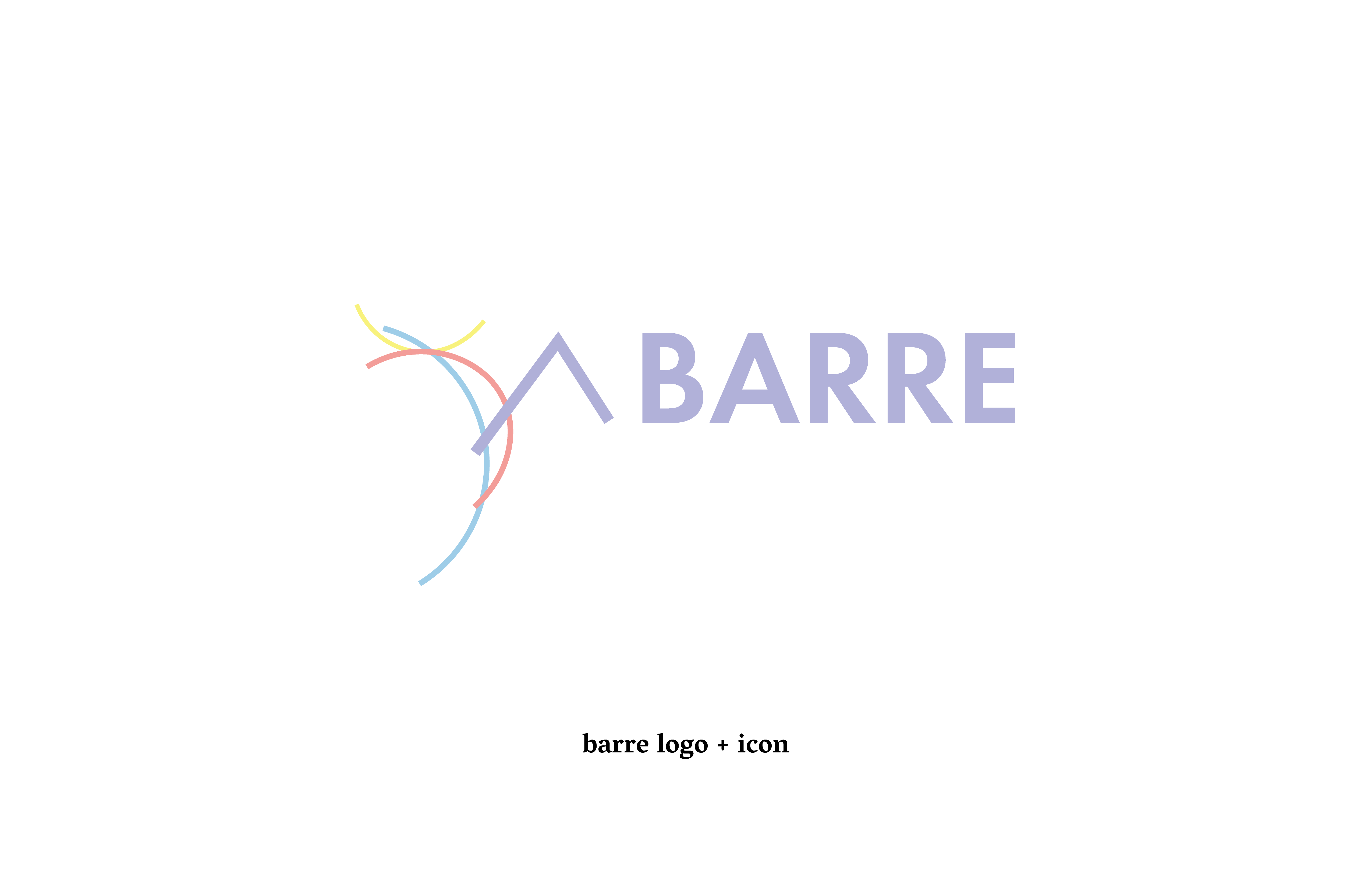
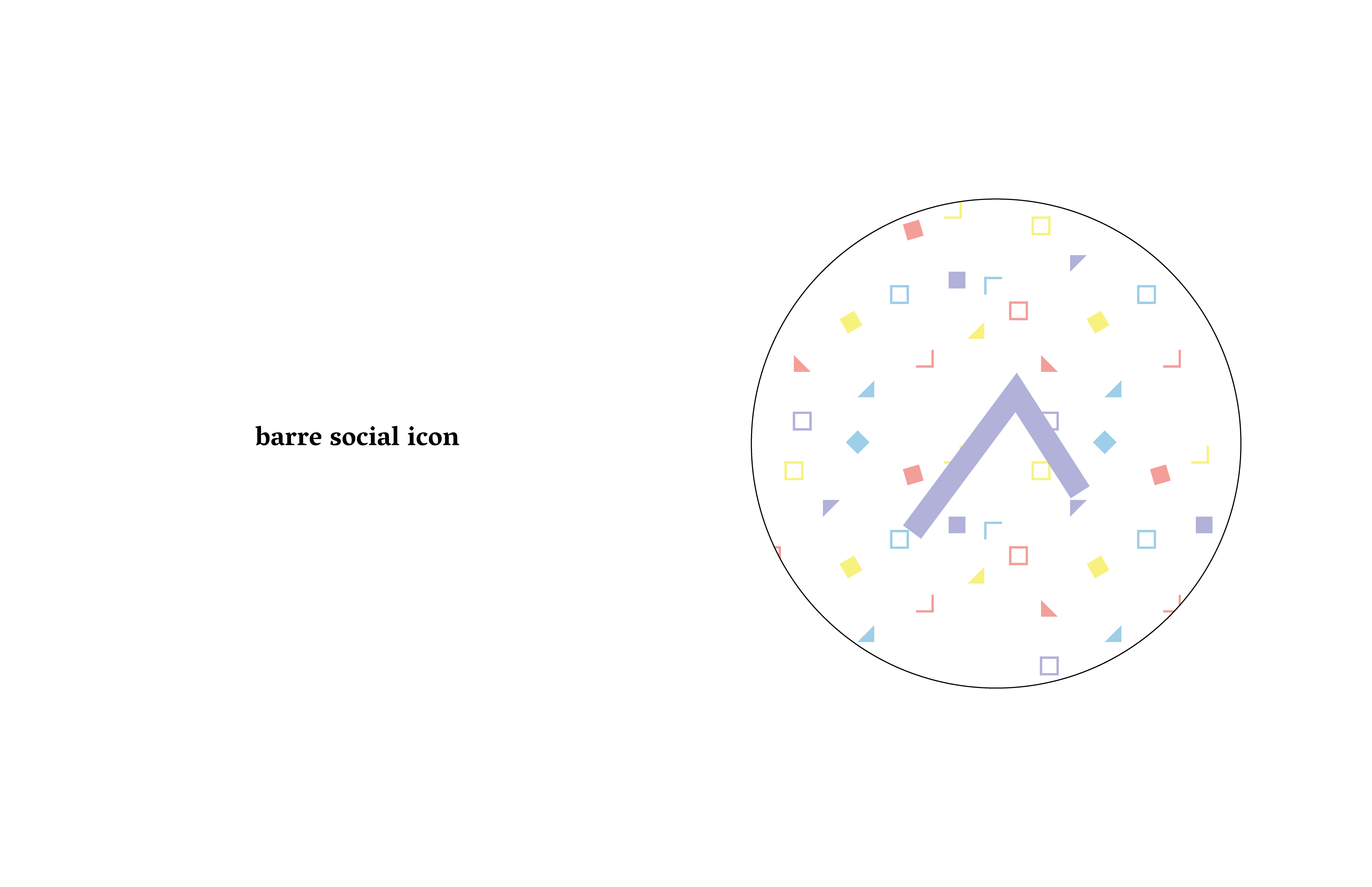
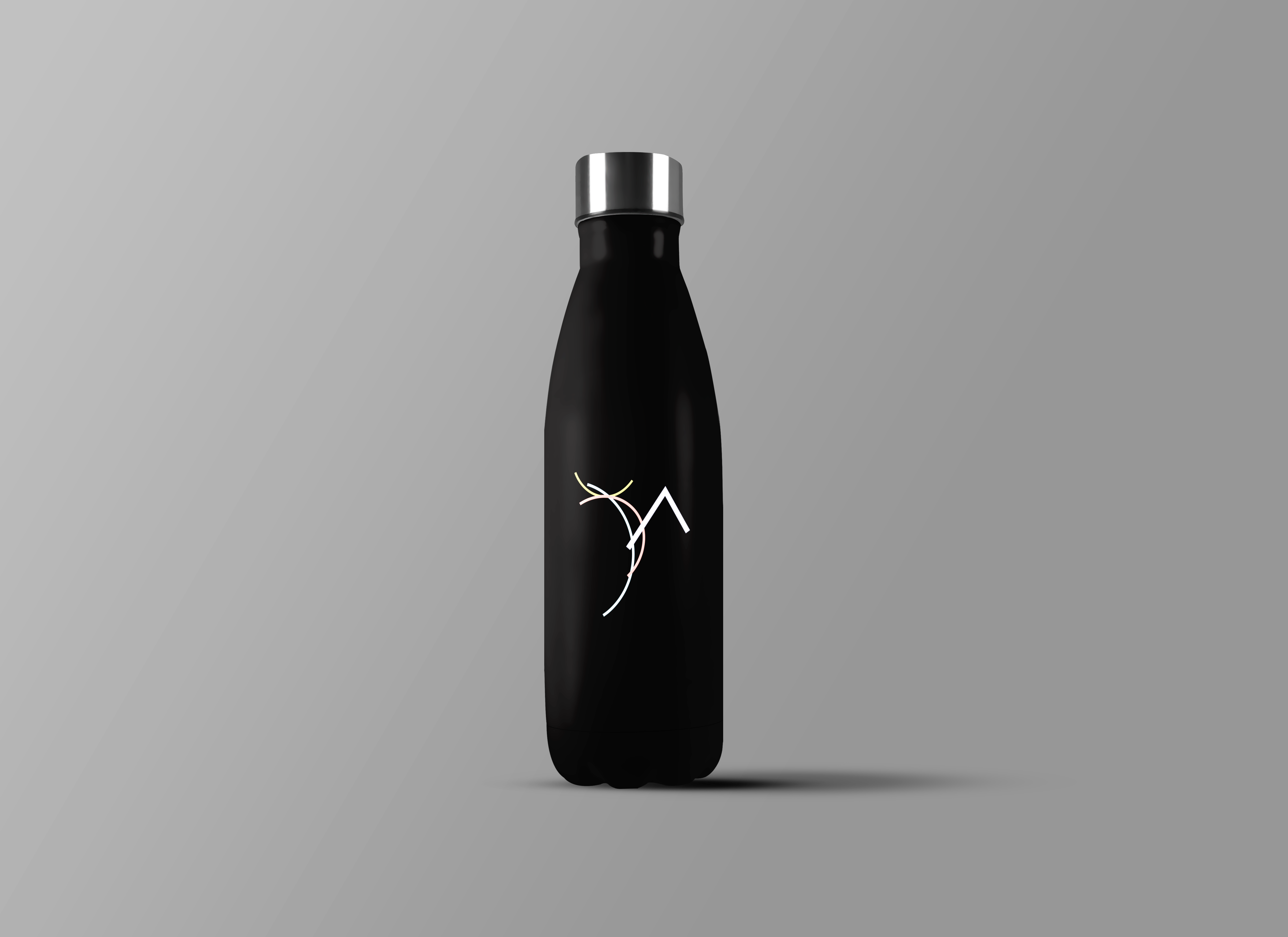
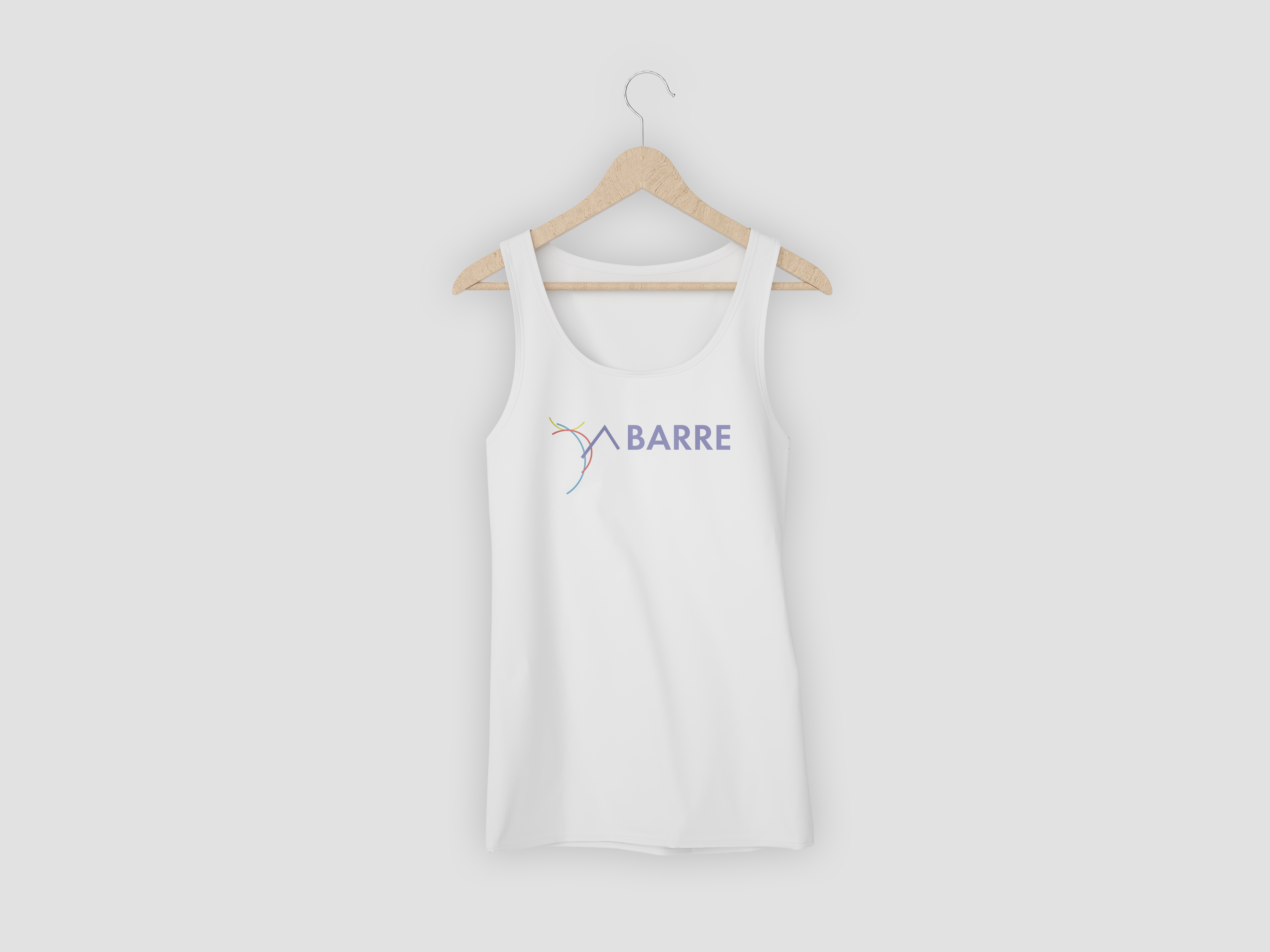
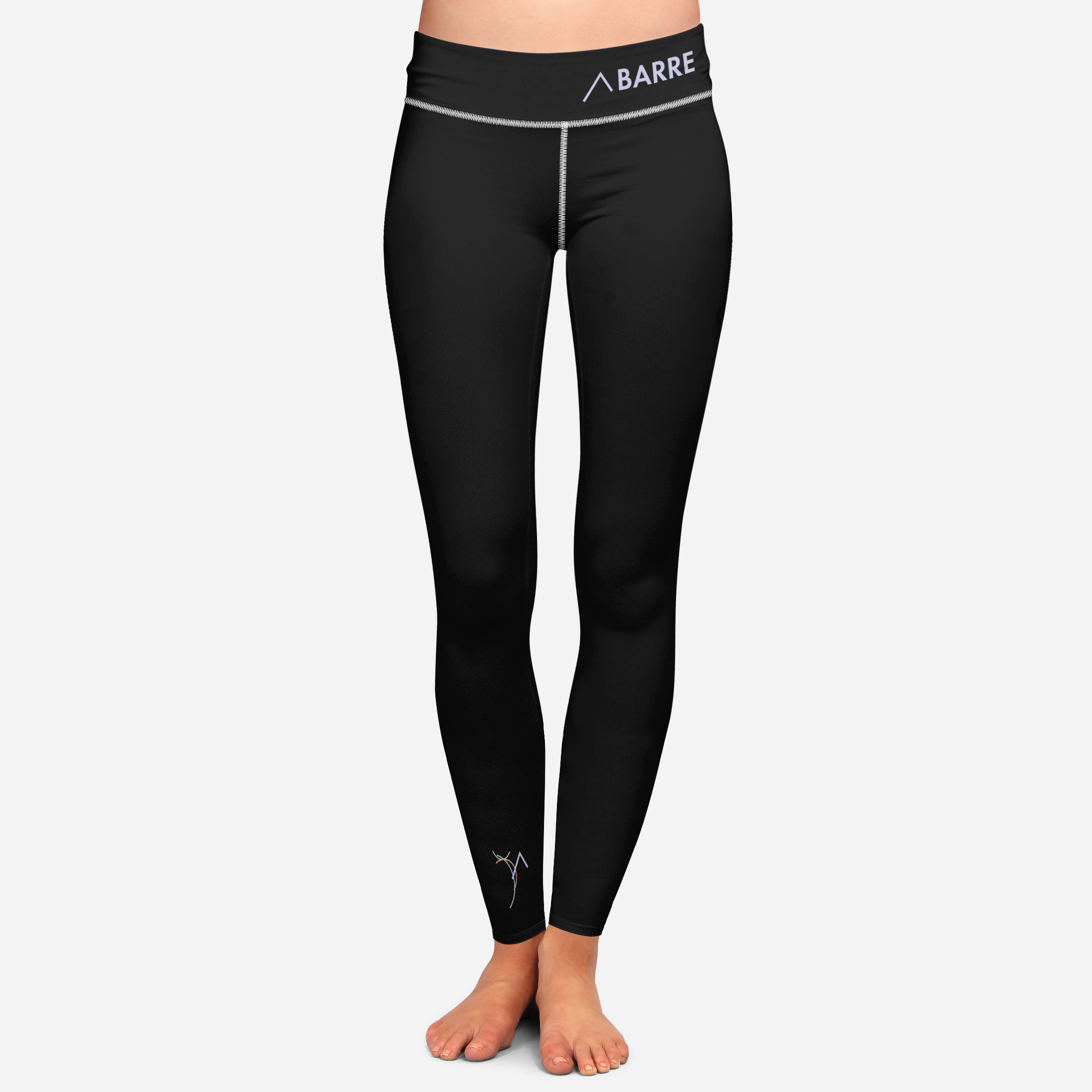
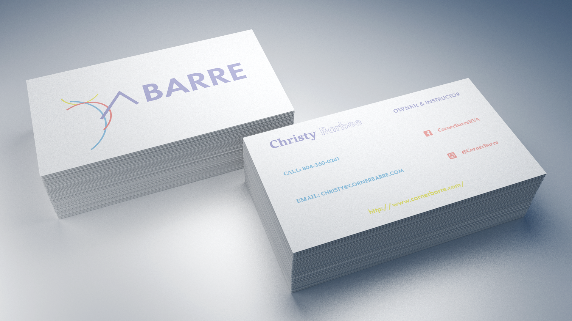
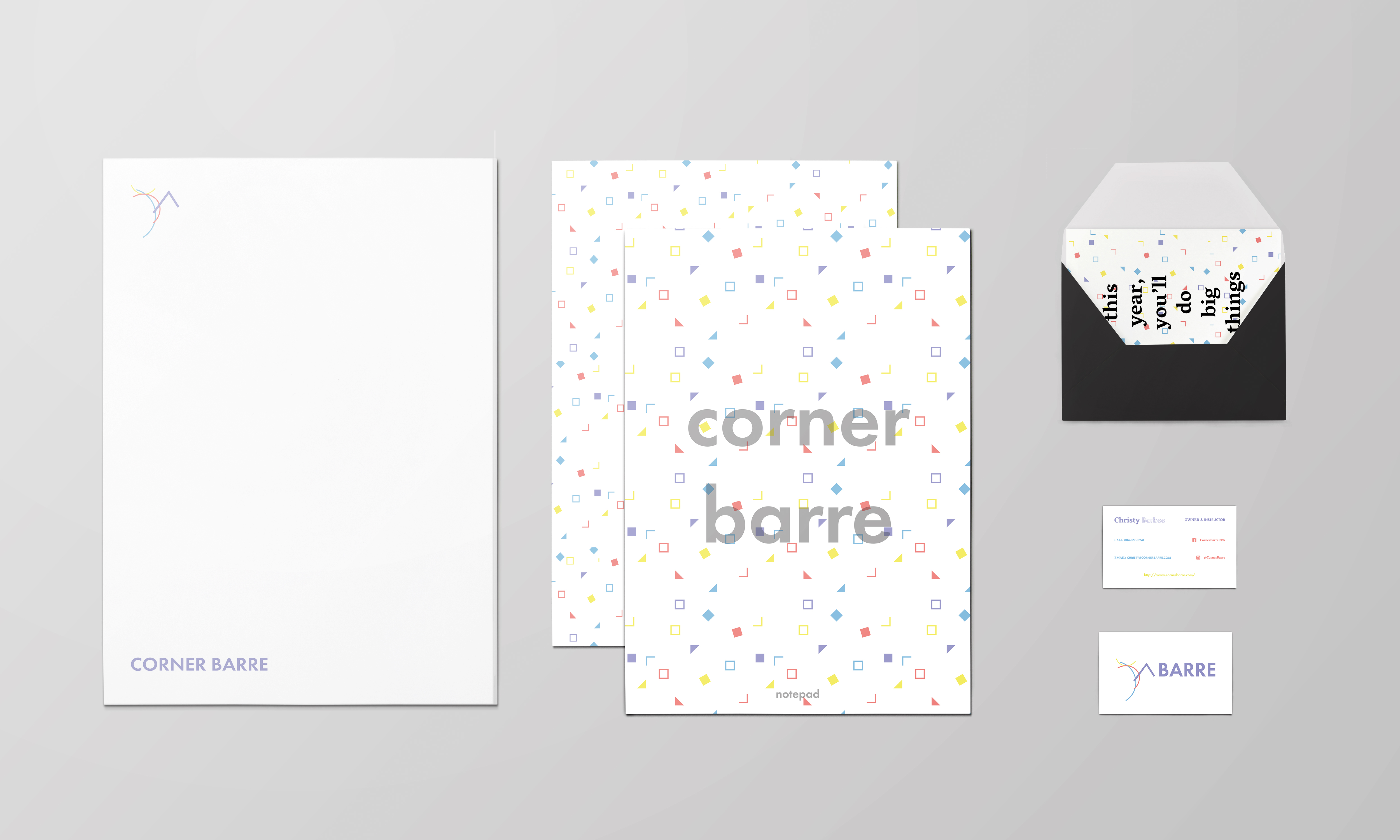
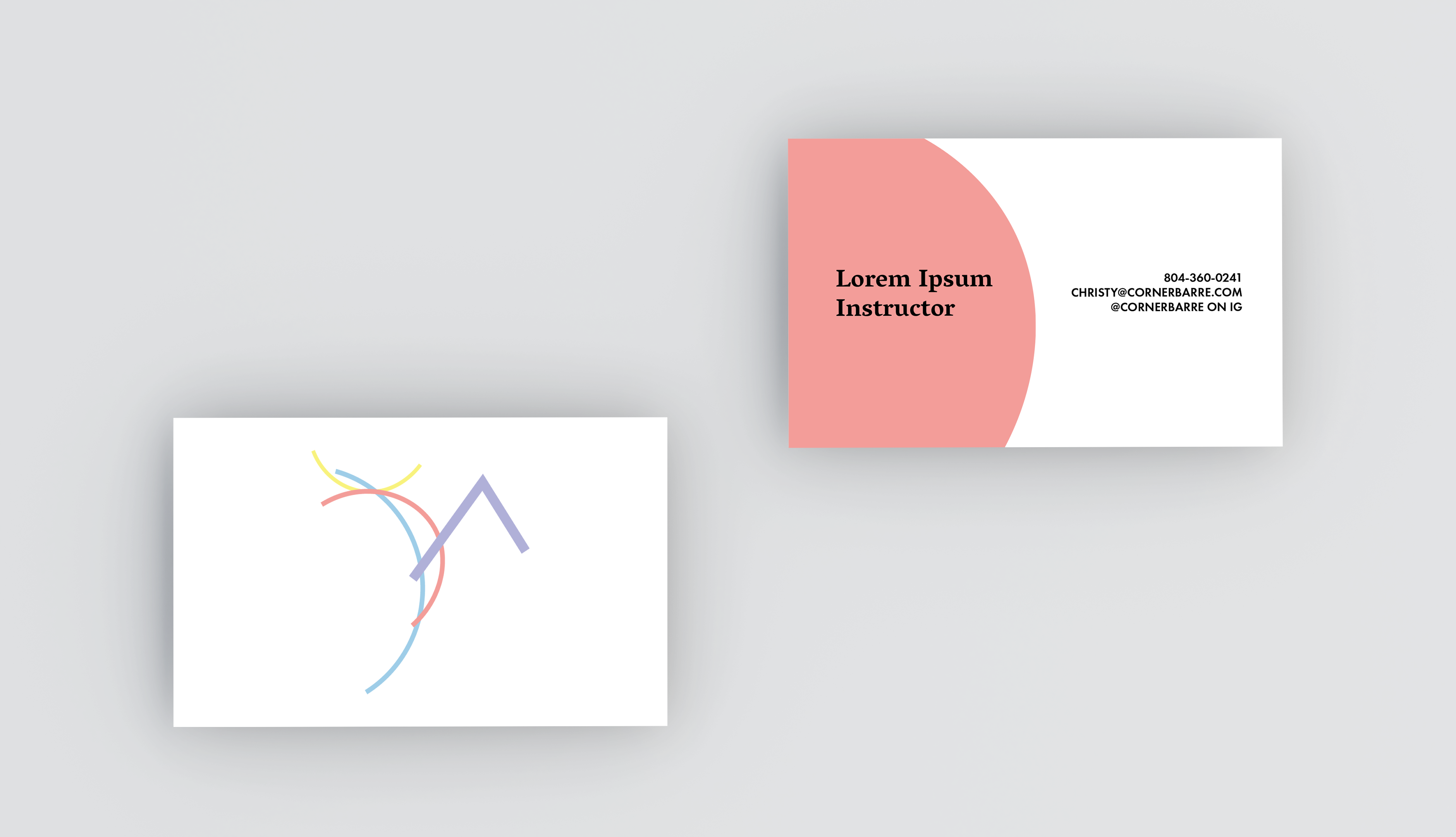
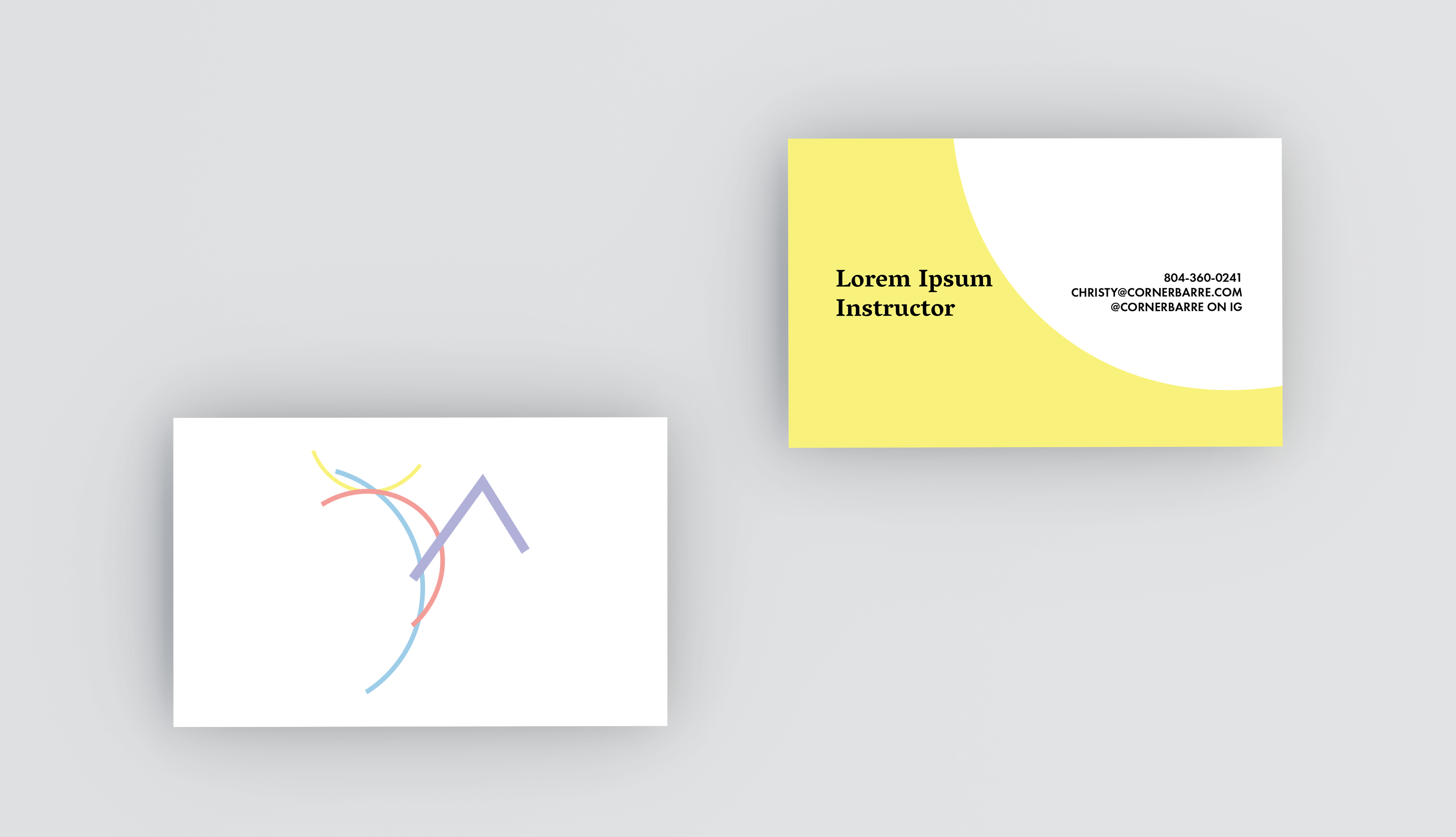
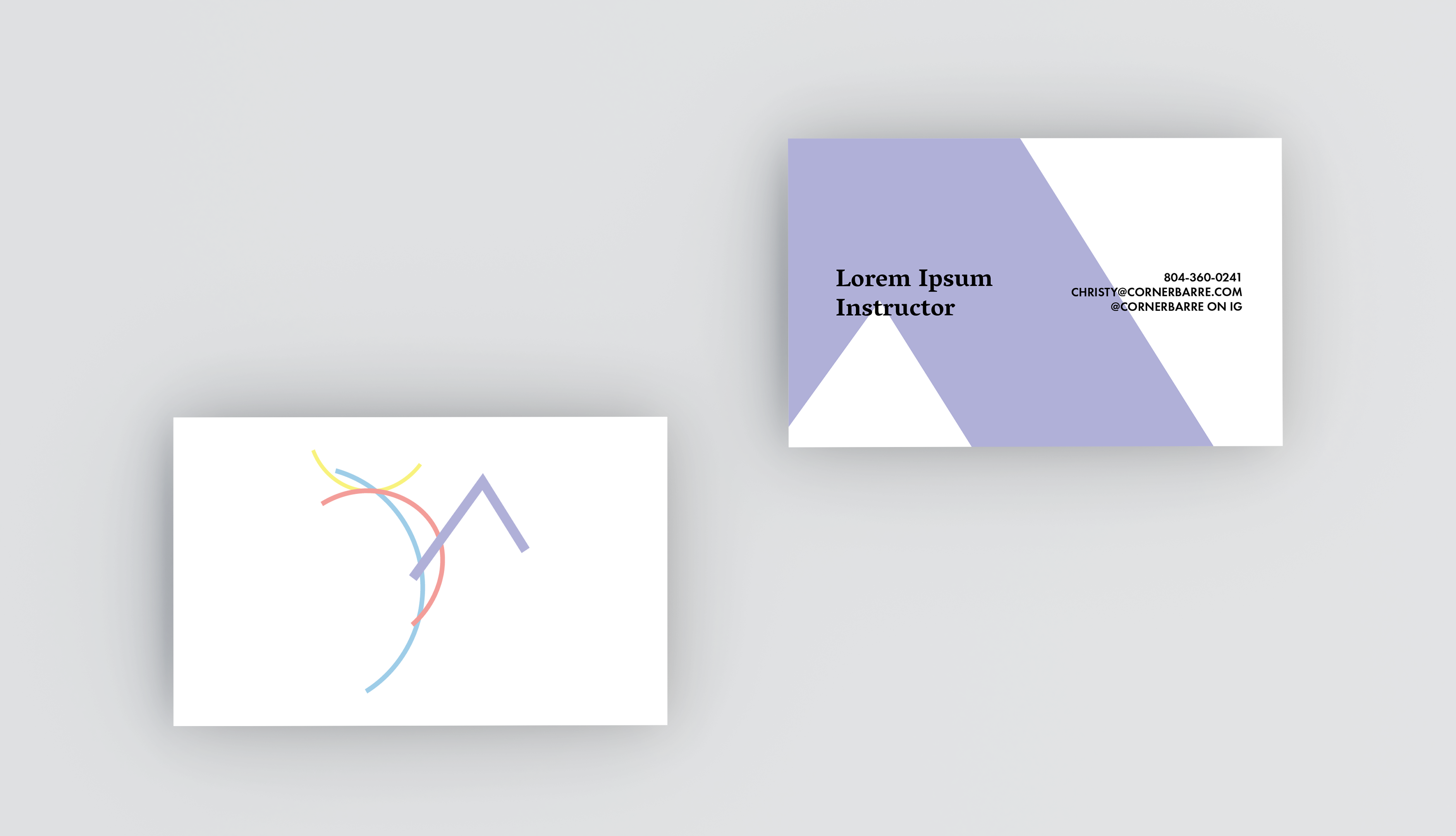
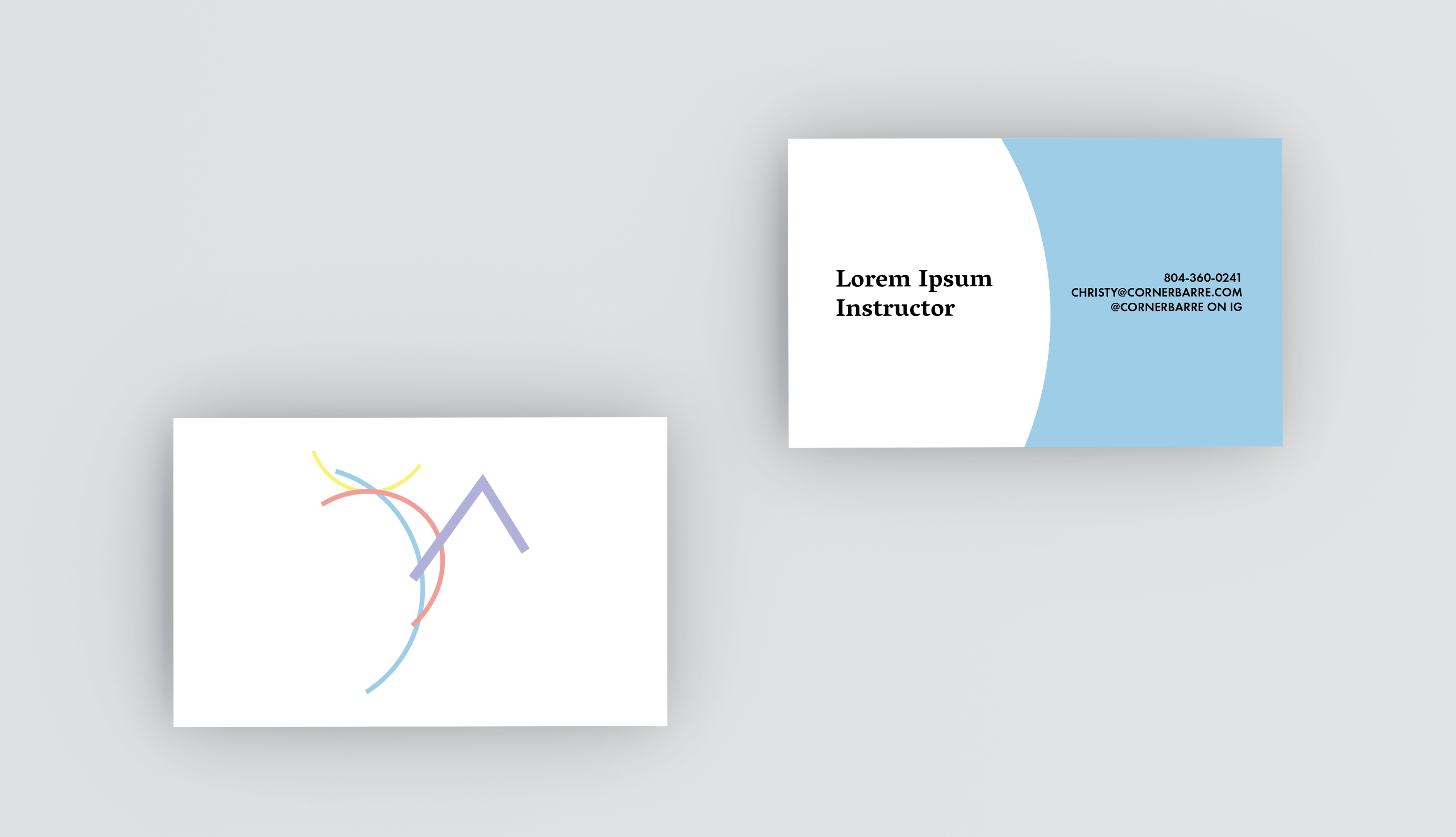
Logo Redesign + Brand Standards
Icon inspired by Kandinsky.


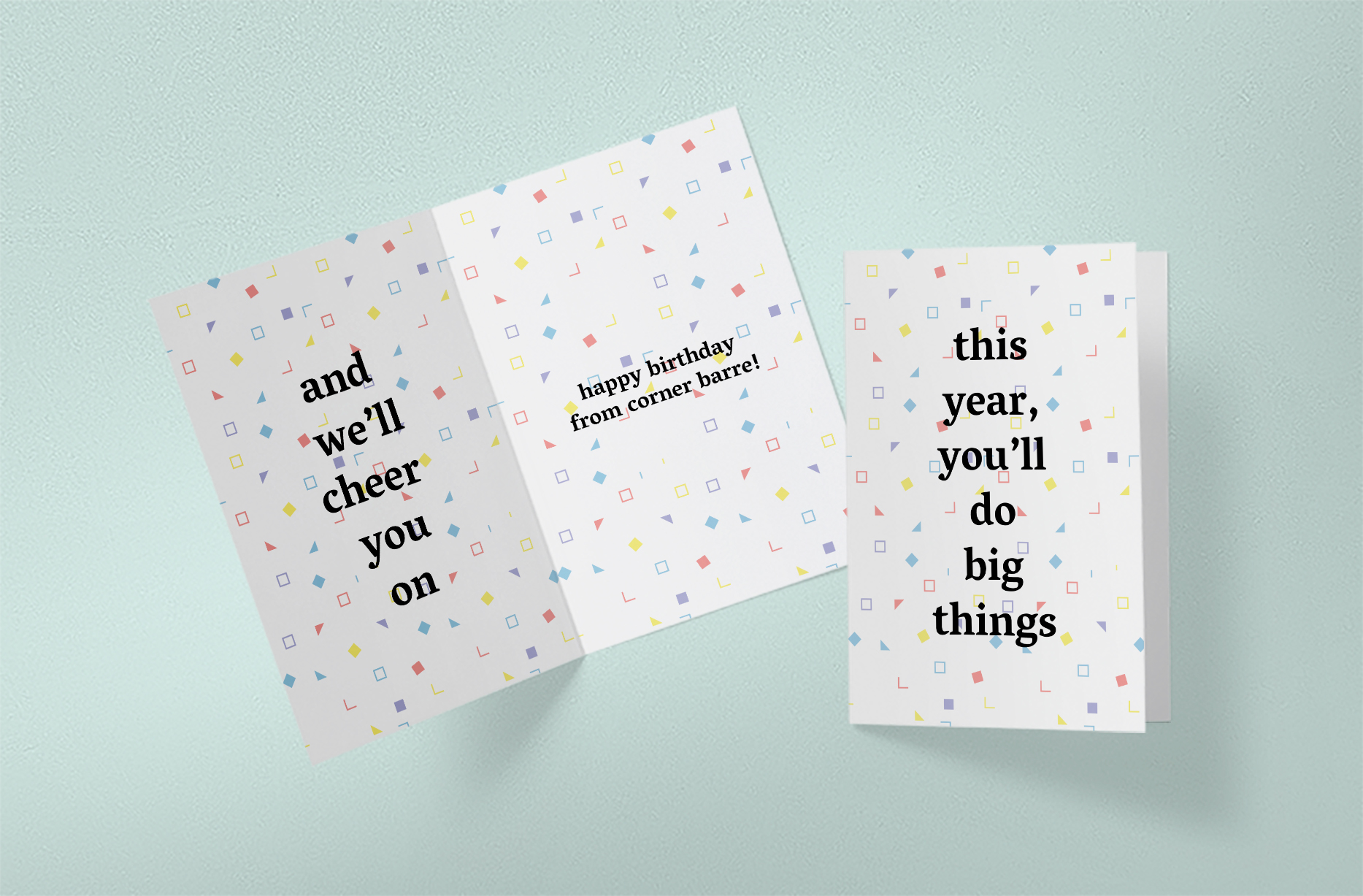
Compliment Cards
As a way to increase bonding within the Corner Barre community, we decided to create compliment cards which new clients could pick up and then keep throughout their time at the studio. We’d offer a variety of cards that all had an adjective and then a color. The cards would double as conversation starters and when a person would be new to the shop they’d be able to connect with someone who they’d instantly have something in common with.
Social Media + Digital
Outside of the video work, we wanted to keep the language in the same vein as the rest of the visuals. In-terms of copy we thought it’d be best to offer words of encourangement and positive reinforcement much like the Barre instructors that we were able to talk to would. We ended having two versions of the digital posters. One that would quite directily compliment the women and then one that would carry the same message but in a less direct way.

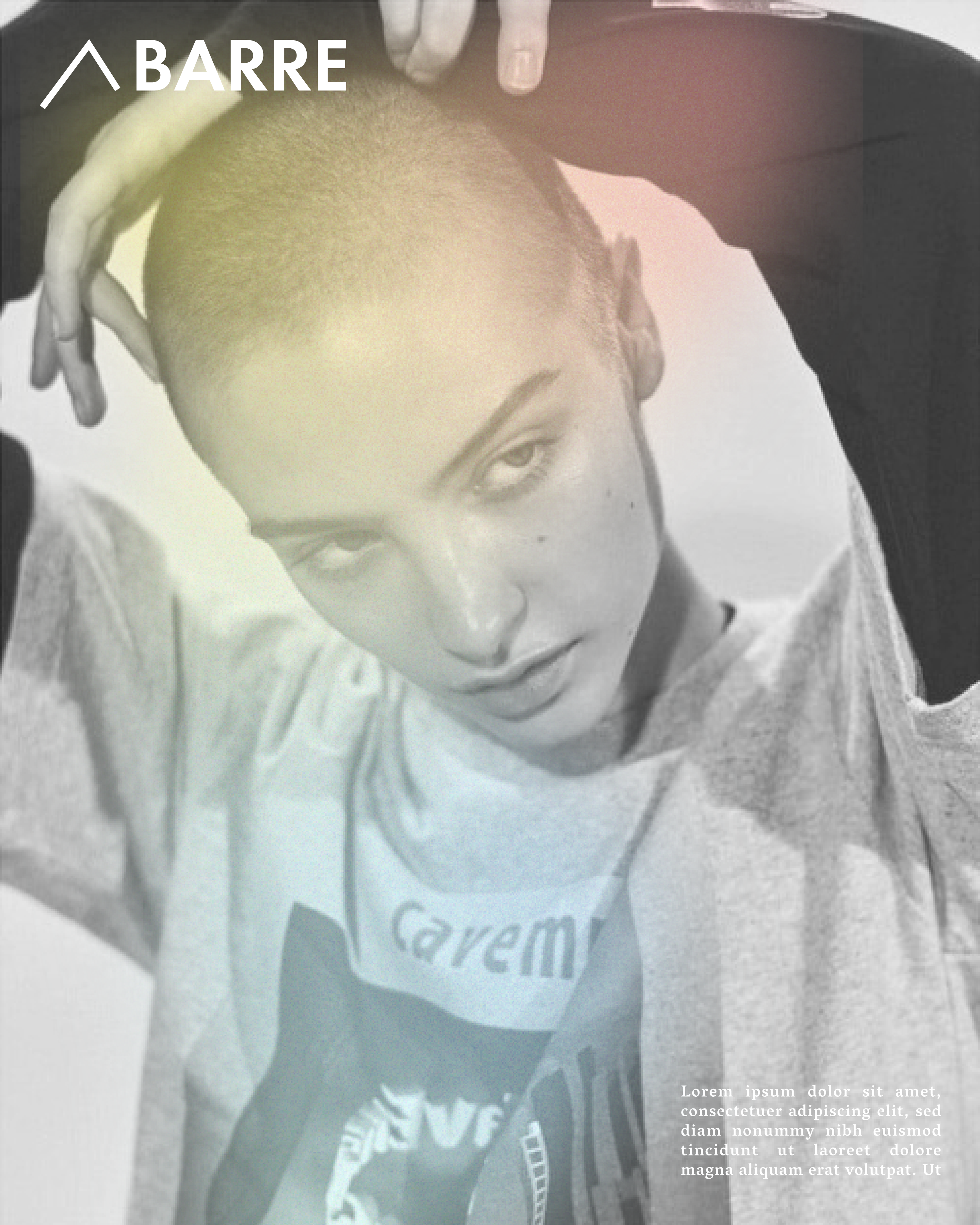
Photoshoot Prototypes || DIDN’T MAKE FINAL PRESENTATION
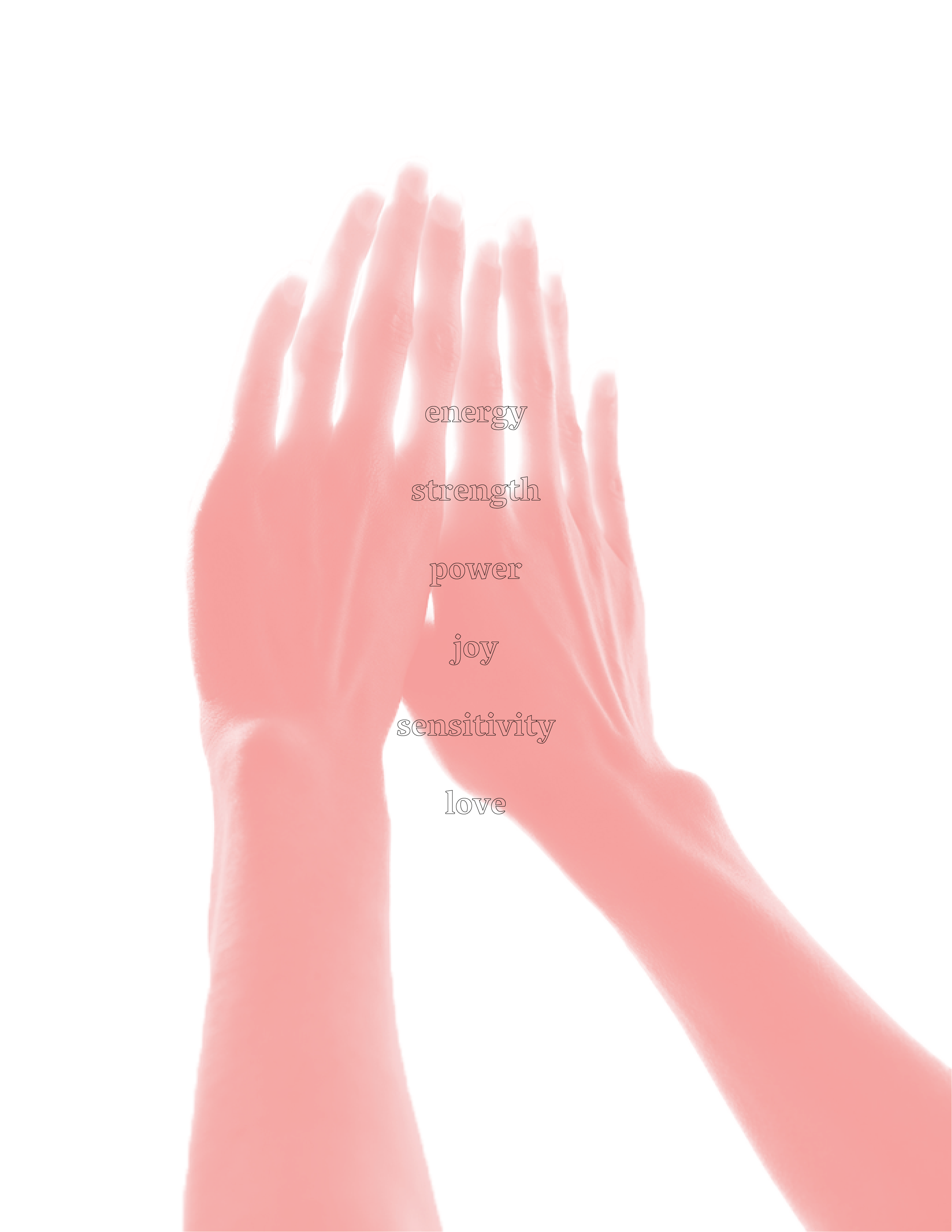
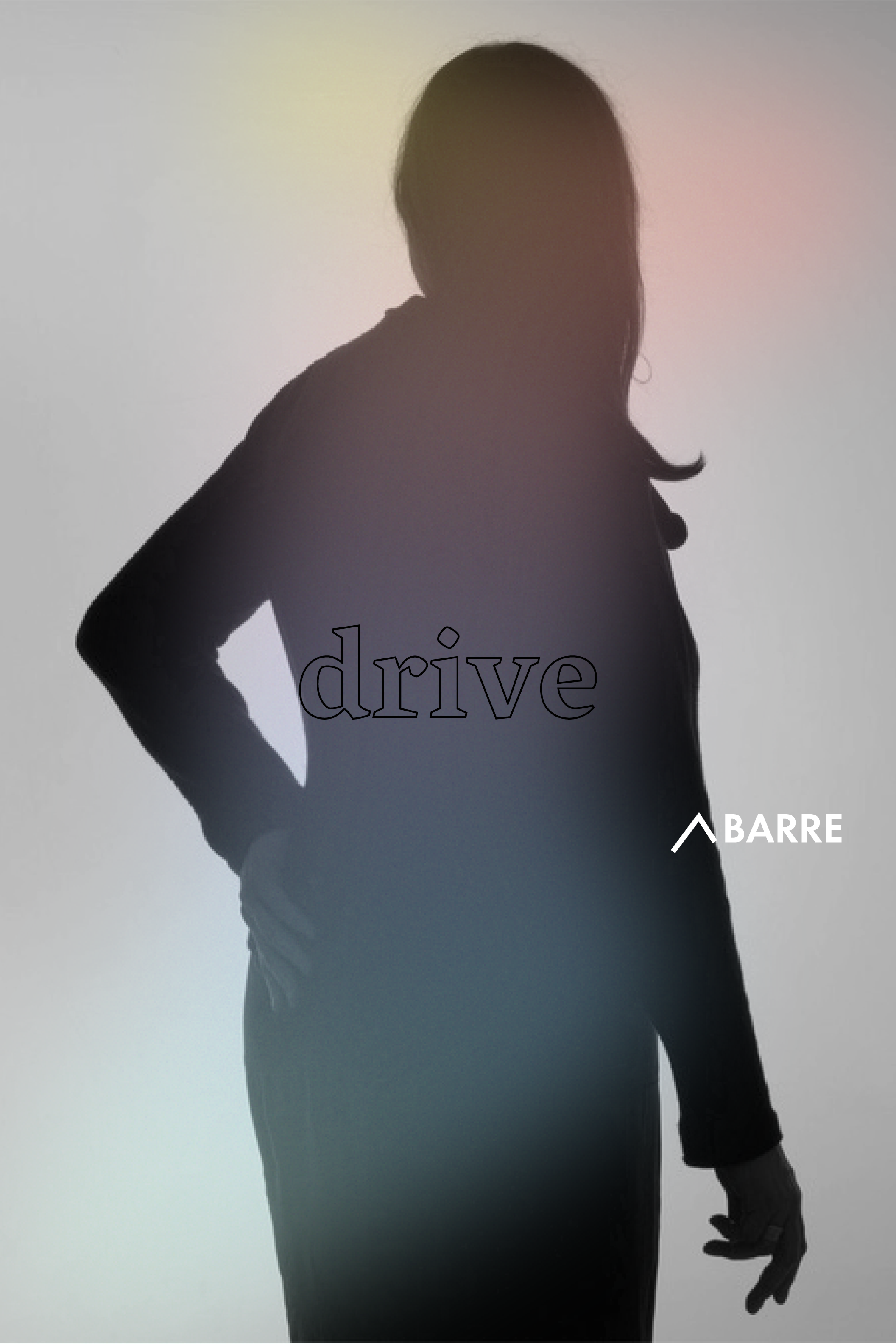
For our photography I originally wanted to do a studio shoot. I wanted to have people of all types in it and I wanted it to be away from Corner Barre in order to focus on the humanity of the clients. I was hoping to use filters on the lights in order to replicate the gradient found within the rest of the work. I thought a soft focus would also be really valuable in creating an air of serenity and distance. In our advertising, the photographs would create a sense of calm and then urgency for someone to want to come in and visit the shop in order to figure out what these people were like. We also didn’t want these people to be perfect by any means we felt that through showing them as they are we’d be able to connect with people and show that Corner Barre would accept them as they are.
This photoshoot never panned out but I was able to get test shots with a friend and then prototype how I’d like the campaign to be shot.
“YOU ARE” V1 || SHOT BY ME

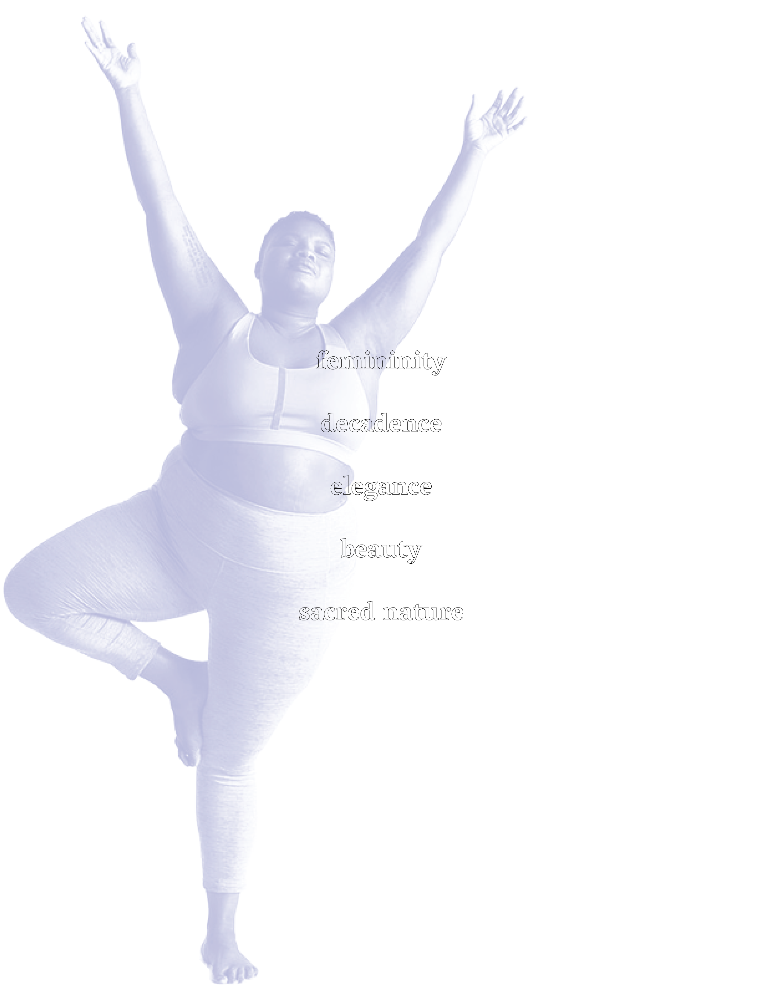
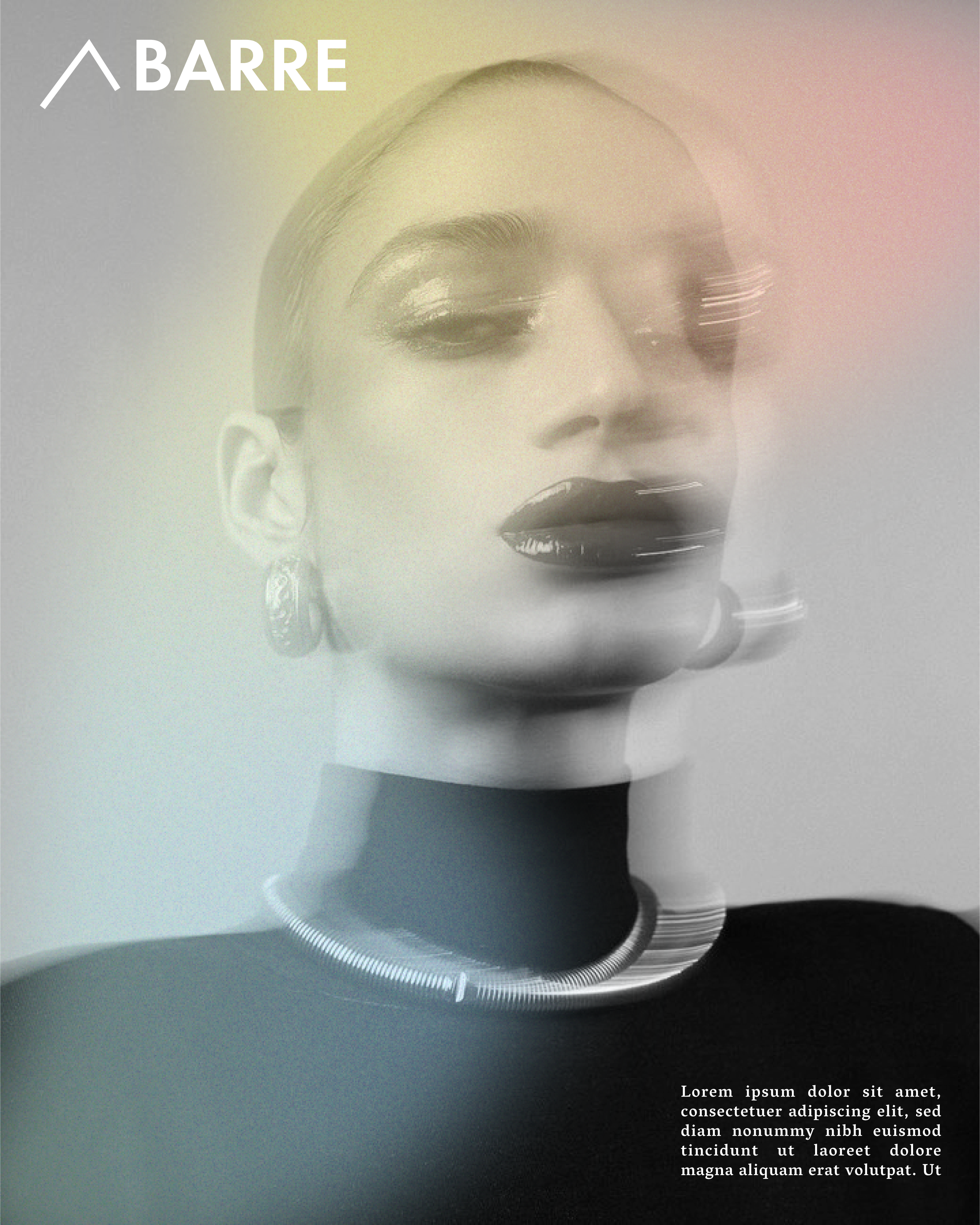
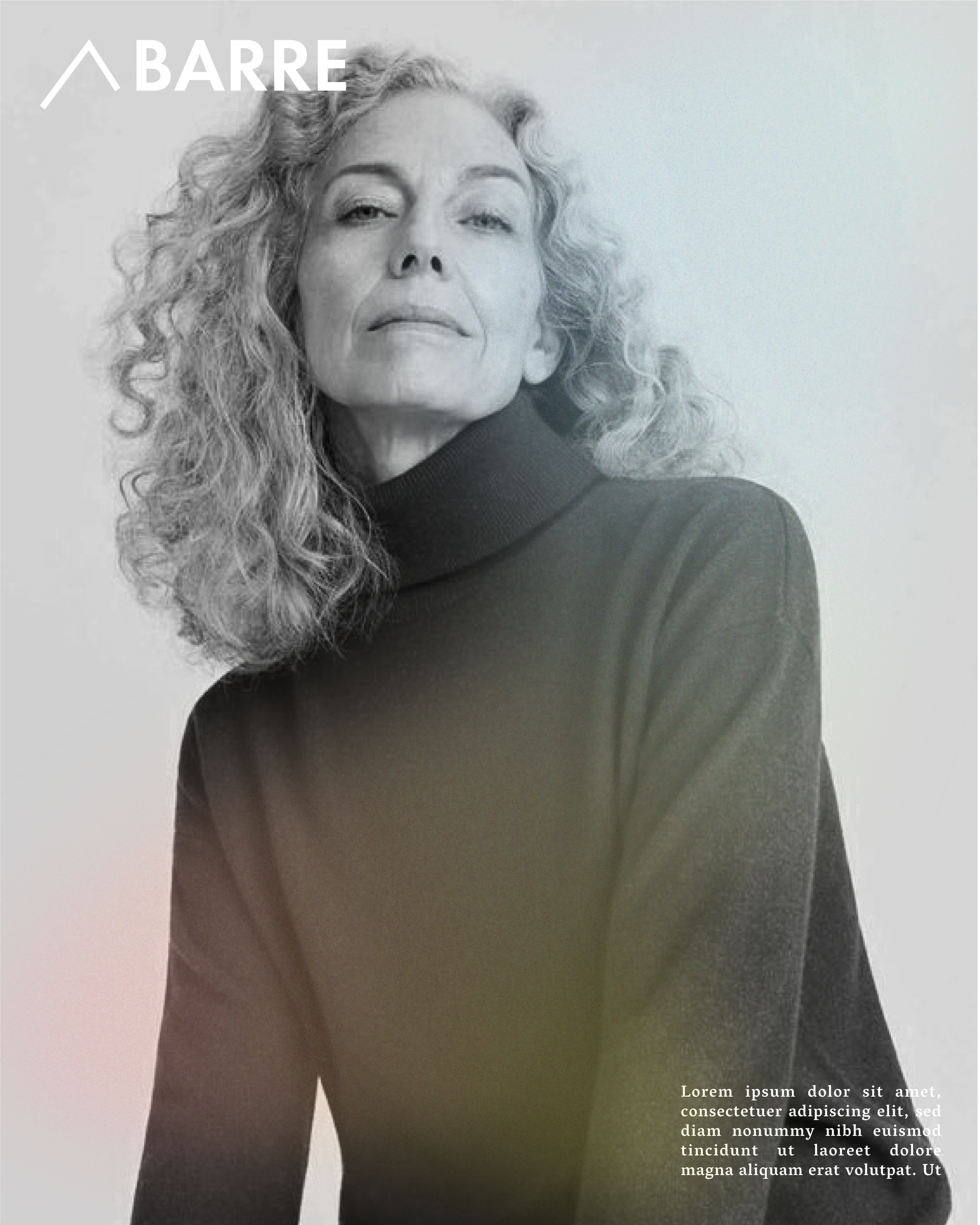
“THE WOMEN OF CORNER BARRE” PROTOTYPE || TAKEN FROM STOCK
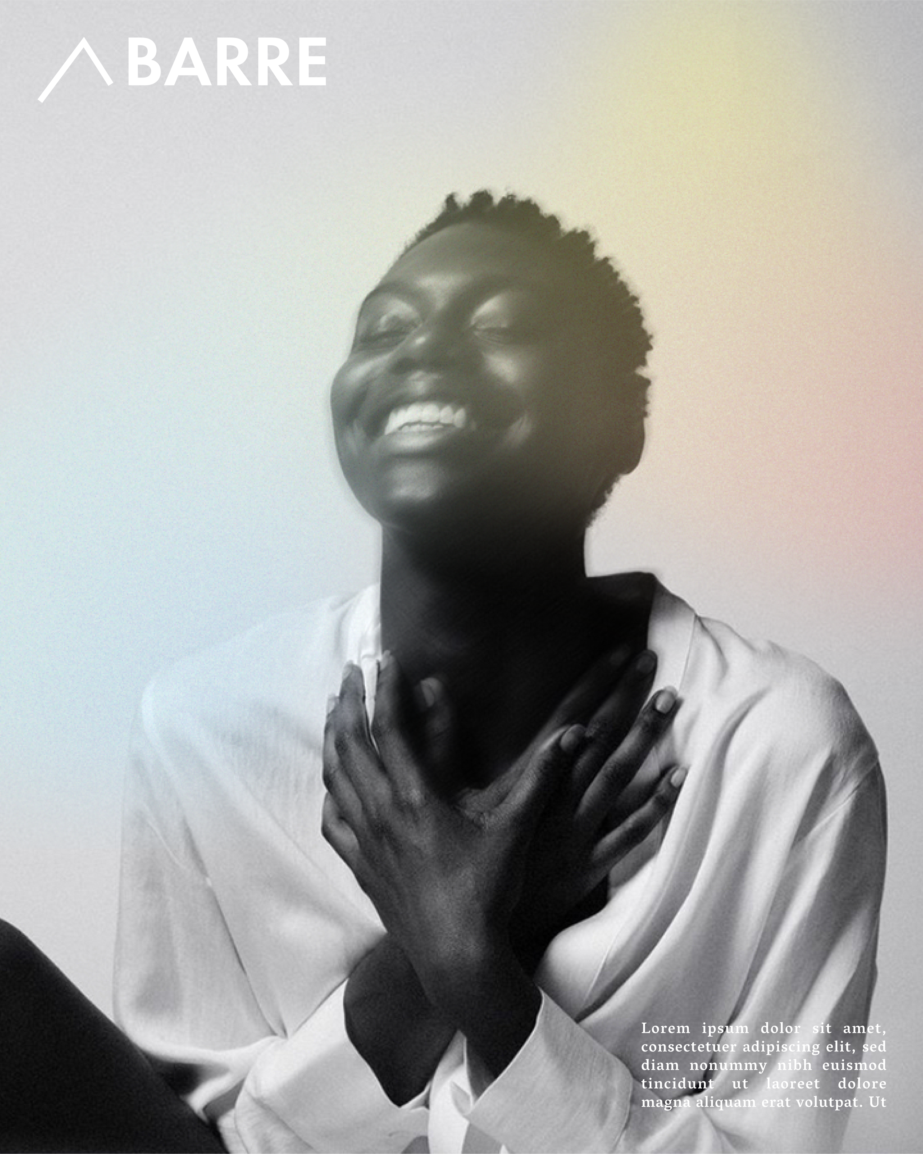
FINAL DIGITAL CAMPAIGN PHOTOS || “YOU ARE” V2
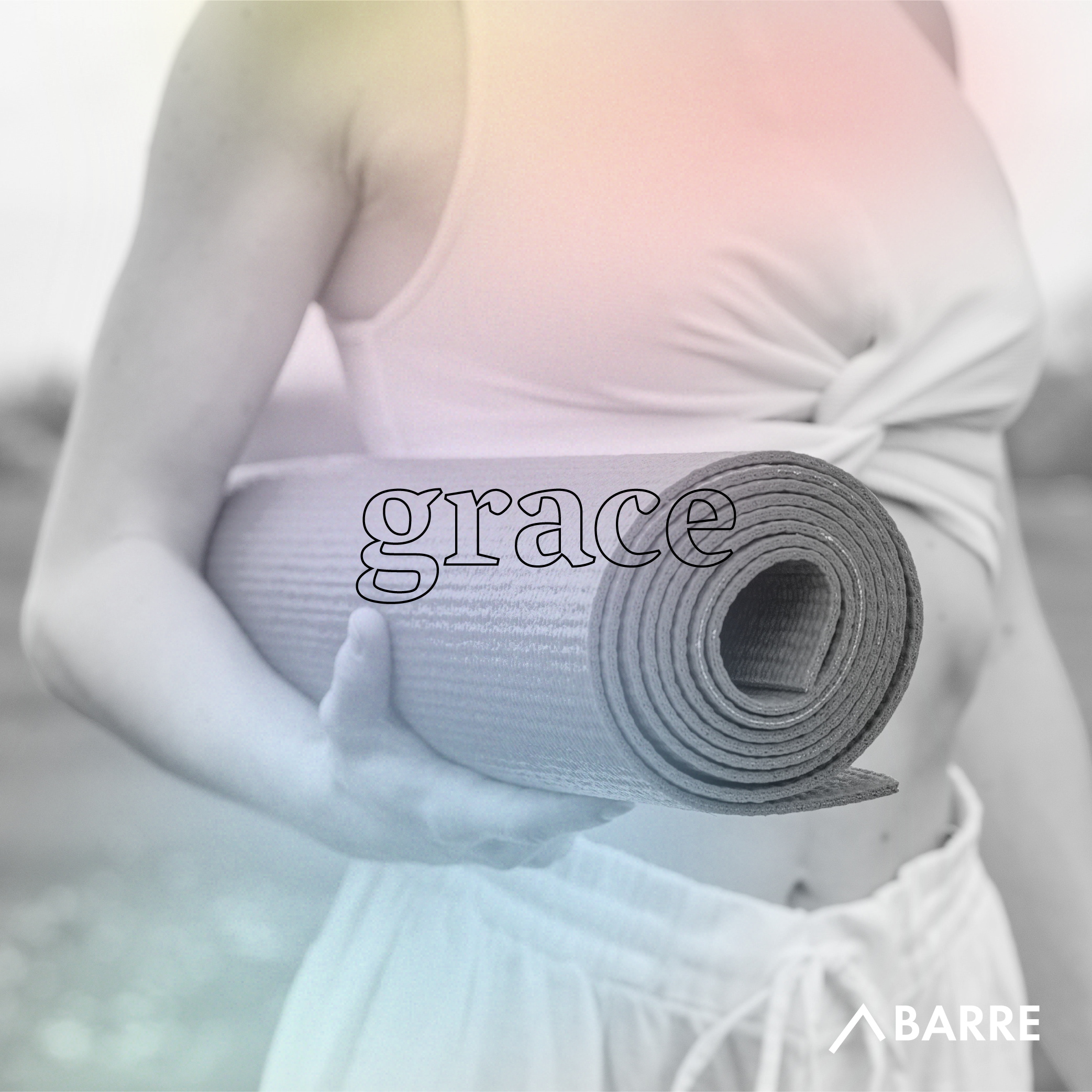


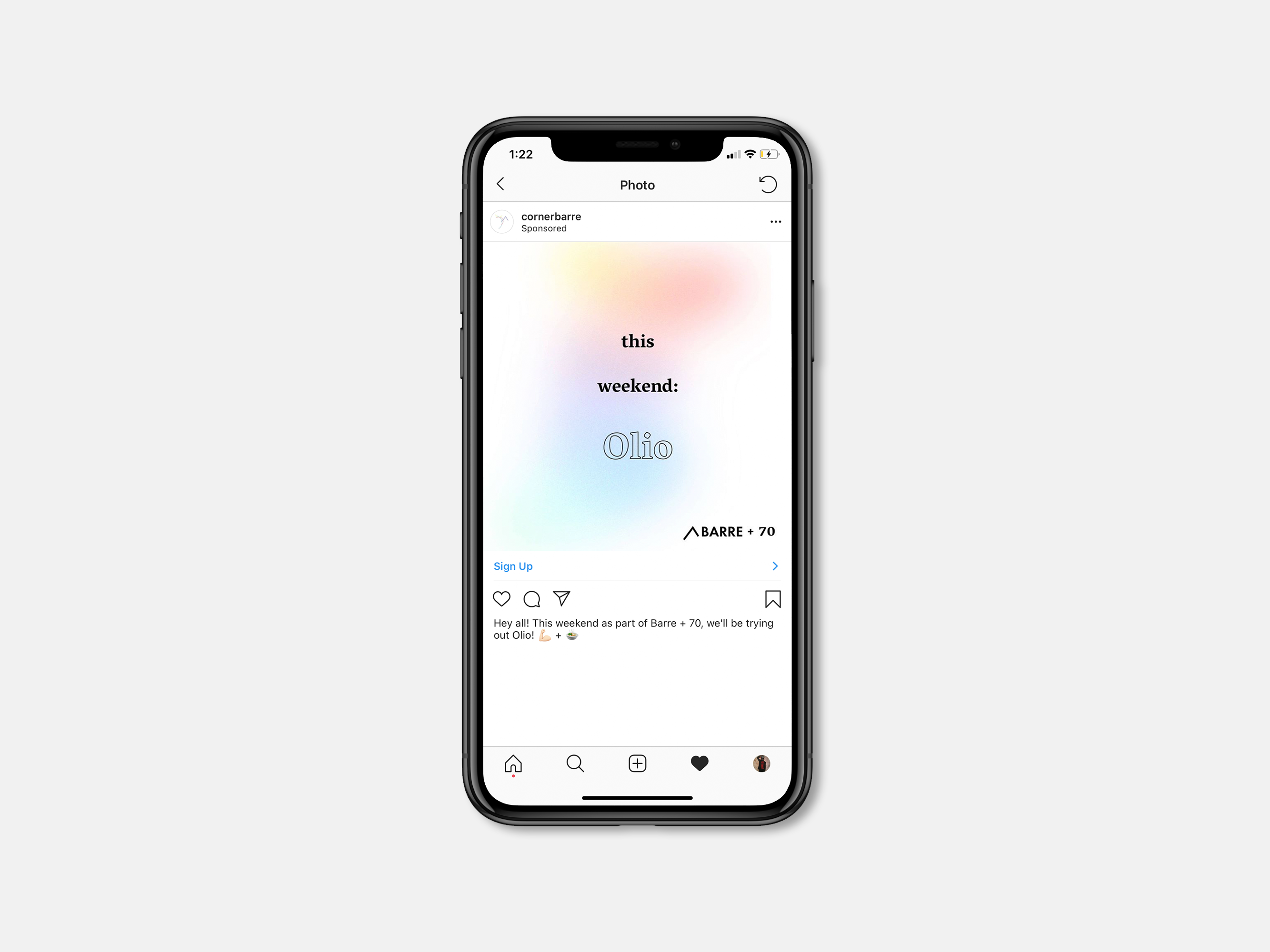
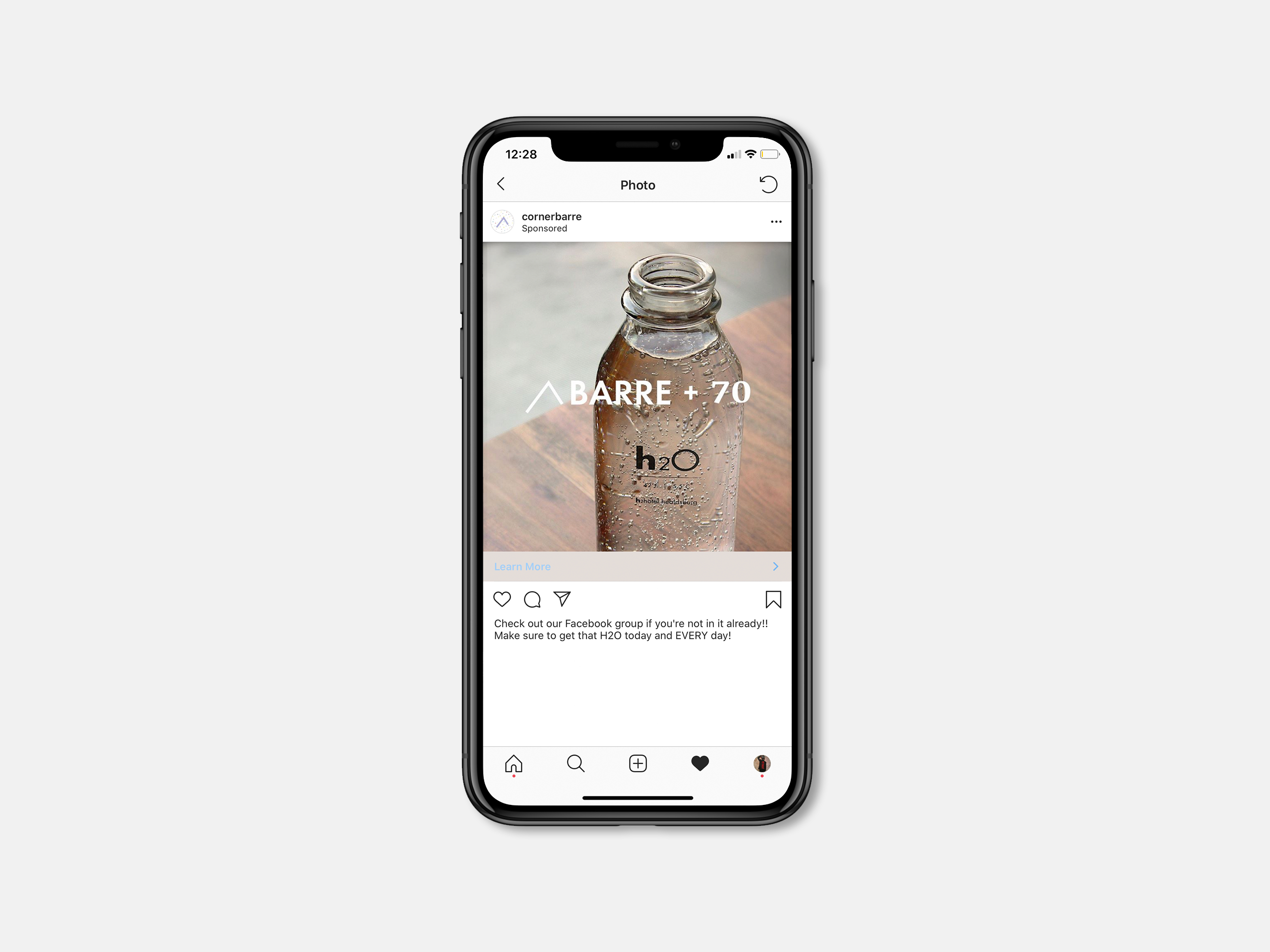
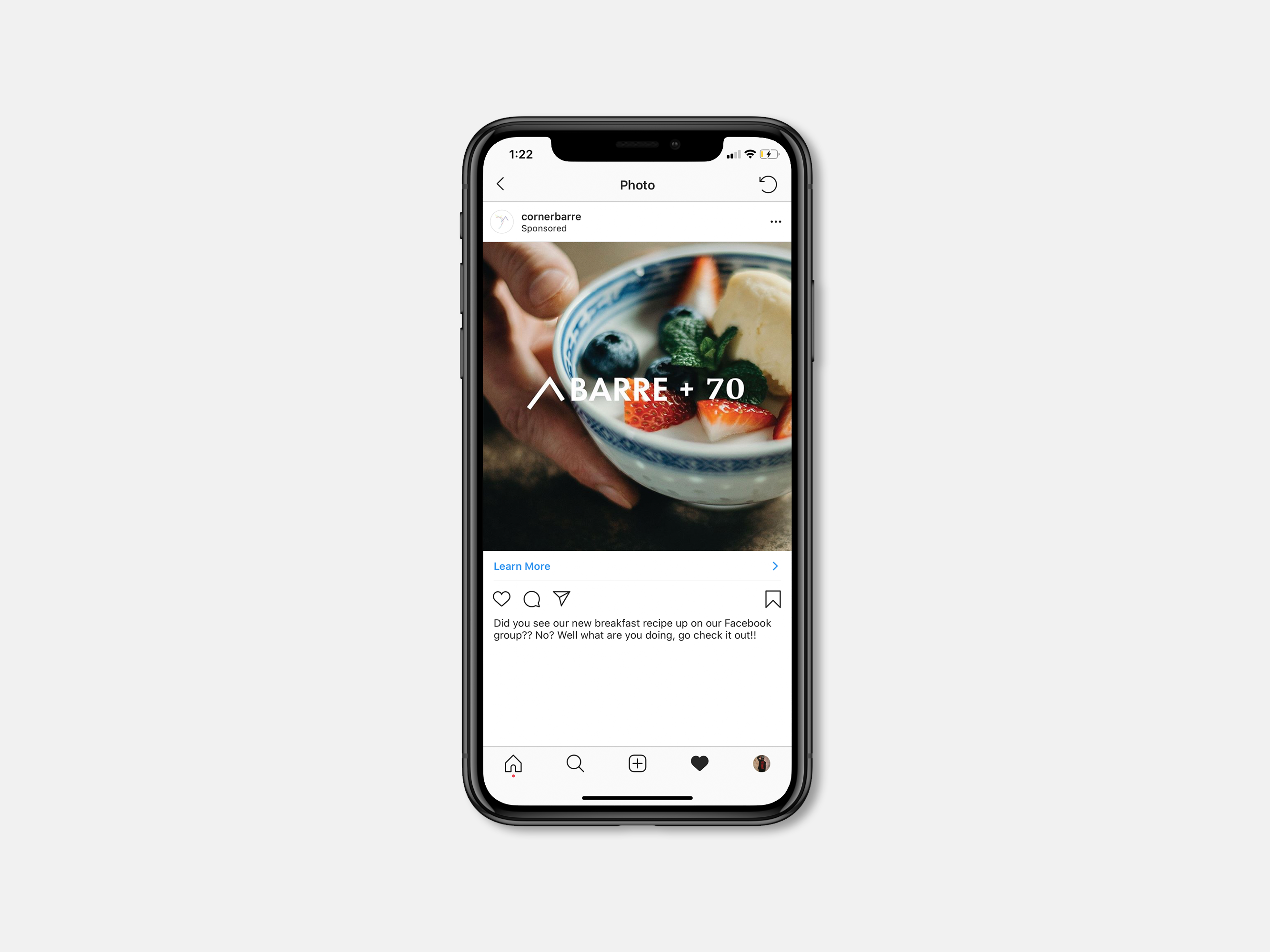
BARRE + 70
Through out our research we kept hearing about how exercising was only one small part of a person’s health. The 70/30 rule is something that most people at Corner Barre have bought into and to show that Corner Barre really does care about a person’s well-being we decided to create a brand extension that would allow for the people at Corner Barre to have an impact on their client’s lives outside of the studio.
WEBPAGE
The client also really needed a new webpage so we ended up creating a prototype of what her webpage should look like. We also re-wrote the copy on the page to better fit the campaign as well as the studio’s personality.
Macbook Mock from Theo Haggins on Vimeo.